# Avoiding nested scrollbars
**URL:** https://discourse.paraview.org/t/avoiding-nested-scrollbars/9523
**Category:** Development
**Tags:** proposal
**Created:** [April 27, 2022, 1:59pm UTC](https://discourse.paraview.org/t/avoiding-nested-scrollbars/9523 "2022-04-27T13:59:30Z")
**Posts on this page:** 15
**Page:** 1
### Author:  [@utkarsh.ayachit](https://discourse.paraview.org/u/utkarsh.ayachit)
#### Post date: [April 27, 2022, 1:59pm UTC](https://discourse.paraview.org/t/avoiding-nested-scrollbars/9523/1 "2022-04-27T13:59:30Z")
For a really long time, I have been annoyed by ParaView’s propensity to show nested scrollbars. For example, see the information panel:
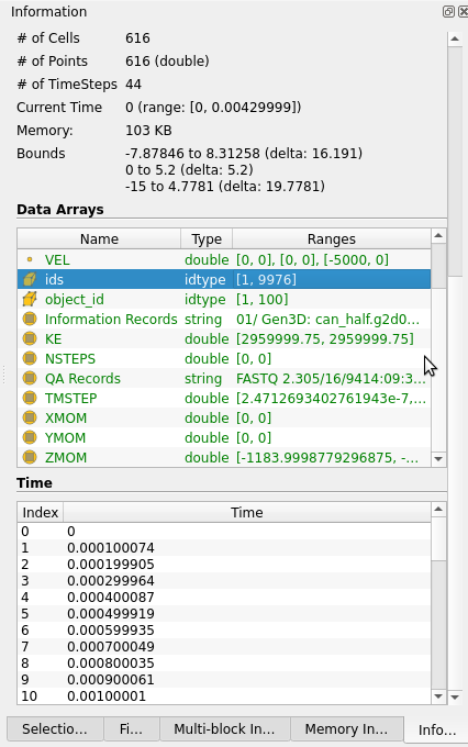
The same thing happens on Properties panel too when widgets for array selection for reader, for example, have too many rows.
To avoid showing these inner scrollbars we have added custom code allowing the table widget to grow to fit at least a certain number of rows before it opts to show scrollbars. Of course, we can make the widget grow indefinitely and avoid the scroll bar problem, but then panel can grow quite long and become very cumbersome.
How about at alternative approach:
1. the inner widgets, like these array or time widgets on the Information panel, will never show a scroll bar.
2. these widgets keep their height as compact as possible, however they can grow to fit a certain per defined set of rows automatically. This number of row to grow to fit should be specifiable in the settings. For users will tall monitors, one can easily set a higher value. For someone like me who has a fairly short monitor, I’d keep this low.
3. when the widget has more rows than the limit, instead of showing scrollbar, it adds “grow” button as the last row in the widget. The user can click this button to show all rows. When showing all rows in this mode, the last row gets converted to “shrink” button. The user can click that to shrink the widget back.
4. The grow state for a particular widget should get saved in settings too so the user doesn’t have to keep changing it. For example, I’d see myself always have the “Data Arrays” widget in the Information panel be fully expanded, but perhaps not the “Time” one.
Thoughts?
---
### Author:  [@mwestphal](https://discourse.paraview.org/u/mwestphal)
#### Post date: [April 27, 2022, 2:01pm UTC](https://discourse.paraview.org/t/avoiding-nested-scrollbars/9523/2 "2022-04-27T14:01:45Z")
+1 !
---
### Author:  [@Kenneth\_Moreland](https://discourse.paraview.org/u/Kenneth_Moreland)
#### Post date: [April 27, 2022, 2:09pm UTC](https://discourse.paraview.org/t/avoiding-nested-scrollbars/9523/3 "2022-04-27T14:09:34Z")
I agree. That sounds like a great idea.
---
### Author:  [@wascott](https://discourse.paraview.org/u/wascott)
#### Post date: [April 27, 2022, 4:22pm UTC](https://discourse.paraview.org/t/avoiding-nested-scrollbars/9523/4 "2022-04-27T16:22:17Z")
+1. Sandia will take it.
---
### Author:  [@todoooo](https://discourse.paraview.org/u/todoooo)
#### Post date: [April 28, 2022, 9:20am UTC](https://discourse.paraview.org/t/avoiding-nested-scrollbars/9523/5 "2022-04-28T09:20:22Z")
If each nested grid were added to a separate tab then each widget could grow indefinitely without requiring the complication of growing/shrinking each region.
---
### Author:  [@utkarsh.ayachit](https://discourse.paraview.org/u/utkarsh.ayachit)
#### Post date: [April 28, 2022, 2:09pm UTC](https://discourse.paraview.org/t/avoiding-nested-scrollbars/9523/6 "2022-04-28T14:09:55Z")
> each nested grid were added to a separate tab
Unless I am misunderstanding, this won’t work for ParaView. Take the Properties for IOSS reader, for example:
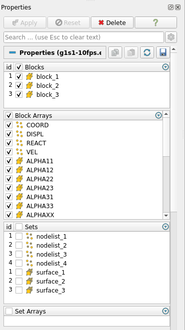
We have 4 table widgets to control the properties on this reader. If now each is a separate tab, I can’t imagine how convoluted it gets for the user to set up the properties on this reader.
---
### Author:  [@todoooo](https://discourse.paraview.org/u/todoooo)
#### Post date: [April 29, 2022, 12:59am UTC](https://discourse.paraview.org/t/avoiding-nested-scrollbars/9523/7 "2022-04-29T00:59:41Z")
Where there is a pre-determined number of table widgets I would have thought a tab control would be the ideal solution. I don’t see what the problem is here. Is it the need to click between tabs?
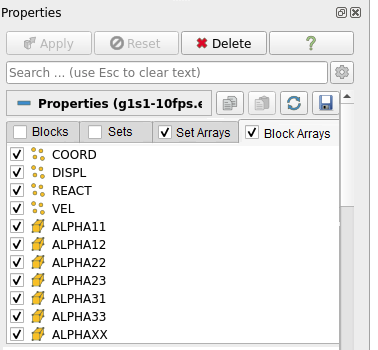
In my opinion the alternative should be a tree view with nested tables at the nodes.
---
### Author:  [@utkarsh.ayachit](https://discourse.paraview.org/u/utkarsh.ayachit)
#### Post date: [April 29, 2022, 2:41pm UTC](https://discourse.paraview.org/t/avoiding-nested-scrollbars/9523/8 "2022-04-29T14:41:43Z")
Don’t think that solves the problem, though. Note, the Properties tab has other properties below the table widget. Now, if the table widget is really long – 1000s – which can happen, a dataset can have 1000s of blocks – then the panel will be incredibly long with user having to scroll a 1000 entries before even seeing what other properties are available.
---
### Author:  [@todoooo](https://discourse.paraview.org/u/todoooo)
#### Post date: [April 29, 2022, 11:17pm UTC](https://discourse.paraview.org/t/avoiding-nested-scrollbars/9523/9 "2022-04-29T23:17:32Z")
Ok. So multiple tables is not the main problem but a tab control could still improve the situation.
If a widget has 1000s of entries and the “shrink” button goes to the bottom of the list, after pressing the “grow” button, won’t that require much scrolling to restore the original view size? Perhaps the shrink/grow button should stay at the top of the table widget.
---
### Author:  [@jaswantp](https://discourse.paraview.org/u/jaswantp)
#### Post date: [May 3, 2022, 1:17pm UTC](https://discourse.paraview.org/t/avoiding-nested-scrollbars/9523/10 "2022-05-03T13:17:29Z")
> I would have thought a tab control would be the ideal solution.
It is, as you said ideal. But it comes with some practical problems.
In ParaView with a default window arrangement, the properties panel takes up 20% of the application width. Within that 20%, if we place 3 or more horizontal tabs, it would be comfy on a widescreen. Whereas, for the unfortunate ones with a 1280x720 screen or a 14" 1920x1080 ultrabook (more common), it ends up looking crowded.
Considering that the properties panel is ubiquitously the most used in ParaView, taking up minimal width… IMO, it would be fair to limit horizontal expansion.
---
### Author:  [@todoooo](https://discourse.paraview.org/u/todoooo)
#### Post date: [May 3, 2022, 10:11pm UTC](https://discourse.paraview.org/t/avoiding-nested-scrollbars/9523/11 "2022-05-03T22:11:37Z")
> [@jaswantp](#):
>
> In ParaView with a default window arrangement, the properties panel takes up 20% of the application width. Within that 20%, if we place 3 or more horizontal tabs, it would be comfy on a widescreen. Whereas, for the unfortunate ones with a 1280x720 screen or a 14" 1920x1080 ultrabook (more common), it ends up looking crowded.
Isn’t that what scrolling tabs were designed to handle?

---
### Author:  [@jaswantp](https://discourse.paraview.org/u/jaswantp)
#### Post date: [May 3, 2022, 10:39pm UTC](https://discourse.paraview.org/t/avoiding-nested-scrollbars/9523/12 "2022-05-03T22:39:00Z")
> Isn’t that what scrolling tabs were designed to handle?
Fair enough, it’d be alright to show no more than two tabs given the width of the properties panel. The remaining may be shown after scrolling. With this design, users may have to click on the scroll button or scroll mouse on the tabs to see what properties are available.
Paired with a “grow/shrink” button, this design looks somewhat promising.
---
### Author:  [@todoooo](https://discourse.paraview.org/u/todoooo)
#### Post date: [May 3, 2022, 10:42pm UTC](https://discourse.paraview.org/t/avoiding-nested-scrollbars/9523/13 "2022-05-03T22:42:18Z")
> [@jaswantp](#):
>
> Paired with a “grow/shrink” button, this design looks somewhat promising.
I agree and the grow/shrink button could be placed in the table header.
---
### Author:  [@ymjia](https://discourse.paraview.org/u/ymjia)
#### Post date: [May 5, 2022, 1:31pm UTC](https://discourse.paraview.org/t/avoiding-nested-scrollbars/9523/14 "2022-05-05T13:31:34Z")
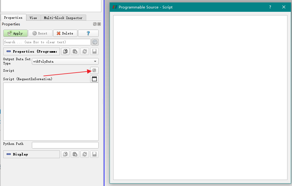
For table with thousands of rows, how about fix height + a button to expand the widget to a seperate window, just like Programmable Source:
In the panel
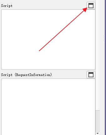
Expanded:
---
### Author:  [@timothee.chabat](https://discourse.paraview.org/u/timothee.chabat)
#### Post date: [May 12, 2022, 8:08am UTC](https://discourse.paraview.org/t/avoiding-nested-scrollbars/9523/15 "2022-05-12T08:08:08Z")
I +1 Utkarsh’s design so far, except for the grow/shrink placement. However I +100 the idea
> [@todoooo](#):
>
> I agree and the grow/shrink button could be placed in the table header.
imo we could have a 3-state button in the header **and** the footer, where the 3 states are :
- fully collapsed : we only see the header with the label (for example `Block Arrays <72 arrays>`).
- fixed size : last row is `...` if not enough space
- full fitted size
if full size \< fixed size then we may want to make it a 2-state button, but I’m not sure if this is a good idea to dynamically change the behavior of a button …