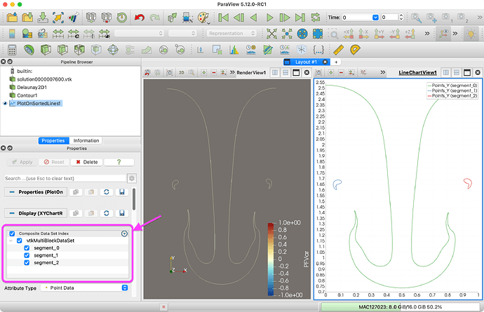
Again, this is discussed in How do I obtain contour lines in a sequence. - #12 by ksugahar. In that post, I suggested to run the Connectivity filter to identify the independent curves. However, your comment about the plotting made me realize that the Plot On Sorted Lines filter is already doing that for you.
The Plot On Sorted Lines filter identifies each connected curve and places the data for each one in its own block of a multi-block data set. By default, the line chart view plots only the first block, which is why that is the only curve you are seeing in ParaView. If you look at the top of the Display properties, you will see where you can turn on multiple blocks (labeled segment_#), which then allows you to control which series are plotted.
When you write out the data to a CSV file, it concatenates all of the blocks together, which is why you are seeing them all in your Python plot. There are a couple of things you can do to get around this.
The first is you can use the Extract Block filter ![]() to extract a single block. Extract each block one by one and save them each in a separate CSV file. Then you can load each one into your Python script and plot each as a separate curve.
to extract a single block. Extract each block one by one and save them each in a separate CSV file. Then you can load each one into your Python script and plot each as a separate curve.
The second is to identify which block each curve is on. Run the result of Plot On Sorted Lines first through the Block Scalars filter and then through the Cell Data to Point Data filter. Save the result of that to a CSV file. Your CSV file will have a new column labeled BlockIdScalars that identifies which curve each point belongs to. In your Python script you can use a pivot table technique to pull out the points for each curve, or you can just suppress the plotting of lines between points that have different BlockIdScalars values.
