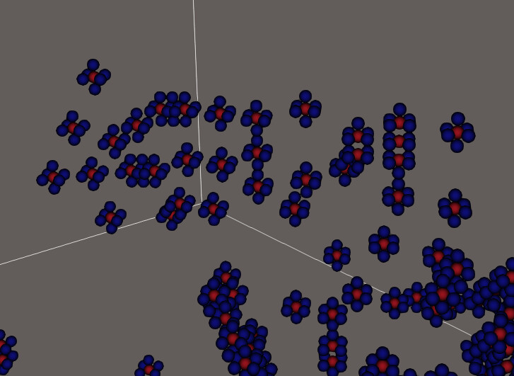
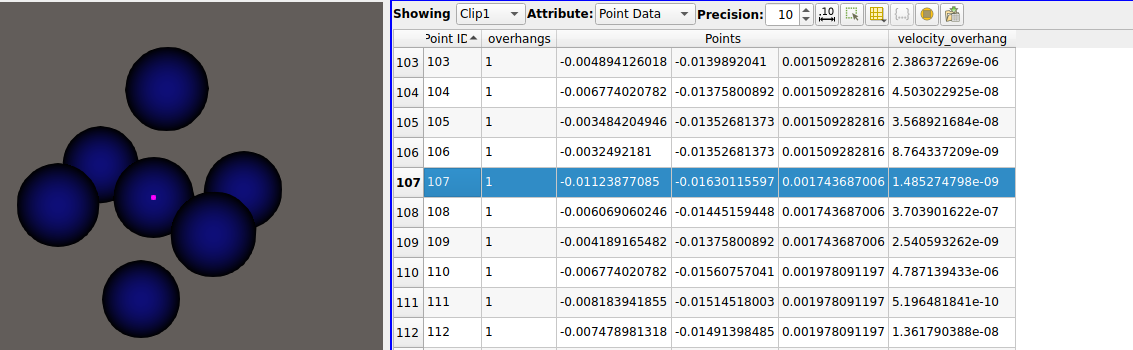
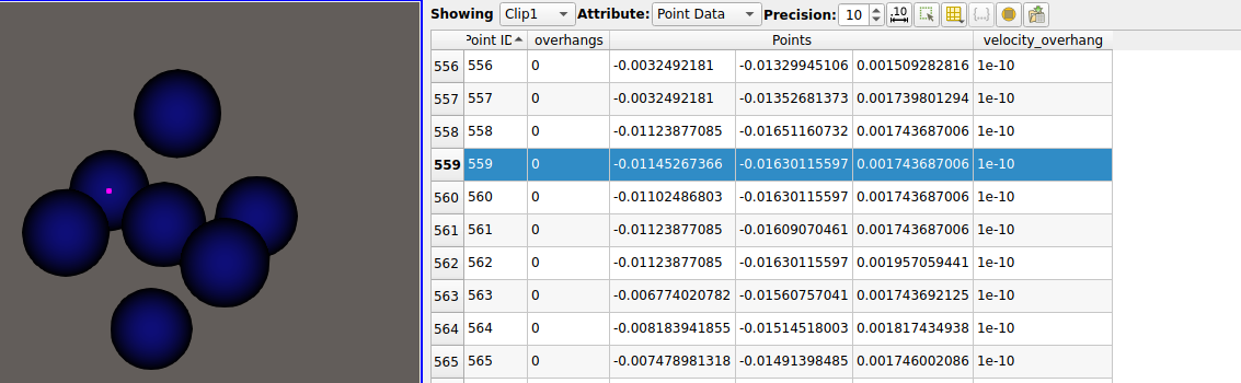
I have data on a structured grid, and I want to visualise which points on my have certain conditions and how they evolve through time. The problem is that visualising with points or point gaussian, also adds some “boundary points”. In the images below, I have two subsequent timesteps. I’m clipping a scalar field (velocity_overhang) to values above 1e-10, (want to do effectively above 0) The point in the middle of the cross has a value that passes the clip, and the 6 real connected neighbours have velocity_overhang 0. I can check this is true in the spreadsheet view. The problem is that the visualisation of the clip adds 6 neighbours around that seem to be the interpolation of where the clipped region would have the boundary (you can see that the x coordinate changes). They also get assigned an “overhangs” value of 0, which is something that I calculate in the code that generates this data and corresponds to the condition that velocity_overhang > 0. So I don’t know if these neighbours are “new” points, or the actual neighbours but shifted?
Step 65:

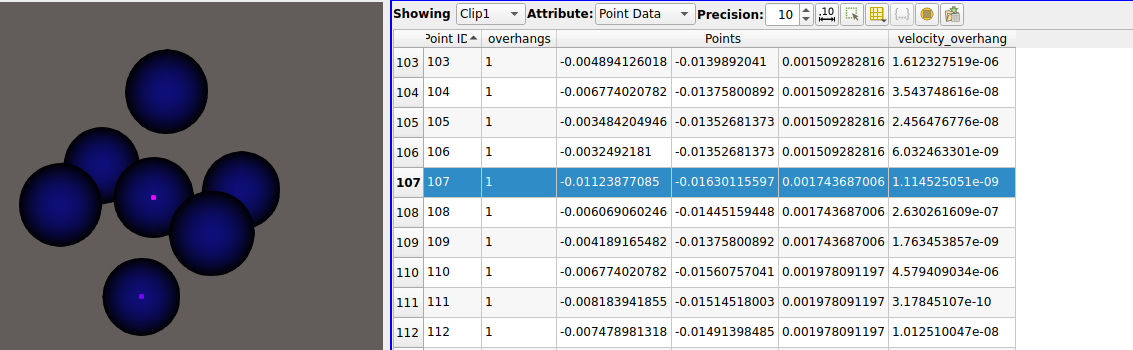
Step 66:
How can I just display they points that fulfil the clip condition (ie the center point in this case)? Should I be using a different filter?
It was initially related to this, before I realised that they are points that shouldn’t be there
Thanks