The Color Map Editor dock in ParaView is both awesome and cluttered at the same time. We’ve all played around with the color/opacity transfer function editor to achieve flashy volume renders. This post is to discuss the organization of property groups and parameters within the editor dock.
There is a checkbox to use the separate array for the opacity transfer function. It is in the Properties Panel → Display → Volume Rendering. It would be convenient for all things related to the color map to be in the color map editor.
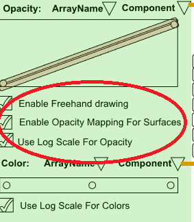
What bugs me most is that the ‘Enable Opacity Mapping For Surfaces’ checkbox appears twice in advanced settings.
Within the opacity function editor, it’d be nice to have a checkered background rather than a plain white background. That editor is useless when opacity mapping for surfaces is disabled and the active representation is not a volume. IMO, it should be hidden or at least disabled.
We can also move around some of the checkboxes and rename the group headers to a shorter meaningful name. For example
“Mapping Data” → “Transfer Functions”
“Color Mapping Parameters” → “Mapping Parameters”
Please mention any suggestions you have for improving the organization of color map editor here.
imo it makes sense to keep this property located in the Display Properties. However we may want to improve the feedback on which array the transfer functions are attached to (maybe something like a label Opacity Transfer Function [MyOpacityArray] and Color Transfer Function [MyColorArray] positioned above each editor ?)
+100 for that. Though as @mwestphal mentioned we may want to display it when using the data histogram option (maybe hiding the line widget when no opacity editing is possible ?)
+1
Some other improvements I had in mind at some point :
Put the “Mapping Data” (or “Transfer Functions” ) section first
improve the display of the opacity editor when range is too small (for example when visualizing the ‘Normals’ attribute of the Sphere Source)
It’d be nice to have an option to “zoom out” in the transfer functions editor when the ranges are not the same than the data ranges. This would allows to visualize where our custom range fits into the data range. Also in this case we could display the Below Range Color and Above Range Color when zooming out.
Change the name of the section “Annotations” when toggling on/off the Interpret Values As Categories option. This section have a different interpretation according to the mode, but no feedback is given to the user.
@mwestphal you bring up a valid point about the histogram. In this case, what we can do is keep the range handles enabled and disable the line widget and control points. Otherwise, it gives a false impression that editing the opacity transfer function for surfaces is supposed to affect the representation.
Thanks for the cool suggestions @timothee.chabat I’ll keep those in mind when reorganizing.
The biggest complaint I have over the Color Map Editor is that there are two advanced buttons. I never remember which is which, thus have to turn both on to figure out what they do. Somehow, this would be nice to have cleaned up.
@wascott thanks for pointing that out. One is for configuring annotations on the legend and the other advanced button next to the transfer function editor is mostly to view lookup tables. I agree that is confusing!
Here’s a rough UI schematic of the new color map editor. Let me know what you think.
It accommodates the array names and components above the opacity (color) editor widgets. This makes it easier to configure color maps for volume rendering. Also made sure there’s only one ‘Advanced’ button.
I took some liberty in renaming the group headers to make them concise.
Edit 1: Mention that contents in green translucent box will be replaced by 2D t.f editor.
In interpolated mode put the color TF editor before the opacity TF editor ?
Put the first 3 checkboxes after the last TF editor ? So that the most commonly used widgets (the color TF editor and the presets) are first
instead of putting the 2D TF editor at the checkbox location, hide the opactiy and color TF editors and replace them with the 2D TF editor ? Like it’s currently done
collapse the opacity TF editor when repr is not volume && Enable opacity is unchecked && histogram is unchecked ? Ideally we could even hide all opacity-related properties and change the title when the only thing we want is the histogram.
Otherwise I’m excited to see these changes integrated
Hi @timothee.chabat
Thanks for your input. I’ll consider them in the redesign.
Sorry if that diagram wasn’t clear. This is exactly what it does! All contents in the translucent green boxes will be hidden/replaced by the 2D TF editor.
When the 2D transfer function is being edited, the display data histogram checkbox should not be available to the user. The 2D transfer editor enforces the need for a histogram.
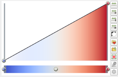
I don’t like the idea of visually separating the opacity editor with the color editor with some checkboxes in between like below:
In the current design, there is visual synergy between the two which helps when editing transfer functions which will be lost.
In general, the idea of hiding big areas of the UI when a certain checkbox is unchecked, reorganizes/resizes all the elements of the dialog - not the best UX :(. How about leaving some of the UI elements disabled (grayed-out) in-place. This would not cause big resizes when the user is fiddling with settings and it helps subconsciously when looking for a setting which is hidden.
Wild idea - separate the three distinct configuration settings - indexed mode, interpolated mode and 2D transfer function mode into three tab pages with selection icons at the bottom. Kinda like whats done for most modern mobile / web apps - material design bottom navigation. Helps since the color editor dialog’s aspect ratio is fixed similar to a mobile page.
Having the ability to change the active scalars from the color opacity editor itself is definitely nice. However, I am not sure how you’d achieve that without some complicated logic. Currently the whole editor gets replaced when the active scalars/separate opacity array/2D transfer mode changes. When the change is being propogated by the editor itself, it would be like a child widget replacing its parent widget (and in turn, itself) from the dialog. Am I overthinking this?
Any thoughts on an alternate toolbox for the many toolbuttons at the right hand side of the opacity editor?
The visual appeal of keeping the opacity and color editors together is a valid point. Although, it is convenient to separate them out to make place for the active color/opacity array combo boxes.
In general, the idea of hiding big areas of the UI when a certain checkbox is unchecked, reorganizes/resizes all the elements of the dialog - not the best UX :(.
Right, this behavior is present in all auto-generated widgets coming from pqProxyWidget. For example, in the properties panel, if you check the Use 2D transfer functions checkbox, the reordering of widgets is insane. But, we do not have to worry about that for color opacity editor widget since ordering of UI elements is set in stone (it already uses a desinger .ui file). So, hiding something would not rearrange the ui elements. See the short video at the end.
There is some flexibility in how we go about doing it. This is the remaining task at the moment. For one, when swithcing from active-scalars to 2D transfer function mode, the logic is to hide some widgets and show the 2D t.f editor. As you’re aware, most of this logic is in void pqColorOpacityEditorWidget::show2DHistogram(bool show). While we’re doing that, it’s possible to hide the color combo box.
Advanced button no longer necessary.
Set Box color will only be visible when editing 2D transfer function.
Here’s the current status. The hiding of unused widgets seems good to me. Those disabled, yet visible checkboxes/sliders in current ParaView demand extra vertical real estate. If they’re useless in the 2D t.f context, better hide them IMO. It keeps the UI minimal.
As @Sankhesh_Jhaveri pointed out, its not easy to place the color/opacity array combo boxes inside the color opacity editor widget. Here is a redesign that adjusts for that.
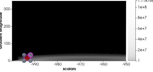
Also very desirable would be a way to rescale the editor window so that you can work very precisely in certain Value ranges. The whole range of gradient magnitude above 100 for example is obsolete in this dataset.
So you could better capture all the details that lie in certain areas.
Another thing that comes to mind would be a support for non-rectangular shapes.