Hello everyone, I am trying to use paraview very recently in the field of scientific research. I have a doubt that I cannot resolve, maybe some of you will be able to help me.
I have a series of data (x, y, z) of which I would like to graph. I can load a .csv file, but I can’t get these points on the “point chart view” screen.
Can you help me?
What kind of visualisation are you expecting ?
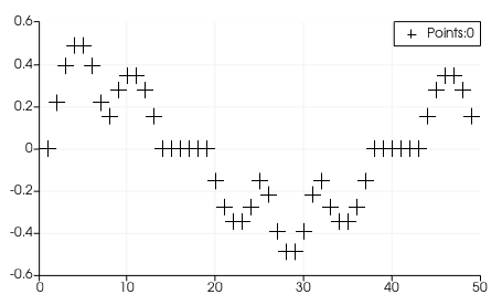
Point Chart View is only a 2D plot, as here:
To position points in 3D space you should use the RenderView:

But the csv reader produce a table that is not displayable in RenderView. Use the TableToPoints filter on you csv reader to create points (check the X/Y/Z columns names in the properties)
My idea is to create many points (or even better spheres) whose positions are given in the x, y, z file and then visualize them in virtual reality.
I’ll try with your suggestion.
thank you so much!!
Ok.
So you need the TableToPoints solution. Then use the Point Gaussian representation in the RenderView to display spheres for each point instead of pixels
Thank you very much for your help!!
I would like to ask you another something else:
Following th example show in “CSV time series” on paraview.org, I am in front of a screen of this type
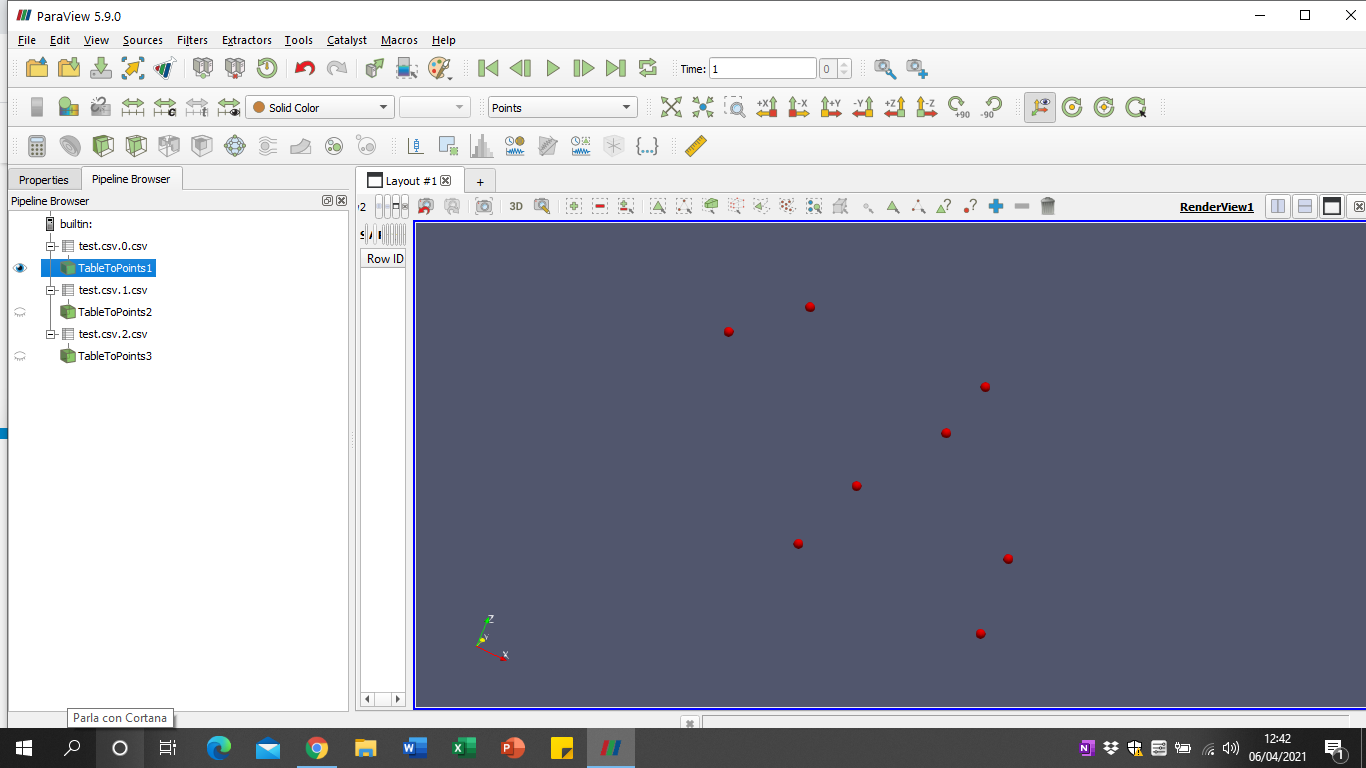
Do I need some other filter to create an animation that goes from the first to the third file? I don’t know if I’m doing something wrong
You need to open your files as a FileSeries. In the open dialog, instead of selecting all files you should choose the entry with dots instead of number. In your case, it should be something test.csv...csv. Then you will have only item in the pipeline, corresponding to the first file. You can use the Play/Next buttons to go through timesteps: the pipeline will be executed with the new input dataset.
You can then export the animation
Ok, thank you very much!! I did it 