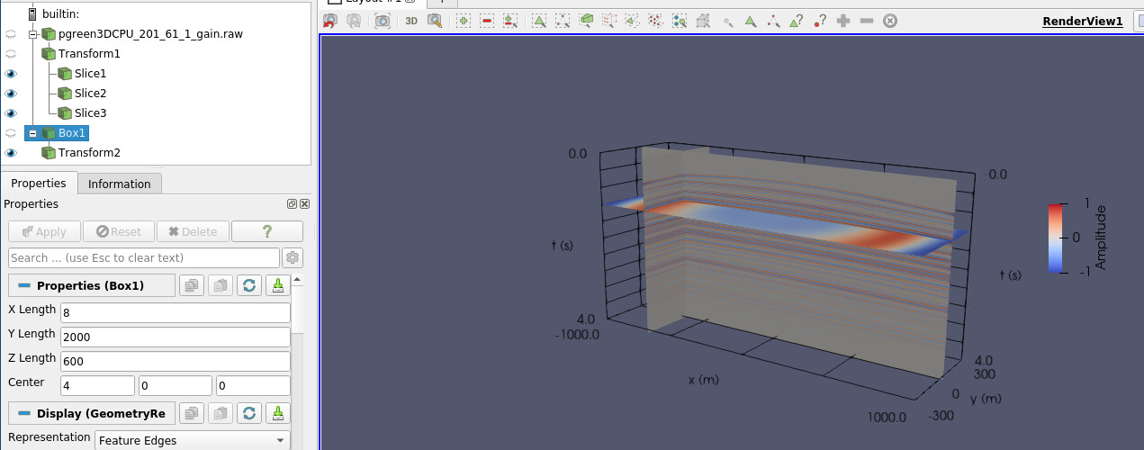
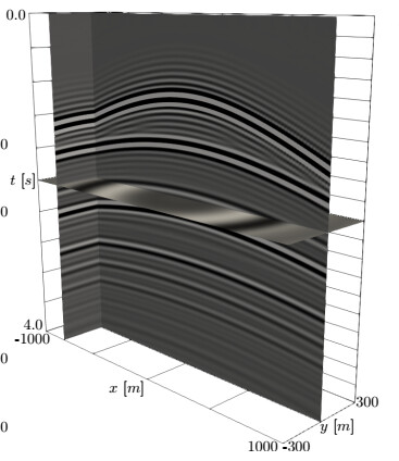
Hello all, I would like to reproduce the slice plot below on Paraview 5.9.1, showing only these 3 edges:
But when trying to tweak the Axes Grid edit window, I achieve:
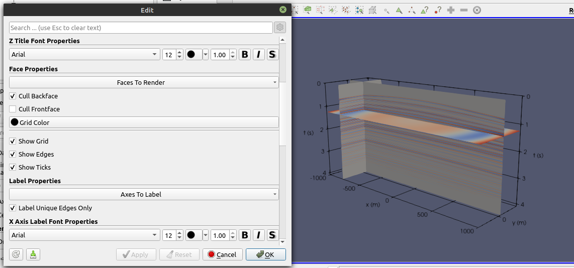
The vertical axis is replicated at the right, and I’d like to remove that. By ticking off Axes to Label → Max-Y, it is removed, but it also removes the z-axis (in-out) at the right

On Faces to Render, all options are ticked except Min-XY.
Another issue is related to using just 2 custom labels on each axis, but maintaining the ticks on the grid (as in the first figure); I could not achieve that, since when I use custom labels the grid automatically change to two lines on each dimension. Any hints?
Regards,
Victor