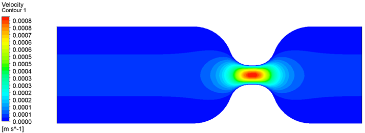
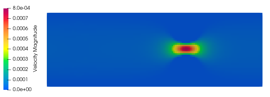
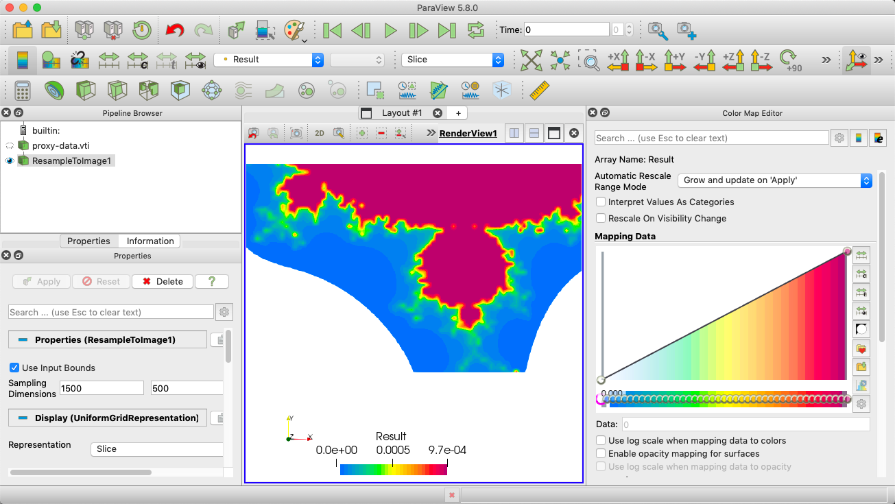
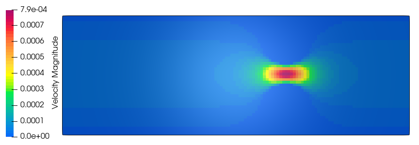
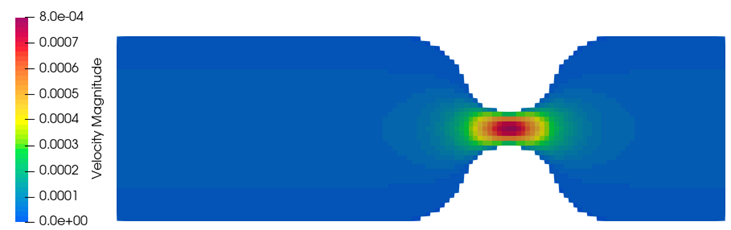
But the same contour I got again using Paraview as in the below figure. Now I want to discretize this contour as in the Ansys figure. I’m very much greatful if someone can help me to do this. Thank you!
One issue that I see is you are using different color maps. -Rant on- The Ansys image is using a Blue to Red Rainbow. This is a HORRIBLE color map. Look at how big the green area is, and now small the orange area is. This map basically lies. Don’t use it. -Rant off- OK, there are times when you want to use a Blue to Red Rainbow. This can be found in ParaView with View/ Color Map Editor, the click on the little folder with the heart (Presets) middle hight, right side. Change “default” to “All, upper right”. Select Blue to Red Rainbow.
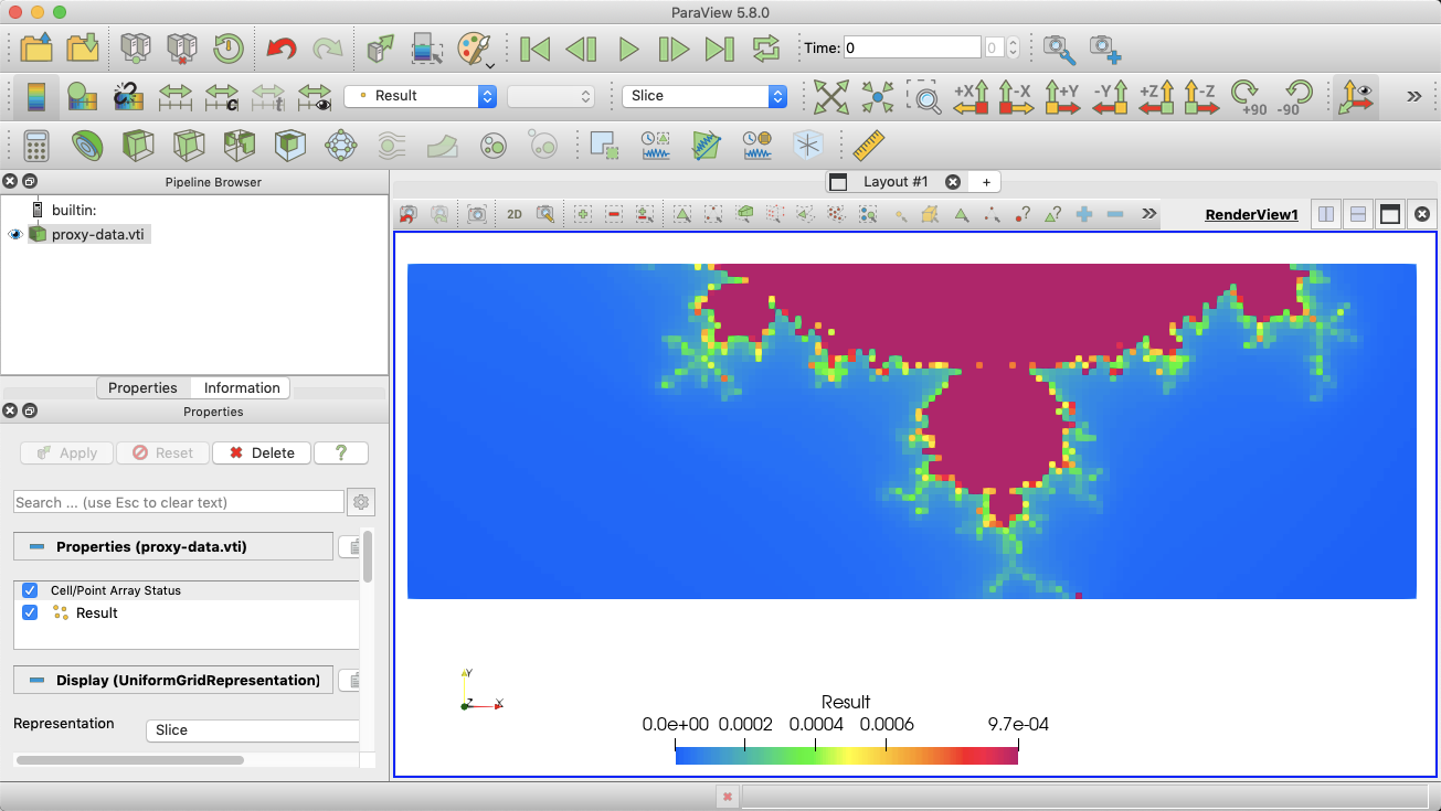
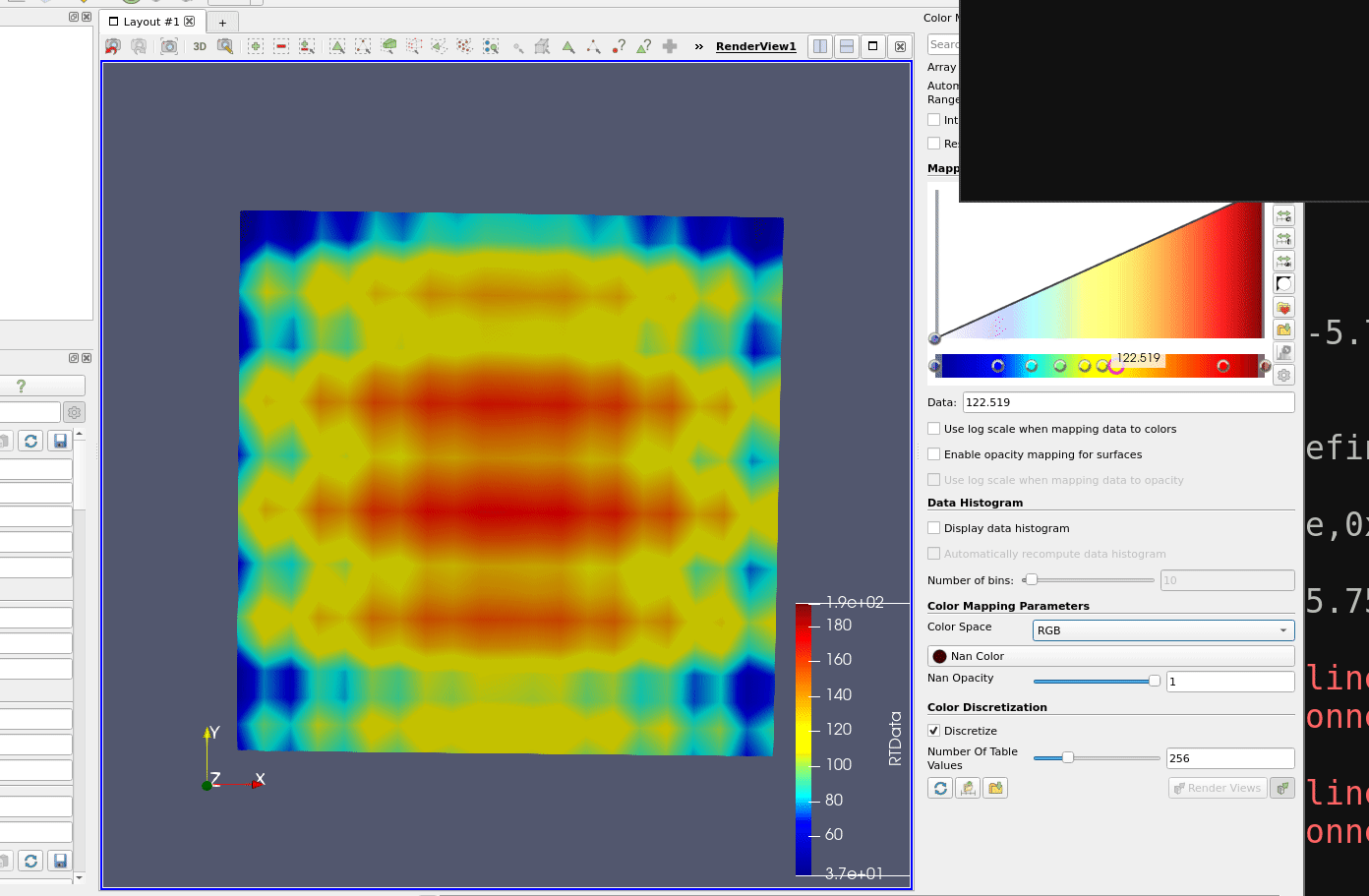
It looks like there are multiple differences between the two images, and it would help if you posted the data that you are trying to render. I have to guess at what your data looks like. Based on the image, it looks like your data comes from a 2D image (i.e. a 2D uniform grid), but I could be wrong. If I guessed wrong, everything I say here is probably wrong. I made some fabricated data to work with that hopefully matches your data. Here is the data that I used: proxy-data.vti (60.8 KB). Here is what it looks like to start (after applying your color map).
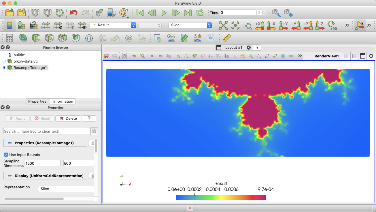
The first big difference is that ParaView’s image has lots of chunky blocks. This is the default rendering for image data; it renders each pixel as a square. The Ansys version is smoothly interpolated. There are a couple of ways to do that. I think you will be happiest with the result of applying the Resample To Image filter. Resample to dimensions that are close to pixel resolution. In the following example, I used 1500, 500, 1.
Now, to discretize the colors as you want to 30 regions, as @mwestphal suggested, open the Color Map Editor and set the Number Of Table Values option to 30. That option is at the bottom of the editor.
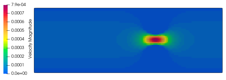
I also note that the Ansys image also has a region that is clipped away. Once again, there are multiple ways to achieve this effect. In my example data, I did it by changing the color at the bottom of the range to white.
Depending on your data, it might make more sense to instead enable the Use Below Range Color value and adjust your range to make sure that anything you want white is “outside” of the range.
You may notice that the ParaView colors don’t match up with the Ansys colors directly. This is intentional. As @wascott ranted about, the colors Ansys is using are perceptually uneven (e.g. way too much of the range is covered by green). ParaView’s color map smooths out the colors so what you see changes with the numbers better.
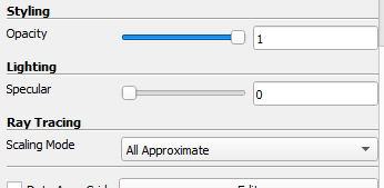
In addition to what everyone above said I would like to point out that the color rendition in your ParaView-plot is affected by shading, whereas shading seems to be turned off in the Ansys-rendering.
This has the colors appear darker than they are in the colorbar.
You can turn off the shading by setting Ambient=1 and Diffuse=0 in the lighting properties of your slice:
As I said originally, it depends on what the actual structure of the data is. My assumption was that the data is a 2D image. By default, that is rendered as a slice, and as such the point data is rendered as pixel blocks (so it rather looks like cell data). (Lighting is also turned off for this instance, which is why I did not mention lighting.) If my assumption was right Cell Data to Point Data wouldn’t do anything because the data is already point data.
But if my assumption was wrong and the field is actually cell data, then my suggestion of resampling wouldn’t work at all and Cell Data to Point Data is the way to go.
Thank you Walter Alan, I use ParaView for the post processing of my simulations. I wont use Ansys. I used Ansys to get an idea about the flow before starting my simulations. Thanks! I selected the ‘Blue to Red Rainbow’ as the default color map
Thank you very much @Kenneth_Moreland for taking your time to give me a good explanation about my problem. I followed your steps and got a good figure than the previous one.
Dinushika,
The way you directly control lighting is with the Light Inspector. View/ Light Inspector.
Also, I believe that you have parts of your object you need to remove, to show only the background. One way to do that would be the Clip filter, then Clip By: Scalar. Get rid of the 0 velocity magnitues. There are good tutorials in Help. Sandia National Labs Tutorials/ Sources and Filters/ Clip by Scalar.
Last, I believe you want to change the background from the blue-grey default to White. Color Pallete icon (just to the left of the time controls/ White Background.
Thank you very much you all for allocating your time to help me to resolve my problem. With the help of you all, I finally ended up with the figure I wanted.
No problem. Glad we could help. It’s a good ParaView community!
Looking at your image, one way to get rid of the saw tooth look above is BEFORE you run the clip to scalar, use the cell data to point data filter. The clip by scalar filter throws cells in or out when clipping cell data, but will clip within the cells when using point data. Move your velocity to be point data.