It looks like there are multiple differences between the two images, and it would help if you posted the data that you are trying to render. I have to guess at what your data looks like. Based on the image, it looks like your data comes from a 2D image (i.e. a 2D uniform grid), but I could be wrong. If I guessed wrong, everything I say here is probably wrong. I made some fabricated data to work with that hopefully matches your data. Here is the data that I used: proxy-data.vti (60.8 KB). Here is what it looks like to start (after applying your color map).
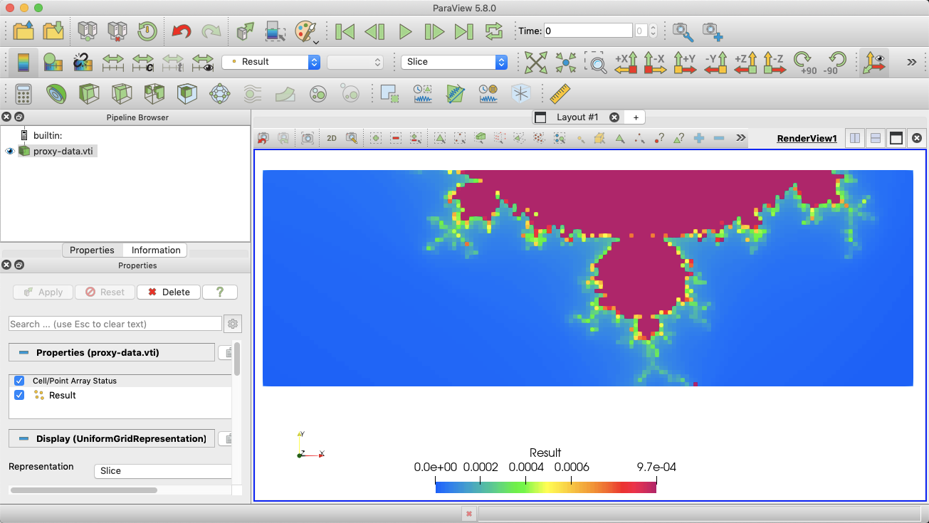
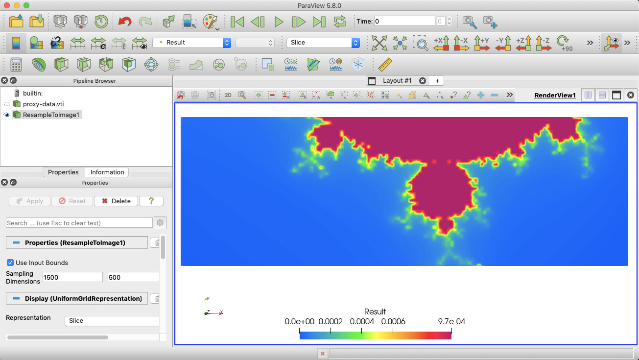
The first big difference is that ParaView’s image has lots of chunky blocks. This is the default rendering for image data; it renders each pixel as a square. The Ansys version is smoothly interpolated. There are a couple of ways to do that. I think you will be happiest with the result of applying the Resample To Image filter. Resample to dimensions that are close to pixel resolution. In the following example, I used 1500, 500, 1.
Now, to discretize the colors as you want to 30 regions, as @mwestphal suggested, open the Color Map Editor and set the Number Of Table Values option to 30. That option is at the bottom of the editor.

I also note that the Ansys image also has a region that is clipped away. Once again, there are multiple ways to achieve this effect. In my example data, I did it by changing the color at the bottom of the range to white.
Depending on your data, it might make more sense to instead enable the Use Below Range Color value and adjust your range to make sure that anything you want white is “outside” of the range.
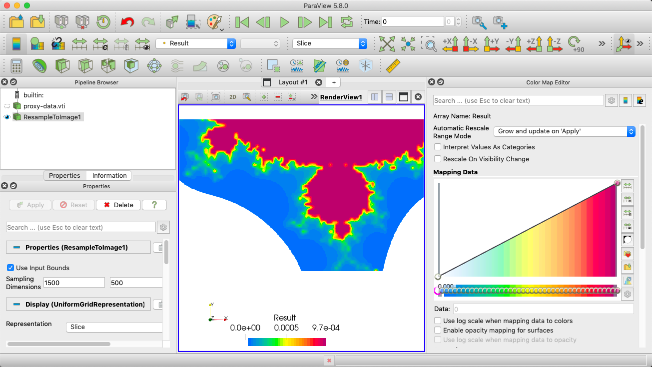
You may notice that the ParaView colors don’t match up with the Ansys colors directly. This is intentional. As @wascott ranted about, the colors Ansys is using are perceptually uneven (e.g. way too much of the range is covered by green). ParaView’s color map smooths out the colors so what you see changes with the numbers better.