First question: there is no way in ParaView to draw black lines between colors in the color legend as you show.
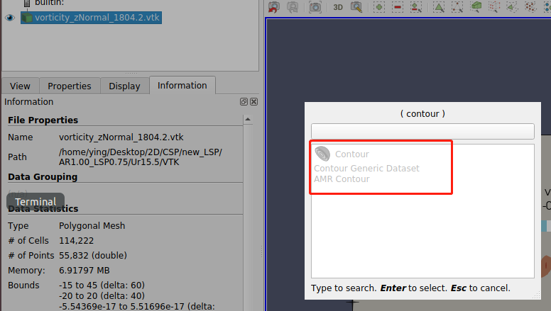
Second question: you can add a Contour filter on your dataset and add 12 contour values, each of which is the value where your color legend changes. Color the resulting lines by Solid color and change that color to black. You would have to determine the contour filters.
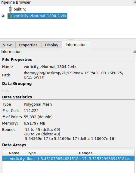
What data arrays are available? I’ll bet your data set has only cell data arrays, or point data arrays with multiple components. Feel free to attach one if you can share the data.
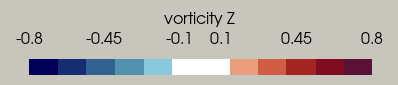
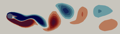
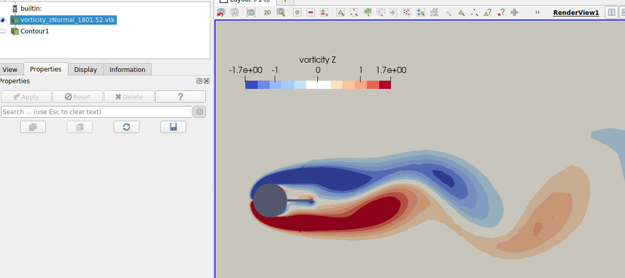
Hi Cory, I open the “auto convert properties” in paraview and now I can add the contour filter. But I met another problem relating to the color of transfer function values. As shown in figure, I set the color within certain range of value as white, and it shows in the color legend, but the contour seems to be grey not white, why would this happen?