Hi, I’d like values above 0 to be varying levels of red, and for values below to be varying levels of blue. I’d like 0 to be white.
How do I do that? Is it even possible?
Hi, I’d like values above 0 to be varying levels of red, and for values below to be varying levels of blue. I’d like 0 to be white.
How do I do that? Is it even possible?
I think you have a typo in your question. You did not specify the color you want for below 0.
The default color map goes from varying levels of blue at the low end, white in the middle, and varying levels of red at the high end. If blue and red are the colors you want, a simple way to make sure white is at zero is to click Rescale to Custom Data Range ![]() . From there you can set the low range to be the negative value of the high range. This will put the middle of the color bar at 0. Here is an example:
. From there you can set the low range to be the negative value of the high range. This will put the middle of the color bar at 0. Here is an example:
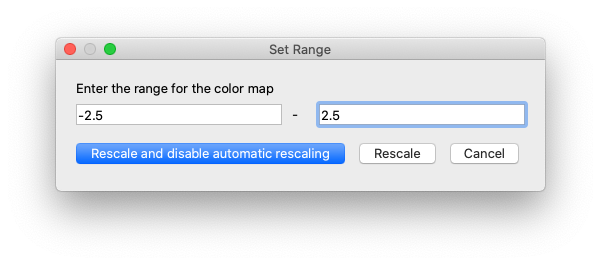
In this example, I’ve set the low value to be -2.5 and the high value to be 2.5. You should use a range that is appropriate your data.
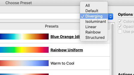
If you don’t want blue at the low end of the colors, you can edit the color map directly. Click the Edit Color Map button ![]() to open the controls to open the color editing controls. ParaView comes with lots of color maps that have one color at the low end, white in the middle, and another color at the high end. To see them, click the
to open the controls to open the color editing controls. ParaView comes with lots of color maps that have one color at the low end, white in the middle, and another color at the high end. To see them, click the Choose Preset button ![]() in the color editor window. I suggest looking at the
in the color editor window. I suggest looking at the Diverging set of color maps, many of which have white in the middle.
If you need more controls, ParaView lets you specifically set what color should be used for each value. See the ParaView User’s Guide for more information: 2. Color maps and transfer functions — ParaView Documentation 5.10.1 documentation
My apologies. You’re right, it was a typo - I have fixed it.
Specifically I want above 0 to be red and below to be blue, but for 0 to be white. I can’t use the custom data ranges of equivalent positive and minus values for some of my plots unfortunately. ![]()
I don’t understand why you would not be able to edit the data ranges, but if you want, you can open up the color map editor ![]() and move the white control point to be at value 0.
and move the white control point to be at value 0.
Oh, I can edit them, but they don’t produce a plot that well presents the geometrical differences