Hi, everyone
Is there a filter to handle such kind of problem? I’m new to Paraview and couldn’t find the similar filter
Thank you in advance for any help
The closest would be to use the “Plot Data over time” filter.
I tried the filter, but it didn’t meet my need. I used the plot selection over time, but it average the selection.
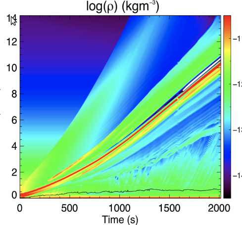
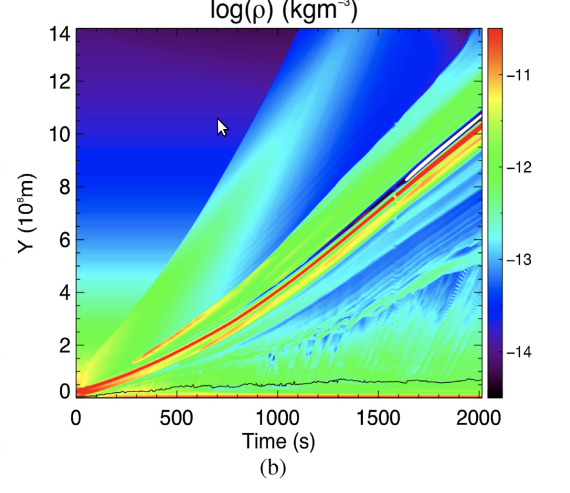
What i suppose effect are shown in the attachment.
Could this effect be done with Paraview?
Thanks for taking your time to help~
You could try unchecking the Only Report Selection Statistics and then turn on all the blocks under Dispaly. That will give you a spaghetti plot, but not a very good spaghetti plot and quite different from your example.
I think for us to help you you will have to describe your situation better. What kind of data are you starting with? (Can you provide an example?) And can you be more clear on what exactly you are trying to plot? You said time-distance diagram, but your example is not really a time-distance diagram. In fact, I’m not really sure exactly what is being plotted because the left and right sides of the image are being clipped off. Time is clearly the x axis. The title is density, but I don’t know if that refers to the y axis or the colors.
sorry, i miss the y-axis title.
Time is the x axis and the position is the y axis. The color represent the density. I want to plot the time-distance diagram along a line, such as x=0 line shown in the example.
Due to the limit of attachment size, i just add one datafile. My dataset have timesteps.
Thanks for your kindness to help me!
bw_2d0002.vtu (3.6 MB)
That clears things up a bit. Fair warning that data management for plotting is not ParaView’s strength. (Nor are heat-map plots.) Your best bet might be to use ParaView to extract the data from the topological structures and then use a graphing/statistics package (such as R or Pandas) to take you the rest of the way.
Anyway, the data you posted has a field named rho, which I assume corresponds to the density in your example plot. I’m not sure what “distance” is. I note that your geometry seems to be axiosymmetric. Is your distance from the center through the mesh in a particular direction?
Yes, the rho represent the density in my example and the distance is expressed from the center along the radial direction. I’ ll try to make such kind of chart by python shell.
Sorry for my bad ability to describe the situation.
I’m very grateful for your patience and suggestion, thanks again!