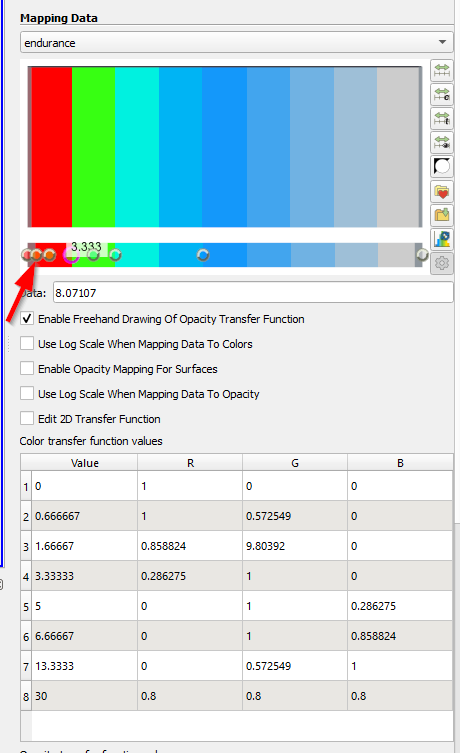
The dots have the right colours (see arrow), but this is not usable.
I have the feeling that Paraview always wants the legend or at least the colours to be linear.
Hence my colour, how do I get the above legend set in Paraview. Or how does the corresponding JSON file look like.
If this has already been described in the help or here in the forum, please link it to me. I have been searching the forum and the help for a few days, but have not found anything suitable.
I can only agree with that.
I myself am not familiar with the programming of ParaView, but that should be implementable with a plugin or something similar.
Hello.
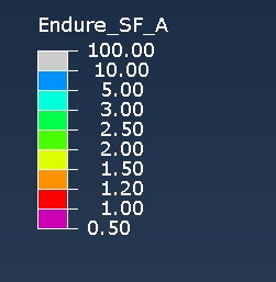
The top “wish” colormap comes from abaqus. I can therefore not share this. But actually I just want to specify my own non-linear areas.
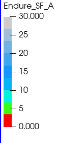
The colormap I created in paraview is not good enough for me. But I am assuming a user error on my part.
At first glance I think it would actually be a significantly deep change in the color mapping implementation if we added direct support for arbitrary non-linear colormaps. Color mapping is surprisingly complex in ParaView.
That’s my guess too. But as I said, if you want to do a proper strength assessment, this is essential. My desired legend is scaled in the current case so that:
Value < 1: physically broken
Value 1 - 1.2: not broken but inadmissible
Value 1.2 - 1.5: minimum safety limit reached
Value > 1.5 medium safety limit reached
The values of 1.2 and 1.5 may vary depending on the requirement. 2.3 can also sometimes mean a safety limit.
Therefore, it would be desirable to have a tool for the colour map with which you can specify your number scale and vary the colours in between as desired.
I myself have been using abaqus, ansys and hyperview daily for over 10 years and this is possible in all packages. I don’t want to badmouth Paraview here, but only to show that this requirement is easy in other programmes. It is a standard functionality there.
Since this is currently not possible, I can only express the wish for an improvement or extension of the colormap.
We ourselves currently use Paraview for communication with our customers. It is an excellent tool with top functions!
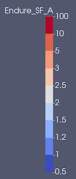
Yes, you could run a filter such as Programmable Filter, Calculator, Python Calculator to map data ranges to category values e.g., [0.5, 1.0) → 0, [1.0, 1.2) → 1, and so on. Then you could color by this new category array, set the Number of Table values to the number of categories you have, turn off ticks and tick labels, and add annotations for the lower values of each range. The end result after doing that gets you this:
In the Edit Color Legend properties dialog (click on to bring it up)
Horizontal Title (set to on)
Title Justification
Draw Tick Marks (set to off)
Draw Tick Labels (set to off)
Add Range Labels (set to off)
Ticks and Annotations Positions (to change them to be on the left or rigt)
As for mapping raw data values to the category array, I expect you could use some function from NumPy to convert from data value to bin using the Python Calculator. It looks like you can use numpy.digitize to do this in a one-liner.