With the OSPRay pathtracer I am observing that surfaces are generally less saturated than the actual color they are painted with.
I guess that this has to do with the color of the lighting, and that it could also be tackled by choosing a more sophisticated material than the default.
I am wondering though if there is a quick and easy way of shifting colors more towards the actual color. Even enhancing the overall saturation could help.
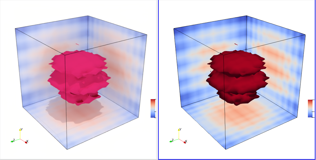
In the right view, colors in the slice match those in the colorbar exactly (via Ambient=1 and Diffuse=0).
In the left view this is not the case making it difficult to interpret the representation:
I wouldn’t guess that the darkest blue in the slice matches the darkest blue in the colorbar.
I thought at first that this was due to secondary lighting effects. That is ParaView’s default background and lights are set up nicely for primary illumination but result in too much energy overall when the secondary rays are added in. I.e. the default lights and colors are too white for the path tracers.
However I wasn’t able to compensate for that by doing things like making the environmental color black and replacing the lightkit with a single white headlight light. Also, the OSPRay ray caster and OptiX path tracers both make better, more saturated colors than OSPRay path tracer does.
So I think this is an aspect of OSPRay’s OBJ material implementation. If you could file a bug report over on OSPRay github that will help us keep it in mind to improve it.
Note to self, simply bypassing the normalization here doesn’t help.
I suspect that what happened was OSP 1-2 changed the SRGB default, which obviated the need for this adaptation in VTK. We should confirm that and look for other related bits of code before merging this to avoid breaking something else unintentionally.