Why is it that application developers insist on making their application’s icon smaller, less information dense and similar to other applications. I thought the whole point of having an icon was to differentiate it from other’s icons so that it is recognizable. What is up with the new icon?
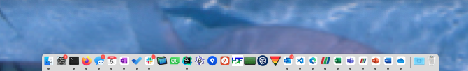
I’ll answer some questions about that screen shot up front: Yes, the dock is at its smallest size because I want all the vertical screen real estate I can get. No, auto hiding the dock is a step backward for Human-Computer interaction and adds extra mental work on the part of the user to “guess” where the icon they are targeting might be. I used to be able to just look for those 3 large slanted bars. It stuck out, it was easy to find. Now I have to add extra mental gymnastics to differentiate it from all of the other icons that have tiny branding on a huge white background.
I’ll be the first to say that a lot of recent UI elements in macos are not helpful (hiding scroll bars by default? - come on!). I didn’t anticipate this particular change would cause the issue you raise here.
If there is similar sentiment expressed by additional ParaView users, we can change it back.
Interesting idea. Microsoft used that same reasoning to change all of the office apps, Visual Studio Code icons. Here is a before and after on macOS.
Being of a certain age and watching the ever changing UI of macOS over the last 30+ years I’m not sure we should hold up Apple’s UI team as the pinnacle of UI as we once used to. There seems to be little thought any more of actual Human Computer Interface (HCI) when developing these user interface items. It baffles me that a development team would want their icon to “blend in” and to look like everyone else’s icon. Wouldn’t you want it to stick out from the others, to make it more easily identifiable to the users? Since there are no words (unless you hover over the dock) the ONLY thing that allows a user to find an icon that they are looking for is visual identity of that icon. That includes the colors, the shapes, the sizes. If you make your icon look the same as every other icon then that adds unneeded mental gymnastics to just locate and launch your application. It isn’t about “… it looks better in the dock”, but about “… does the change relieve the user of any extra work” and in this case I would vehemently argue that is does not.
Guys,
After looking at icons on my Mac (Grrr, I hate Macs, but that’s another story), I completely agree with Mike. The new icons are a huge step backwards. Having said that, my expertise with Icons goes back about 15 minutes, and I am NOT an expert.
I don’t see where the guideline says we should have a small ParaView symbol in the middle of a large white space. (Note, I may be running old Apple icons on my Mac, I have no idea). One observation I have made is that almost no apps use icons as we now do, with the exception of Microsoft applications. Word, Excel, Powerpoint and ParaView now look similar. Old ParaView looks similar to Notes, Skype, Firefox, finder and Safari - a very large image filling the icon with transparency around the image.
Cory, I would strongly argue for moving back from this change. If you agree, want me to write up bug report?
OK, probably not the best place to grump about unrelated Mac issues. Deleted this paragraph.
You don’t have to be an expert in UI design to understand the difference. You took one look at the new icon and new something wasn’t “right”. That is the “gut instinct” that is missing from today’s designs.
@wascott It is actually really easy to stop the mac from going to sleep… just put your finger between the screen and the base…
Oh my, I believe they finally added this functionality to Macs. System Preferences/ Energy Saver/ Power Adapter/ Prevent computer from sleeping automatically when display is off. About time.
Lets wait for Cory’s thoughts before rattling cages.
So I see we still went with the newer icon design in 5.10.1. I read through the Apple Guidelines that were linked above. They give you a template and some “harmonious” instructions about how you should create your icon. These are guidelines and in the case of ParaView I think they should not be followed. ParaView has an identity and that identity can be identified by it’s icon. Why should someone else dictate to ParaView how that identity should visually look? I think the other part of this is that if one carefully looks at the icons for macOS applications, even those from Apple themselves, some of their icons are able to fully utilize the rounded rectangle and use full color everywhere. Not just a logo on a white background. The problem is that the ParaView icon is basic enough that just putting it on a white rounded rectangle detracts from its identity. Leaving the icon as it was originally developed allows ParaView’s identity to shine through the sea of icons that all look the same.
Cory and I have had an offline discussion. Here is the meat of the thread.
email 1 from Alan
Good point that I am on an older OS (Catalina). (My new M1 machine, coming in about a month, will have Monterey, I believe). OK, uncle. Let’s keep with the white background. However, as you say, let’s make the ParaView bars bigger? Maybe use between Google Chrome, Find My and Self-Serve as a template? Basically, when I look in my Dock, let’s make it easy to find ParaView?
email 2 from Cory
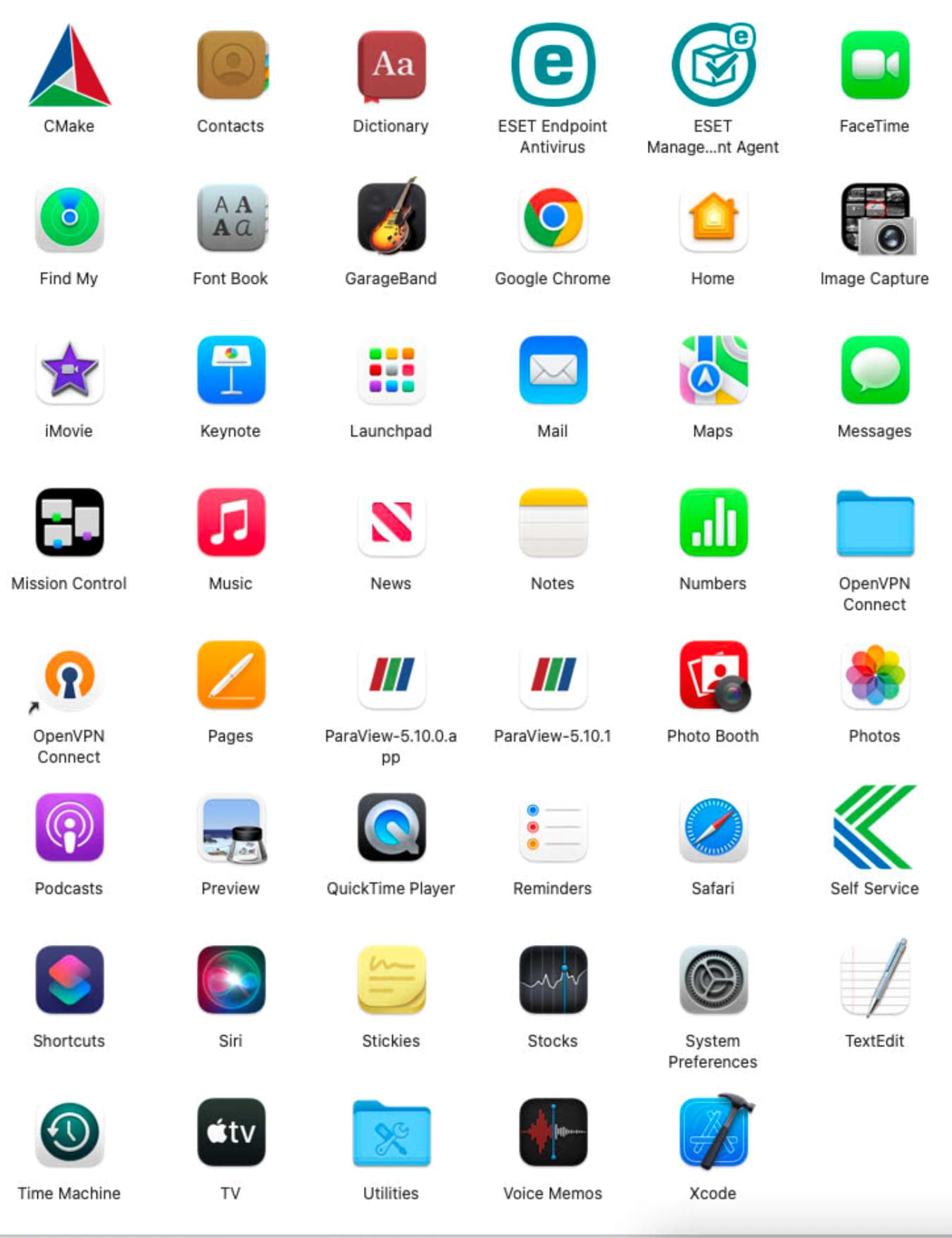
On the version of Mac OS you and I run, there are fewer icons. But on the new Mac OS, many more icons that have the rounded rectangle shape, some with the white background as it makes sense. That’s the key design feature I think. I have a mac with this new OS (12.1 Monterrey) and application icons like this
Somewhat off-topic, but consider putting your Dock on the right or left edge of your screen. It’s the best way to maximize your limited vertical real estate.