For me, there are too much information in the properties panel and some filters might be hard to understand. I think there are a lot to improve in the properties panel but for now I will focus on the properties group.
We sometimes don’t need to adjust the properties of a specific group but this group stay entirely visible in the property panel. I propose here to add an arrow near the group name to collapse or unrolled the properties of the group. Maybe we should open the discussion if we should collapse or unroll all by default. Personally I think we should unroll all by default to keep the properties easily accessible but I put a poll here to get your opinion on it.
Adding this would likely require some refactoring of the filters. For instance, the Data Axes Grid is currently not part of any group, whereas it could be placed under Miscellaneous to avoid having a standalone property. But I don’t think it is necessary to review all existing filters to identify ungrouped properties to add this feature. Instead, we could address these cases incrementally whenever a filter is modified.
Unless the child widgets are created on the fly when expanding a group (which they would not be given my understanding of things), the XML should not need to be changed. Widgets do not need to be visible for the testing framework to generate synthetic events on them.
We could also imagine having an optional property in the XML to have each individual group collapsed, or unrolled by default.
Some filters can have a lot of properties and would benefit from having some groups collapsed and some unrolled by default (with advanced properties on)
In my opinion, the default should be collapsed. Most of the time when I load data, I do not touch the properties, just interact with the scene in the Render View. If I wanted to change a default value, I could find it much faster if the sections were collapsed, as shown in the screenshot.
Using ParaView always felt like endless scrolling though properties. Switching Properties Panel Mode to Separate panels for each type of properties already helped but the collapsed properties sound very good to only expand what you need at this moment.
I’ve always had that “endless scrolling” feeling myself, and at times it can be a bit frustrating to find the property I need (even after years of use).
Personally, I would rather expand/collapse each section until I find the thing I need than to scroll up and down through all the properties at once.
Yes, I know there is a search option but I just never use it. And I don’t know why!
This is exactly my experience too after many years using ParaView pretty much daily.
And yet I still toggle the advanced properties everywhere because I need it or I want to know what properties I can use. So I get even more things to scroll through.
Same here! Never use it, don’t know why.
Paradoxically I always use the quick launch to select filters and never the toolbars
A general comment that I would like to make regarding all of these different “Proposal: Improve X” posts is this:
I like to think of ParaView as “The Power User’s Tool” (™). I like that there’s 1M different filters all available to me within one or two button clicks. I like that I can reset my color limits in one button click. I like that I can change between 7 common views (or additional saved views) in one button click. I like that I can Compute Point Normals with a simple “scroll + click”. I like that Nonlinear Subdivision Levels is similarly easy to specify, etc. I do wish that Camera Parallel Projection was an icon on the toolbar… but at least it’s a “scroll to the bottom of the Properties panel and click the box”.
I don’t think ParaView should try to cater to:
Entry-level CFD analyst
Engineer that uses FEA 1x or 2x a year
2nd-year undergraduate in physics trying to visualize cosmological data
Radiologist (e.g., visualizing CT scan data)
Etc.
Who are likely to be overwhelmed by the plethora of options, filters, data types, view types, etc. provided by ParaView. My opinion is that there should be other tools that provide streamlined workflows & simplified UI/UX for them. These other tools could be white-labeled / modified ParaView instances, new tools based on VTK and inspired by ParaView, etc.
But please don’t insert additional UI/UX layers in front of everything… it’s already annoying enough to me that I have to click the on every dialog every time I (re-)install ParaView.
As long as the functionality and capabilities are there it will always be a “Power User’s Tool”. You’re just talking about the UI/UX.
I guess I agree that it should not necessarily cater to any specific user group, but I don’t see why it cannot be more accessible and accommodating for those kinds of users you mention. Everyone is entry-level at some point, and if the tool is more capable than others then why should the user experience turn them away from using it and towards lesser-capable tools?
Everyone loves a tool/script/program/workflow perfectly streamlined for their particular use case, but you cannot assume that it exists. And to say that it should exist… well you expect the entry-level analyst to build it themselves then?
I think there’s absolutely a way to approach a redesign so that it is more welcoming to new users and still very efficient for advanced users. Maybe add the ability to generate custom toolbars? Or provide a “favorites” toolbar that can be easily modified with any filter/action?
I’d rather ParaView be like Blender, Inkscape, and Adobe Premier Elements than like SketchUp, PowerPoint, and iMovie.
Everyone loves a tool/script/program/workflow perfectly streamlined for their particular use case, but you cannot assume that it exists. And to say that it should exist… well you expect the entry-level analyst to build it themselves then?
Many of these tools already exist. The entry-level CFD modeler has a number of GUI tools dedicated for them. The engineer who dabbles in FEA has Abaqus/CAE, ANSYS Mechanical, FreeCAD, SolidWorks, Autodesk Fusion, etc. The radiologist has 3D Slicer, TomViz, VGStudio, and more. The physics undergrad has CartaVis.
I think there’s absolutely a way to approach a redesign so that it is more welcoming to new users and still very efficient for advanced users.
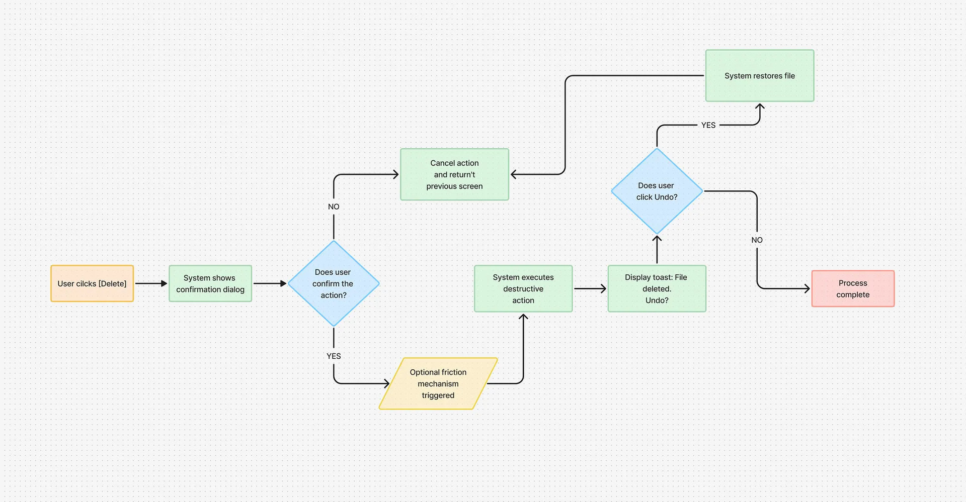
I’m not in disagreement, but as an example, I don’t want ParaView to go the route of other applications where, when you click File->New it pops up a modal dialog stating “You have unsaved state that will be lost if you continue” (clicks Continue), another dialog appears “Are you sure?” with the confirmation buttons swapped order (clicks Yes), another dialog “Session has been reset” (clicks Close). That’s definitely very friendly for the new user, very explicit about the danger of what they’re doing. But not what I want in ParaView.
If we can support novice users without sacrificing UI/UX for professionals, I’m all for it. I’m just saying that I don’t want to see ParaView to get the “iPad treatment” where it focuses on being dead-simple for beginners / amateurs to use, but no longer useful for professionals who use ParaView every day.
Note that I’m not in favor of manipulating hidden objects: we are doing integration test so the test should reflect what the user actually can do. For me Qt testing should (at least) warn when using an hidden object.


 on every dialog every time I (re-)install ParaView.