The toolbar of ParaView is overloaded to me, there are too many buttons that are always present and for some views of ParaView, almost all button turns gray. I think there are a lot of improvement to bring to this toolbar, here are some change I would like set up :
For me, a tool button is relevant if it is an action done often during a ParaView or if it is an action by most of the user, that’s why I think some tool button should be deleted : Save Catalyst State and Save Extracts are too specific for being in the toolbar I think
There is one button Connect and one button Disconnect, they could be merge together to be a conditional button : if we are not connected to any server it is a Connect button, if we are connected to a server it becomes a Disconnect button
The VCR Controls and Current Time controls take a lot of space in the toolbar and are useless for data who have not time steps, so I think we could try to hide them by default if we haven’t timesteps in our current session, and if we open a data/state file with time steps, then make it appears. This would lighten the interface when working with those kind of data
For the Color Map for a Data Object, we currently have 3 combobox : the variable we want to color by, if it is multiple components, the component we want to use (or magnitude) and the type for representation (outline, surface, etc.). Here I would suggest to remove the component selection for variable with only one component. This would make appear / disappear the combobox and change the size of the toolbar depending on what we chosen but for me it’s no big deal, but some people might disagree, to be tested
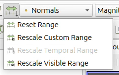
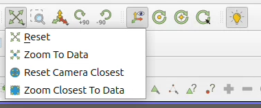
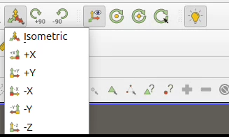
Several buttons currently offer very similar functionality and could be merged into a single control, complemented by a small arrow to show that multiple options are available. A simple click would trigger the default action displayed on the button. However, a long press would reveal a menu with alternative actions. Once a user selects a specific option, it becomes the new default, allowing them to repeat that action with a single click thereafter. While accessing less frequently used actions would introduce a small amount of friction initially, this friction quickly disappears for repeated use. This approach represents a balanced trade-off: it slightly increases effort for occasional actions but significantly simplifies the interface overall. If we never lighten the toolbar under the assumption that “users are used to it”, the interface risks to become increasingly complex over time, as new buttons continue to be added, it ultimately leads to a toolbar that is overcrowded and harder to navigate. I identified 3 family of buttons :
Reset Range buttons with Reset Range, Rescale Custom Range, Rescale Temporal Range and Rescale Visible Range
Reset (camera) buttons with Reset, Zoom to Data, Reset Camera Closest and Zoom Closest To Data
Camera angle buttons with +X, -X, +Y, -Y, +Z, -Z and Isometric
Generally in favor of this, but I’m not the biggest fan of 3. and 4. because showing buttons conditionally decreases familiarity with the interface by making other buttons move around more. VCR & time picker design could be reworked though, we need to look at what others apps do for this.
More suggestions to evaluate:
merge ruler and protractor
not show the statistics filters in the toolbar by default (quartiles, histogram, integrate, etc.)
add a new button in the toolbar to display the quick search menu.
I generally agree that there could be some cleanup/decluttering, and personally agree with suggestions 1/2/5 more so than 3/4.
Combining some options seems logical enough. But I don’t know if the proposed solution for doing so would be sufficient. “Long press” isn’t really an intuitive user action except on mobile (and I don’t think right-click is a good alternative), and just showing a tiny downward arrow in the corner might not be clear enough to everyone that it means “multiple options available”.
I suggest a combobox where most of the widget acts like a normal button but clicking on the arrow at the far right side actually opens the options list. I also wouldn’t mind if the full action text was (optionally?) always visible next to the icon - I never remember the difference between Reset/Zoom to Data/Reset Camera Closest/Zoom Closest to Data (but I have no suggestions on how to distinguish those icons, that’s a tough problem!).
About 1, would it be possible to customize the toolbars to be able to remove the buttons we don’t use? I don’t know if this makes sense but for instance on the “Main controls” toolbar I never used these:
Save Extracts
Save Catalyst State
Apply changes to parameters automatically
Find data
If I’m not mistaken for now my only option is to remove the whole Main controls or go along with it as it is. This is only useful to experienced users and it doesn’t help to declutter the toolbars. Maybe the default could have less buttons, and users could add the ones they need later?
Suggestion 2 sounds good to me!
I agree with @Louis_Gombert on 3 and 4. I prefer to see gray fields/buttons because I know it’s here but unavailable rather than having it appearing/disappearing and not being sure where the thing I’m looking for is, and why it is currently not showing up.
Suggestion 5 would be very nice but I think the user should be able to choose which families to group or ungroup. For instance for my usage the Reset Range family could probably be grouped, but I really want to keep the +X, -X, +Y, -Y, +Z, -Z buttons directly available.
Reading this comment I realized I have the same issue with the Open / Save Data / Load State / Save State buttons in the main controls toolbar. It could be useful to me but I don’t use them because I don’t know what they do and my reflex is just to click on File > and pick what I need there instead of using the toolbar.
I thought it was just me being lazy or having bad memory but I asked my coworker who happens to do exactly the same.
awsome idea of be able to customise and show/hide what we like!
I also agree in keep showing the grayed buttons. This comes in hand with the commend I made in the search bar improvement a lot of time is a simple issue of data type that does not allow us to use a specific filter. furthemore, it is a great way to discover new tools inside paraview.
for 5., if implemented it should be also possible to turn off, for a UI/UX perspective dropdown menu can be quite annoying for a lot of users. the i went from 1 click to 2 clicks, this has been prompt so many times in freeCAD UI/UX redesign.
agree also with @theodorebaltis in the reset/zoom to data/ etc, i simply click it randomly till i get what i am looking for. it is dumb from my part? yes, but when i tried to remember after a few days of not constantly working on it i forget.
and also agree with @Yann on the open/save data, I sepecially do the File> because i have already overwrithen a saved stated by trying to load it but hit the save by error.
This is quite hard to define due to the variety of users. While I agree that Catalyst is quite niche, lot of actions can be candidate to addition or removal. Typically I do not know why you do not want Save Extracts .