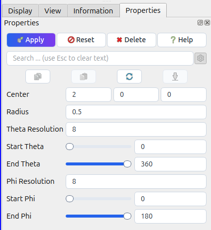
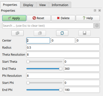
I feel like the UI of ParaView seems a bit old. Indeed it uses all Qt elements by default without any customization. Elements are also all packed together and the widgets have no space to “breath”. Modernizing the design of interface could also give to ParaView a unique visual identity. This would be done by modifying the CSS of the base widgets used in ParaView : QPushButton, QToolButton, QComboBox, QLabel, QLineEdit, QCheckBox, QSpinBox, QSlider, QDockWidget. By customizing these elements (more rounded shape, removing too flashy borders, adding padding inside elements and between elements, etc.) it could already improve the design.
The purpose of this topic is not to discuss this specific design in detail, but rather to assess whether you are open to similar large-scale changes across the entire application. If so, I will propose more substantial and comprehensive improvements.
If there is customization, will ParaView have to do any work to continue using system themes? For example, on macOS, ParaView is pretty well blended in with other apps (IMO; I do not use macOS apps regularly though).
I’m not too concerned about rounded shapes, flashy borders, etc. and more concerned with things like information density (I prefer dense, but understand that others may prefer more padding) and color blindness concerns (though I’m not affected myself), and tab navigation ordering being sensible. Perhaps keeping padding for touch screens is also useful these days.
I think we could add an option like “Legacy UI” which would turn off the new design and get back to the old design whol blend well with MacOS. But by adding a new design like this to ParaView, we could have a common design through all system for ParaView, having the same design for Linux, Windows and MacOS. And indeed, by adding these, we can easily add a native dark mode option in ParaView settings.
Personally I prefer the old look, which seems cleaner to my eyes.
Would it be possible to not hardcode the new design but be able to change it at runtime (don’t know if it’s possible with Qt stylesheets)? Or if not at runtime, then after a ParaView restart, so without having to recompile ParaView.
I think this is a misguided goal. I’d much rather blend in with the platform look-and-feel than something “unique”. For example, the order of Ok and Cancel buttons depends on the platform (GNOME is “backwards” to me). Also, the skeuomorphism trend died out even with Apple instead going back to uniform theming, so “unique for a purpose” stuff even went away (though being a trend, is likely to come back in some form or another in the future).
I wish that the tools I used had a consistent theming option available, but such is life on the terminal. Qt and GNOME each have cross-theme plugins available for such things (to the extent possible at least).
one thing i would add to the redesign of the UI in general, would be a small change in the defaults, make advance configurations (the gear button) ON everywhere by default instead of OFF by default. i was creating a feature request for getting the modified type columns on the open data dialog, when realized that there was a gear here also and it was making to show this exact thing, that i did not noticed before…