Hello!
I have chosen 4 points whose data (temperature) I want to display over time.
I chose the points and used Plot Selection Over Time.
The Quartile Chart View shows shaded regions like this
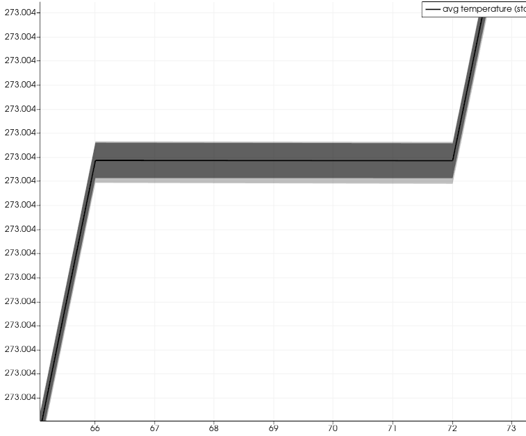
How can I plot lines for each selection; I don’t want an average or shaded regions.
Thanks!