Time Inspector and Animation View redesign

This is a proposal to refactor the AnimationView and the TimeInspector.

Context

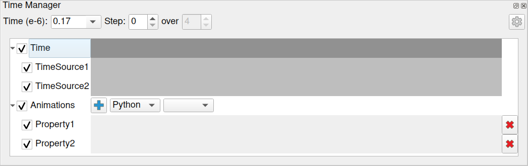
The AnimationView is the place where to configure animation tracks (e.g. a camera path around the data) in a timeline. It also contains several widgets to control how the time is handled by the (Animation)Scene (e.g. current time, stride).

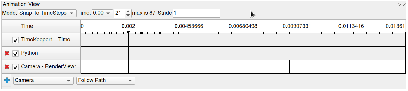
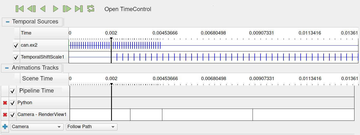
The TimeInspector, which seems less known, display a timeline with one line per pipeline source providing timesteps, and allow to select wich one is used to generate the list of timesteps available through the scene. It also embeds the VCR toolbar and the CurrentTime toolbar.

Problems

The scene time controls are dispatched over different places (two dock widgets and a toolbar), making life not easy for (not only) new users. They have some redundancy, but there still are some feature holes.

Typically, the animation scene contains most of the time control widgets but:

  • they are about configuring time and not animation tracks, so it is often misleading when looking for them

  • they are not organized in a “ParaView” way (horizontal layout, no advanced mode)

  • there are some hard-to-find features (e.g. configuring a min time in “Snap to Timesteps” mode)

  • no VCR controls

Proposition

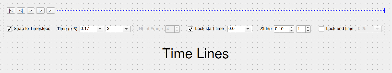
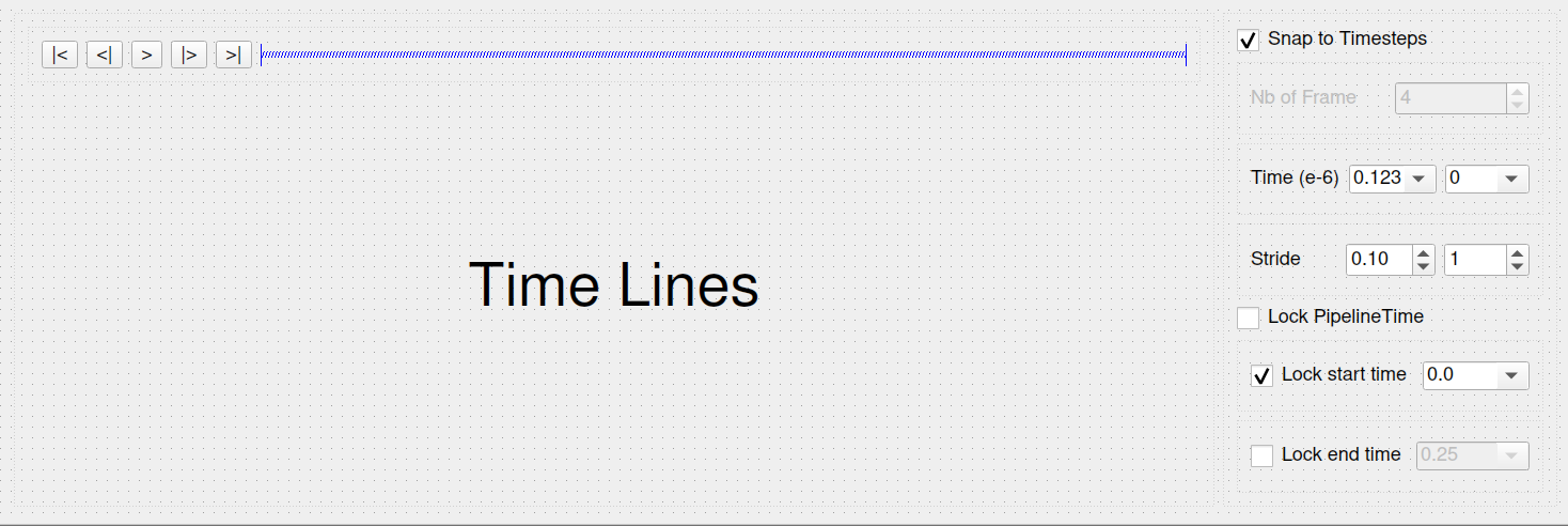
Only one dock with timelines, with collapsable sections to easily switch from animation to time sources. The first timeline comes from the TimeInspector. This is a read-only list of sources with timesteps.

The second one represents the current animation tracks. They are created and modified from this interface (or python, of course) to control the chosen properties over time.

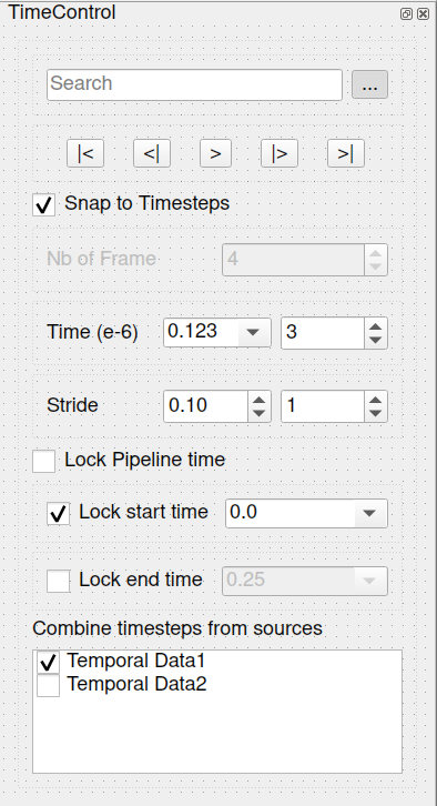
Alongside, we design a new “Time Control” dock with the scene time properties, that fits more closely to a Property Panel.

TimeControl_basic

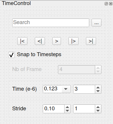
And its Advanced mode:

1 Like

@cory.quammen Do you have some inputs on this ?

@mwestphal FYI

I think this is great !

I just want to mention that even though they look similar, merging the animation timeline with the time inspector timeline is not really a good idea since they are different concept, but making it aligned but still separate is indeed the right way to go !

1 Like

@wascott This looks like something that would be very good for our users. What do you think? I think it is a great idea!

I confess that I am not enthusiastic about your proposal, especially the addition of a new TimeControl panel.

You pointed out that we had several ways of interacting in order to manage time (positioning or movement) and there you propose to add a new one to users who are already quite lost.

Let’s go back to the original need of physicists:

  • facilitate the position at a time among tens of thousands by offset or value:
    • by slider, it is very good in a coarse search but not in a fine search;
    • by drop-down menu, it’s good when you’ve already approached the desired time from a coarse value but not in a fine search,
    • by search, it’s good for a external copy-paste, otherwise you usually have to enter anything that can be off-putting,
  • facilitate the position at the stride by delta offset or value:
    • in order to roughly see the phenomenon in time before looking at it finely
      (something equivalent but in space it’s the Depth Limiter filter for the HTG representation)

These are manipulations that the user will regularly access for modifiers.
The approach here is therefore to facilitate this for them.

We then understand that even if the use is different, @mwestphal, certain needs are the same.
Some access modes are in Animation view and still available in different mode, this is a fact.

Going further, the user would like to be able to set the time for each of his databases by sometimes assigning the same value to a subset… for comparison purposes.
Currently, in order to provide functionality even if not fully satisfactory, we have allowed setting the time to be loaded (from the list of times available in this database) in the properties of our Hercules data reader; or set an offset timing.

This is why we propose to evolve the time inspector, partly in a redundant way with what is possible to do in the different modes of the Animation view but not for the purpose of making animation.

In our old exploration tool, in addition to the VCR control, we found (generally in bottom) the time slide, the search for a time (copy-path or edited) and the positioning of the stride (edited), in offset and value (switch via checkbox).

Finally, we could return the question by asking if it is normal to have to go through the Animation View to manage the way we move in time? :wink:

The problem is not simple, I recognize it, because it is necessary to succeed in putting oneself in the shoes of a physicist/digital developer who would use this tool to explore and analyze his results.

@patchett2002 @Kenneth_Moreland @cory.quammen Comments?

A few thoughts.

  • Superficially, I like this idea. Having two related (but not the same) view/inspectors for time based controls doesn’t make sense. Combining them sounds like a good idea.
  • I dislike the vertical height of the current Animation View. Combining the two vertically makes this worse. For laptops or other small screens, the “Time Control” would be too tall. I like that you added the ability to compress them. Problem with starting compressed - no one would know they are there. Problem with starting uncompressed - too tall.
  • I usually dislike on ParaView where we have the same controls in two places. An example is Coloring, where these controls are in a toolbar and also in the Properties tab. I prefer having them one place. Further, I dislike when the same family of controls get split into separate or distant locations, increasing user’s cognitive load. The example here is the play controls. Either make them half the current size or preferably remove them.
  • Of the two views, I believe the Time Inspector is by far the least useful or important. Lets leave it compressed?
  • I dislike moving the mode controls to a property. Even though it logically fits there, it isn’t near where it is used. Keep these controls at the top of the “Time Control View”.
  • In the proposal above, you have “Time” and “Scene Time” as redundant lines. Delete the lower one (no matter how the layout ends up).
    That’s my first guess.

I kind of like the combined panel idea as it shows some useful information about the time values lined up with the animation controls. Maybe remove the Scene Time if we can live without it and just list Time.

I don’t think a new Time Control panel is that useful as a separate panel. The VCR controls are redundant with those in the combined Animation View/Time Inspector panel. I would put the widgets in the Time Controls perhaps in a section at the top of the combined panel.

If I understand correctly, there is some agreement to have only one dock widget ? So it means:

  • combining both timelines (with some adjustement on collapsable sections and Time track)
  • having every time control widgets alongside the timelines

My current problem is about the second point. My initial proposition break this, and I agree this is not great.
But I’m not satisfied either by my other variants:

Widgets at the top of the timelines

Like current AnimationView.


Cons: not easy to read / find widgets (IMHO).
Pros: … Not so tall ?

Side widgets

Cons: even taller dock, less width for timeline.
Pros: better widget organisation (IMO and at least more “ParaView-like”)

We can use the “advanced mode” feature to reduce the number of default visible widgets, but I present the advanced version here as it still has to be usable.

Any better idea on how do the combination ?

My preference is the second one, even with the shorter timeline width. In a perfect scenario, we would be able to zoom and translate on the timeline.

This already possible :wink:

Ctrl+Wheel to zoom, middle click to drag.

Oh, nice!

Sorry Cory, our preference goes to the first proposal, with the shortest height.

We already place “Animation View” and “Time Inspector” with “Python Shell” as tabs under the “Render View”. We generally leave it always visible.

We use the right part for the “Color Map Editor” and “Find Data” tab, often closed for to extend the “Render View”.

(It must also be said that the names of our databases (even if the reader reduces their length via GetPipelineName) are relatively long.)

Yes I like the second one as well, but, Alan makes some good points that screen real estate is valuable especially if you are running on a laptop, so I would propose that the top suggestion is the best, but with an added advanced mode that would show the side widgets. This way we would have the best of both worlds.

I also believe that the Animation tracks should be above the Temporal Sources, but that is just a matter of preference.

The more important aspect that I think would be useful would be that the bottom timeline should be able to be hidden as well, so as to save more screen real estate. My suggestion would be something obvious that there is display below, such as a down arrow near the bottom of the box.

Nicolas, I think I agree with Lekien. Users will get use to where the controls are and will very quickly get use to a new layout. I find Animation View is frequently opened and left open. Minimizing vertical height is critical. Although not as visually appealing as the side widgets, my vote would be for “widgets at the top of the timelines” as we have now. I also like what appear to be smaller “play” icons than originally proposed (although this could just be an artifact of the images being smaller on Discourse).

Thanks for all those inputs!

I will work to a (last) proposal trying to:

  • combine all in one dock
  • minimize height of the dock
  • minimize number of clicks for frequently used features

(also note that my screenshots where just manual POC, actual widgets may differ in shape and size)

I’m late to the party. I agree with a lot that has been said already.

I do have a thought. What if we add a fourth block to the Properties panel after Properties, Display, and View that is Time? That would allow us to have a place for time options without being obsessed about cramming every possible option into the animation track dialog and without having yet another dockable widget the user has to manage. I realize that this is not a perfect solution. It treats the Properties panel as a widget dumping ground, and it doesn’t solve the problem of having time split into 2 places. But I would argue that the widgets at the top of the Animation View plus the union of tracks in the Animation View and Time Inspector does everything available elsewhere except play, which is easily available in the toolbar.

Although I agree that space is a premium, I think the best way to conserve space to remove the collapse widgets shown in the original markups (as well as removing the scene time track as suggested by @cory.quammen). Under normal circumstances you only have 0 or 1 temporal sources, so the bar for that is shorter than the 2 collapse widgets. Instead of having the collapse widget, just separate the tracks by a couple of pixels to indicate a grouping. All of that will fit easily in the current default size of the Animation View until you start adding time sources or animation tracks.

Here are some other random comments.

  • I suggest having the time bar stay at the top of the dialog under the GUI controls even when you scroll (sort of like freezing the header row in a spreadsheet). That might help manage when you have several tracks.
  • It would be great if the zoom feature was easier to discover. I had totally forgotten how to do it, and no user would discover that on their own.
  • I said this earlier, but I think the combined dialog should have the widgets of the Animation View at the top (perhaps changing the Mode option to a checkbox). Although I see benefit of having the VCR controls there, space is at way too much of a premium to include them when they are otherwise so accessible. The rest of the controls of Time Inspector are just a subset of those in Animation View.
1 Like

Ken,
The issue I have with putting the time controls anywhere on the Properties tab is that it is 1) confusing to a new user and 2) separating controls that should be used as a single unit. 1) is true because a user is playing around trying to figure out how to control time. He/she will look in the properties tab, find time controls, and not know the animation track exists. Alternatively, they will open the Time View (or whatever we call it), see tracks, and not see how to control them. 2) The issue here is again one of having a View controlled by information in the properties tab, i.e., not in the same view. This feels clunky.

With regards to collapse widgets, I just changed my mind. I agree with you. Lets get rid of the collapse widgets, and just live with the time control as a whole. It should only include zero or one line normally.

Time bar at the top - Agreed. Good idea.

Blink blink … I didn’t know about the zoom feature. Please add a help bubble when you float over the controls?

I agree with your comments about having widgets at the top, and removing the VCR controls. They are already so prominent on the Time Toolbar that they are not needed here. (I think I understood your comments correctly).

2 Likes

Hi there,

Some update on my work:

1 basic view, all tracks collapsed

2 basic view, all tracks expanded

3 advanced view, all tracks expanded

Few notes:

  • the grey rectangles are the place where timelines will be drawn, still on the todo list
  • the start time and end time configuration will be done by editing the corresponding labels in the main timeline (upper dark grey timeline)
  • Sequence mode is the mode when no TimeSource track is checked, Snap to Timestep otherwise. So no other widget to do the switch, just use the checkboxes. Checkbox from Time line is a master checkbox.
  • In Sequence, the Number of frame widget is editable.
  • Current time widget is an editable dropdown list. So it is also possible to freely type a value (with completion).

@mwestphal @timothee.chabat FYI

2 Likes

@nicolas.vuaille Really nice design. Compact, but has everything we need. Well done. If possible, please get it checked in by 5.12.0-RC1, my guess would be April 1.
Again, I really like this design.

1 Like