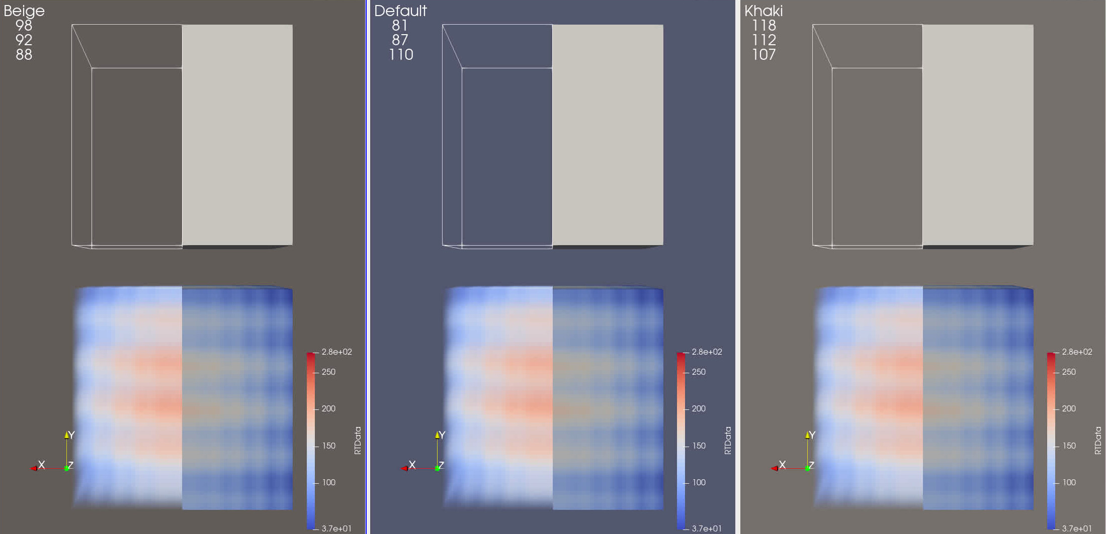
Francesca and I have been discussing new backgrounds forever. At Francescas suggestion, I would like to propose two new backgrounds, both from the beige space. See attached screenshot and state file.
New-Backgrounds3.pvsm (1.9 MB)
I was also thinking of removing the Print color palette. Everyone knows “white” is Print, why have redundant palettes?
Ever since Francesca’s presentation last year https://media.githubusercontent.com/media/visit-dav/largedata/master/bindocs/LLNL_June_2020sm.pdf, I have been using her suggested background color (See page 31). I think it is time to make it official. 
While I think this is neat and needed, keep in mind that changing the default will require updating all the baselines in ParaView and in ParaView based application.
Seems to make sense to me. I’m sure there’s much more that I don’t get about the reasons but I’ll leave that to people more informed than me about the matter.
While the Cool to Warm transfer function does look better with the new backgrounds I wonder if there’s a better choice for the default surface color and outline with these new backgrounds.
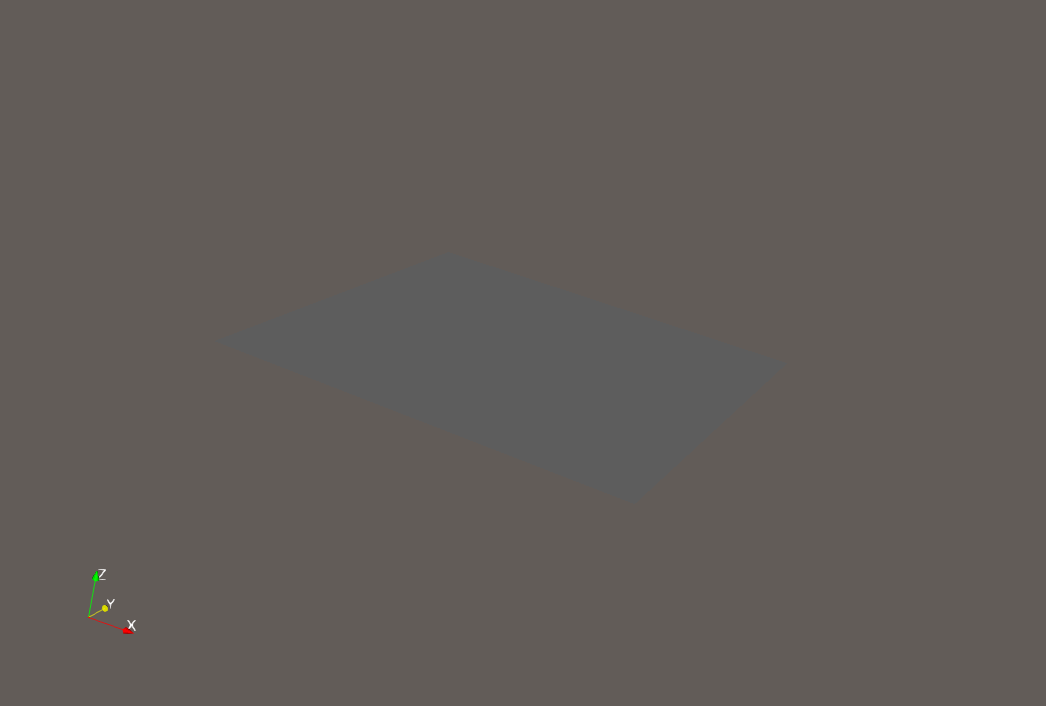
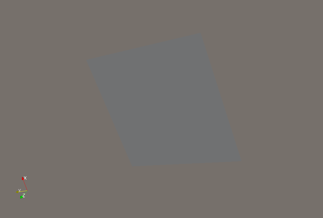
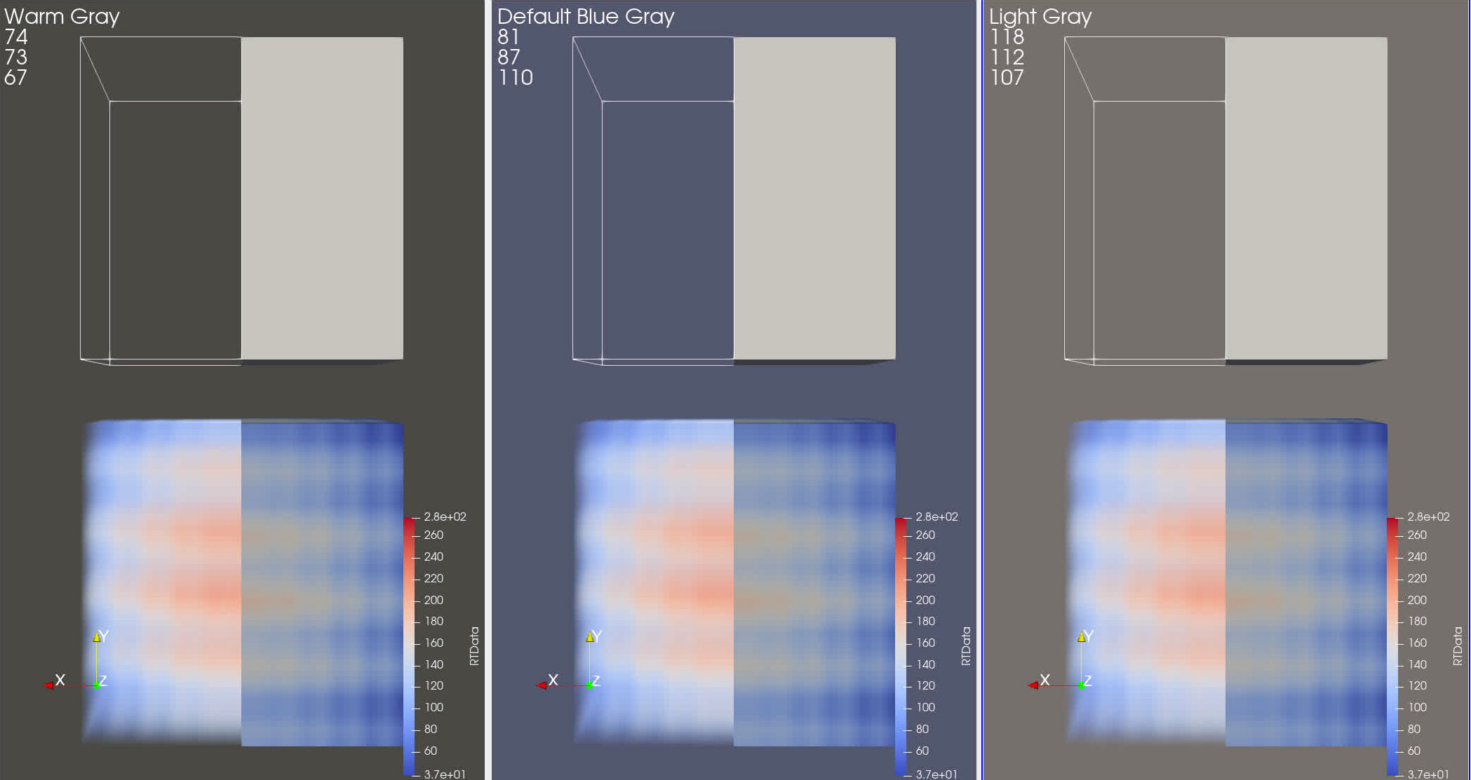
I just wanted to remind everyone why we haven’t made this switch awhile ago. The problem with both the beige and khaki backgrounds is that a white plane can get lost in the background at the right (wrong?) angle. As an experiment, here are some screenshot of a plane on top of each of the colors using the default lightkit and a headlight, respectively. I moved the camera around by hand to the point where the plane mostly disappeared into the background. If you look really close in each picture, you might be able to see the plane, but you have to look very hard.
Beige Background

Khaki Background

Yep, you nailed the tradeoff. Let me get with Francesca, show her our issue, she can propose ideas. I will let everyone know what we come up with.
Surprisingly, with a white palette, the plane never disappears. I assume the lighting equations never saturate.
Let me say that for the reasons Mathieu stated, and Ken stated, I am NOT proposing changing the default. I am proposing adding two new, optional palette backgrounds.
Ah, I see. I have no objection to adding new palettes. My only comment is that the two colors are a bit redundant. If I was going to pick one to add, it would probably Khaki. That one was marginally harder to hide the plane in the background.
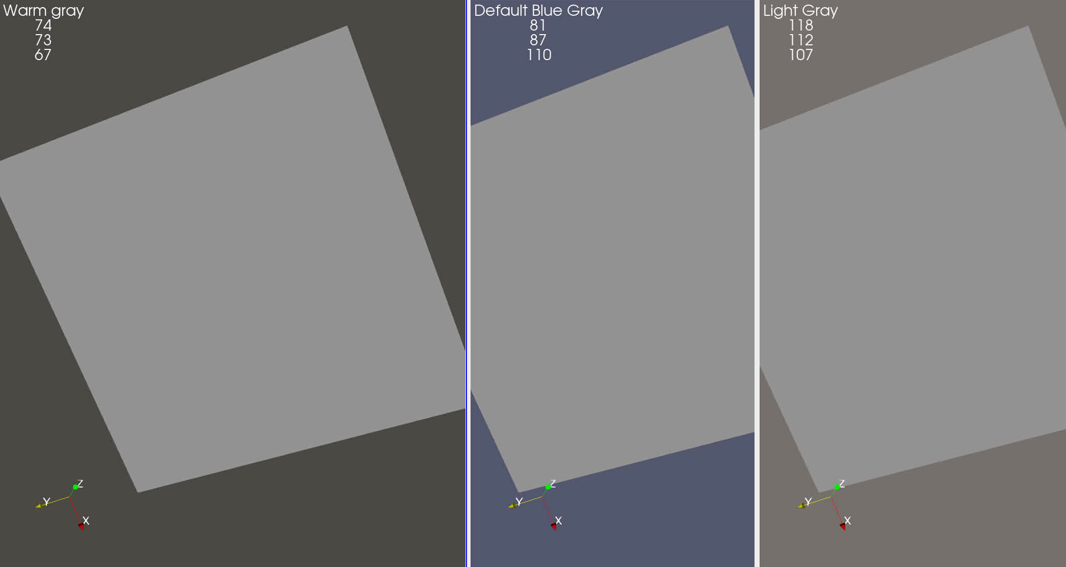
OK, here is the most recent proposal. There is more of a difference between the two new backgrounds. Further, the Warm Gray is quite resistant to having planes disappear. I also propose we get rid of “print background” and “gray background” (which is a duplicate of Default. Then, we will list them as follows (basically default, then in dark to light order):
- Default Blue Gray Background
- Warm Gray Background
- Light Gray Background
- White Background
- Black Background
The only thing that bugs me about the color palettes is that the “Show Box” box is always white, even when chosing the “White Background” scheme. I can’t find an option to manually change that color either.
It’s not a big deal, because I would just switch to another scheme for editing, then switch the scheme back to “White Background” before saving the state for the generation of renderings, but maybe it’s something you’d want to consider for fixing while you’re at it…
I have no idea what “Show Box” is. Mind elaborating?
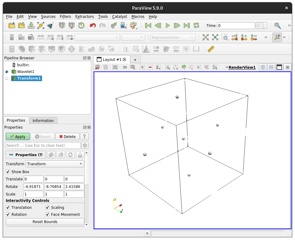
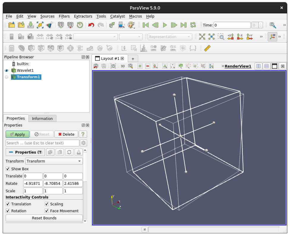
Perfect, clear example. Thanks. That is a bug. I will write it up and get it fixed. Note it may not make the next release. That one is getting pretty full…
Already written up here: https://gitlab.kitware.com/paraview/paraview/-/issues/20599