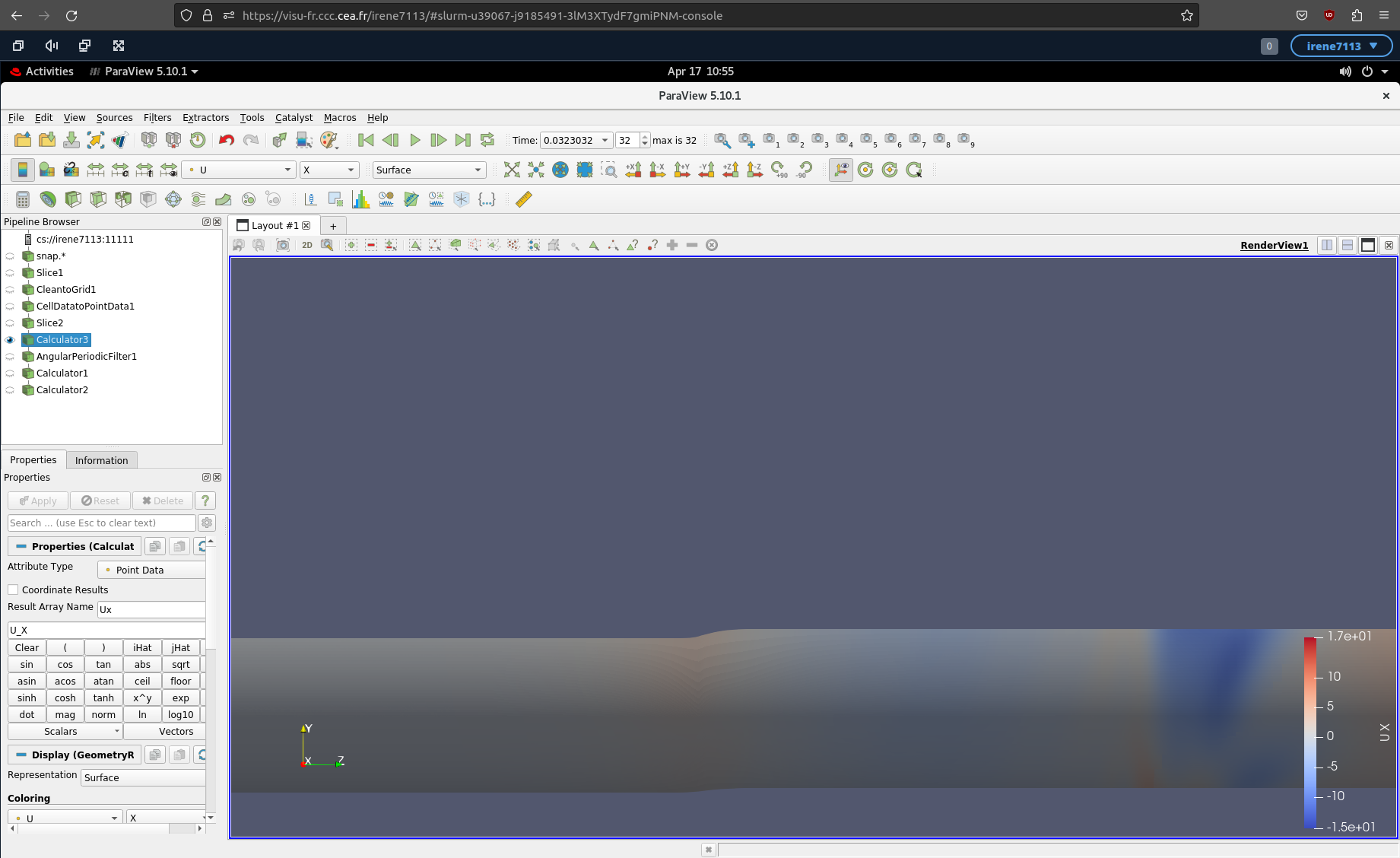
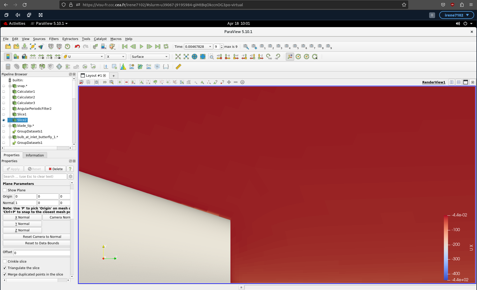
I am having problems to properly visualise a 3D vector (namely, the velocity) field in ParaView. If I select one of the components from the vector, I get the following view:
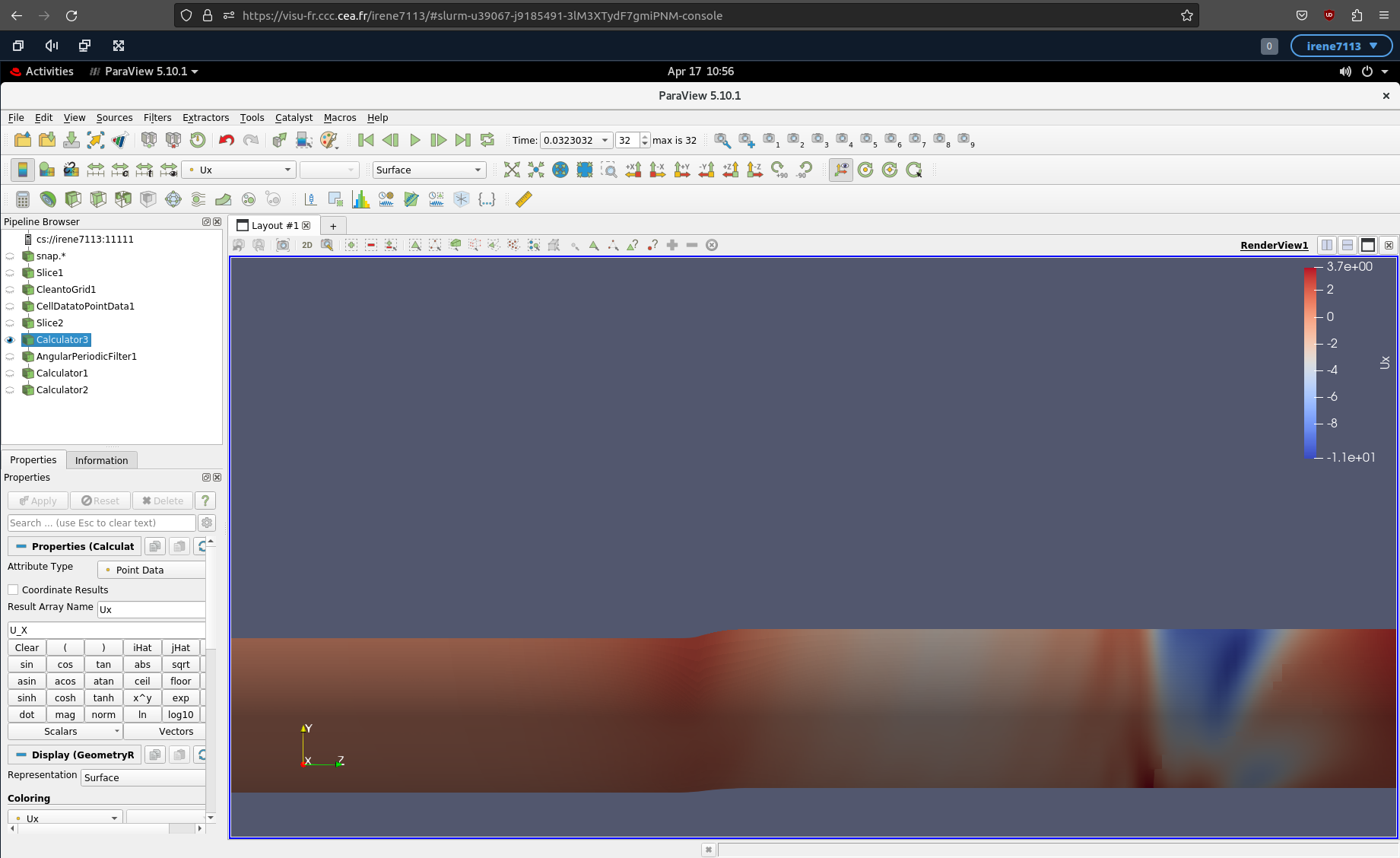
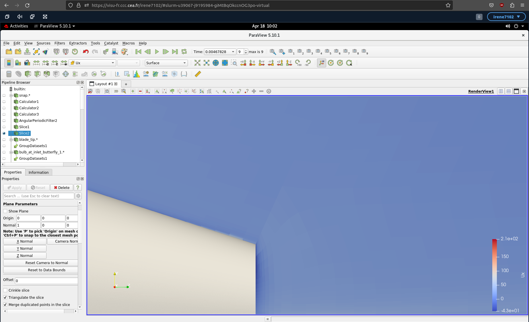
However, if I create a new array using the Calculator Filter, which is just the same component of the same vector, I get the following view (for the very same time step):
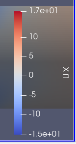
It looks like the data is the same, but the color map scaling is different. If you look at the color scale for your first image (the one showing the X component of the U vectors), you will see that it goes from -15 to 17.
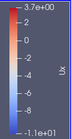
In comparison, the color scale for the output of the field from the Calculator filter goes from -11 to 3.7.
Because the output of the calculator filter is narrower, you are seeing more detail. Try using the Rescale to Data Range or Rescale to Custom Range to get the ranges to match up.
I can’t say for sure why ParaView scaled the two fields differently, but it might have been that you ran an animation showing one but not the other.
Thank you very much Kenneth for your reply. Indeed, the color scales are different; but I clicked on Rescale to Data Range before producing the pictures above. In fact, this is the “natural” scaling applied by ParaView when selecting the desired data array (none of the pictures come from an animation).