In the next release of ParaView, we are trying to give a new look and feel to our favorite platform.
Part of these changes have been changing the default color map and background (read more here Replacement default color map and background palette). Other things that we potentially considering for the next paraview release are c++17 and complete Qt6 support.
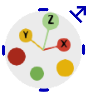
In this post i would like us to discuss the possibility of changing the default orientation widget. You might wonder what is that? And the answer to that is:
A few years ago, @jaswantp added the vtkCameraOrientationWidget which is pretty cool because, a) @jaswantp only designs cool things, b) it allows for manipulating the orientation of the camera by clicking at the axis buttons (-x,x, -y, y, -z, z).
The current state is that the default widget is the orientation axes (the old guy) and if you want you can enable the camera orientation widget by making it visible.
I propose that we change yet another default for the next version of paraview by changing the default orientation widget with the one that @jaswantp designed, because it looks cooler, and it has extra functionalities.
If we agree to move forward with this proposal, i plan to expose the same advanced settings for both widgets (names, colors, location, visibility), and create a drop-down menu which would allow you to choose your preferred widget. The only downside of this approach is that you cannot have both visible at the same, although i don’t see why someone would want that.
If anyone has a better idea for the style of the widget, it can easily use another shape/design.
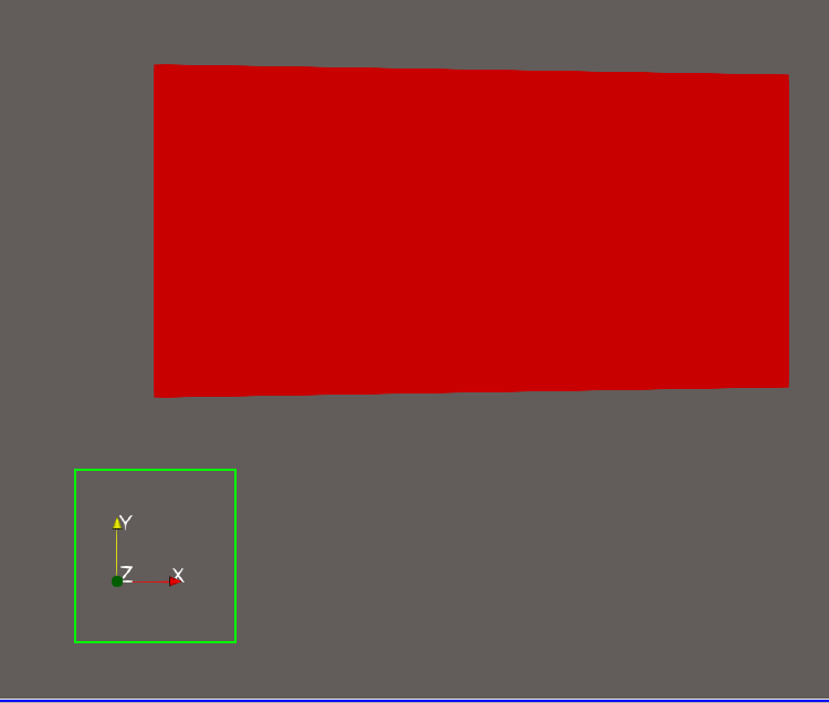
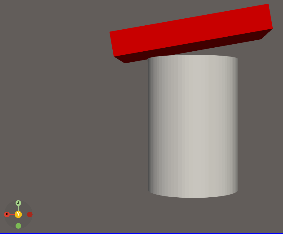
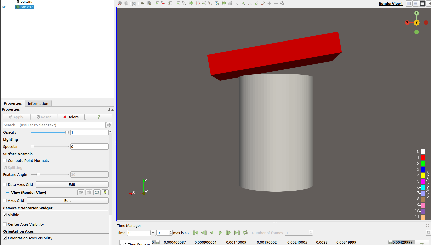
The orientation widget representation in VTK with 3 sticks and 6 balls is just a starting point I made with inspiration from blender - 3D Navigation gizmo - #4 by jaswantp
The only thing I miss from ParaView’s current orientation widget is the ability to interact directly with it to change its size and location on the screen.
Although I could be convinced either way, I think I like the original best. If is very clear to someone that hasn’t seen it what it represents, and is more subtle than the one with spheres.
Axes are more clear since they are drawn with arrows, but text labels and arrow tips often interfere leading to a messy appearance. Unless you use a palette, the text labels may not contrast with the view’s background color, making axis labels illegible.
Circles at tips of axes are less intuitive but the text labels are always clearly rendered inside the circles.
Camera Interaction
None
The widget can be used to reorient the camera interactively and snap the camera to any axis.
Widget Interaction
The widget can be dragged around the screen and scaled.
None
My preference is the newer widget because (1) the axis labels are more clear and (2) I find the camera interaction is more useful than placement within the view. I just wanted to point out there are a couple of missing features. I don’t have money to fund implementing them.
Another potential idea for changing the camera orientation widget, is for it to look like the original with arrows until you hover over it and it becomes the one with circles
@dcthomp does a good job summarizing the differences.
One further difference I note is that the original widget is asymmetrical. The origin is in the corner and 3 orthogonal arrows point only in the positive direction. The new widget points in both the positive and negative direction. That makes it a lot harder to differentiate many orientations, particularly those 180° from each other.
Maybe the new widget could make the vectors in the negative directions have an alpha component to differentiate positive and negative directions.
Good point. Maybe make the positive direction have arrows? One thing I don’t like about the current orientation axis is that it’s hard to tell if you are looking up or down an axis.
In the new widget, the text appears only on spheres corresponding to the positive directions. The negative directions do not have text unless mouse hovers on top of the sphere. It was designed to help differentiate up/down, left/right, back/forward-ness.
@terryturton suggested to only show the negative symbol when you hover over so that the axis name does not occupy space to show something which you can see from the positive side.
Also maybe add a cone/triangle to the positive directions to have the arrows that we want and yet another encoding channel to differentiate which direction is positive and which negative (so far, we have absence of label and absence of stick connecting to origin).
On hover, handles (shown in blue below) could appear:
to allow
Rotation of the camera about its current axis (in 5° degree increments when shift key is pressed). This would be when click+dragging on the 4 blue handles at the edge of the circle.
Scaling of the widget about its center, when click+dragging on the bar+arrow (⤇) in the top right corner.
Looking at the widget, the negative is really hard to see with the associated axis label, especially if it is in the back. It is just really small. The color should be sufficient to identify which axis.
I will comment that the red/green for x/z is not colorblind friendly. Would moving the green to a blue be too much of a shift?
I really like the cone/triangle idea but yes, only in the positive direction please.
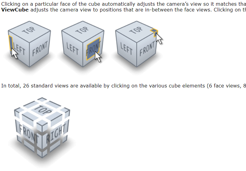
Actually, looking at that patent, I do not think it applies. We should be able to implement @jaswantp 's “view-cube” visual with 26 selectable viewpoints as long as the cube does not illustrate things present in the scene.
The reason is that both claims 1 and 11 (the only two independent claims in the patent) require “different statistics for one or more features of the 3D scene are reflected on the different faces of the 3D representation based on the viewpoint corresponding to each face” to be shown.
That is, we could not show the skybox or a preview rendering of the scene on the cube faces, but drawing blank faces – or even faces labeled “front/back/top/bottom/left/right” or “+X/-X/+Y/-Y/+Z/-Z” – should be fine. We would be in violation of the patent if the widget depicted features of the scene or data extracted from them.
Also, software patents have been outlawed by the supreme court of the United States, so this patent should never have been awarded. The problem is that once the patent is granted, the burden of invalidating the patent is on the defendant accused of violating it (meaning you may get to pay a million dollars or so to litigate it in court).
Discoverability, not appearance, is critical
I am fine with either the coordinate axes or the cube as long as the features are discoverable (i.e., there are responses to hovering over regions of the widget so users understand they can interact with the widget rather than just use it as a reference).
The thing I’ll say is to please consider the pragmatism of needing to create static images to share with stakeholders. E.g., a view-cube viewed straight-on doesn’t help the viewer understand a plot contoured by \sigma_{xy}. The widget in the second image of the first post I fear would be confusing when viewed in a report. It just seems like arrows are a commonly understood shape for directions:
This discussion is very interesting, but I’m a bit concerned about this:
Half of my users don’t like changes and will be upset if we remove these arrows, while the other half are very open to changes and already love the new proposed widget, as it seems similar to Blender’s, especially with the “drag to an edge to align to the axis” feature.
When I saw the post two days ago, I found the new visual really confusing, as it wasn’t clear where the positive axes were. Today, it seems more understandable to me.
Maybe keeping the arrows with the new design could be a good option, or perhaps turning the negative axes gray?
It’s also true that the new widget might be better for navigation within the view, but as @GregVernon mentioned, it’s harder to understand in pictures and animations.
I also agree with @terryturton about the colorblind-friendly choice.