We ( a group of developers) are thinking of replacing the default background palette with a color that is more neutral gray with a hint of red (i.e., making the background a warmer color). We are also discussing changing the default color map to a map that has more discriminatory power. As the default background color and the default color map interact, we need to discuss both at the same time.
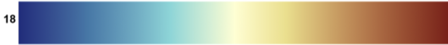
A bit of background on the Cool to Warm color map. This color map was created by Ken Moreland around 20 years ago as a better alternative to the old rainbow. It corrected two issues with the Rainbow color map. Cool to Warm is linear where the original rainbow is not (original rainbow has a huge green area in the middle). Additionally, the original rainbow looks the same in the mid range and high end for color blind folks that can’t tell the difference between red and green. It was a huge improvement. However, the Cool to Warm color map does not have excellent discriminatory power - the ability to resolve fine changes in variable data. The goal of this project is to create a linear color map that is color blind friendly that has better discriminatory ability and looks nice.
A bit of background on the current default background. This background is also around 20 years old. A little bit of color was added to a neutral gray to keep flat surfaces from disappearing as they are rotated using our lighting equations. An example of the problem is Sources/ Cube on a gray background. You can make planes fade into the background. An issue with our current background is that it doesn’t have enough contrast with the Cool to Warm color map. Another issue is many people like a warmer background.
The goal of the new default color map is to increase discriminatory ability by adding more colors to the map (more hues) and more brightness changes (value) while staying linear and color blind friendly. We also wanted to keep the min and max from being too dark. We consider dark maps to not be as aesthetically pleasing.
The goal of the new default color palette is to not distract from the main color map but to maintain contrast with same.
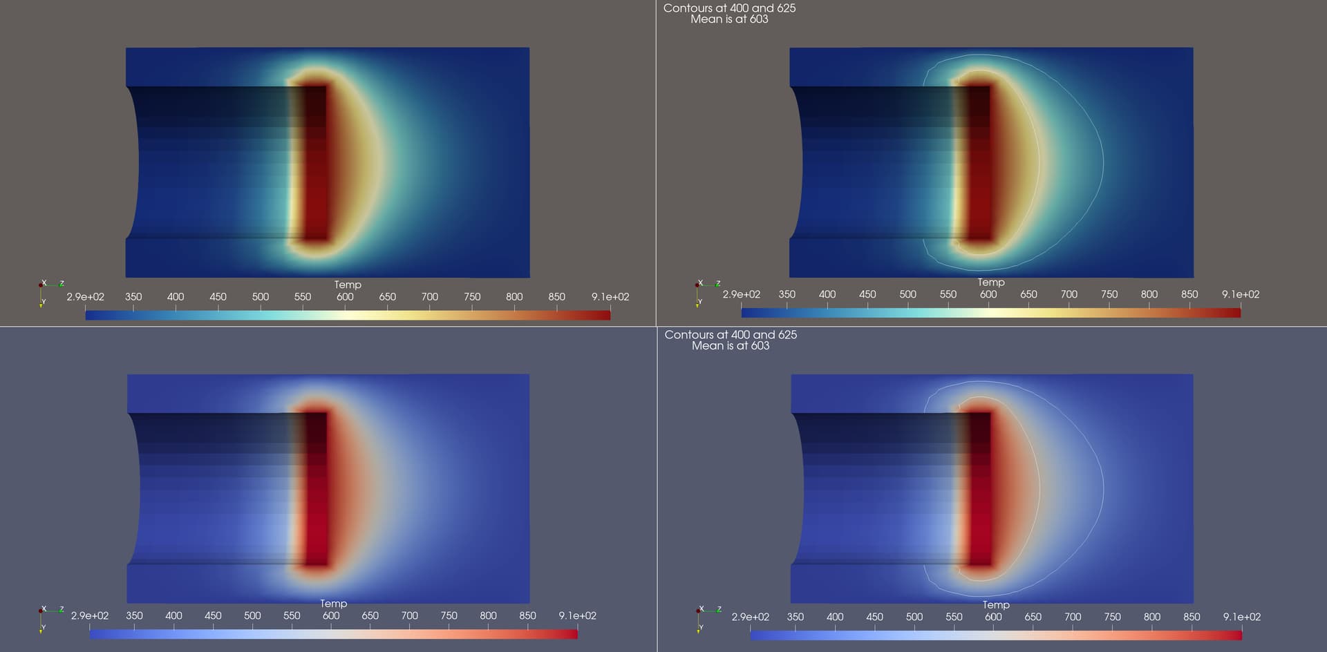
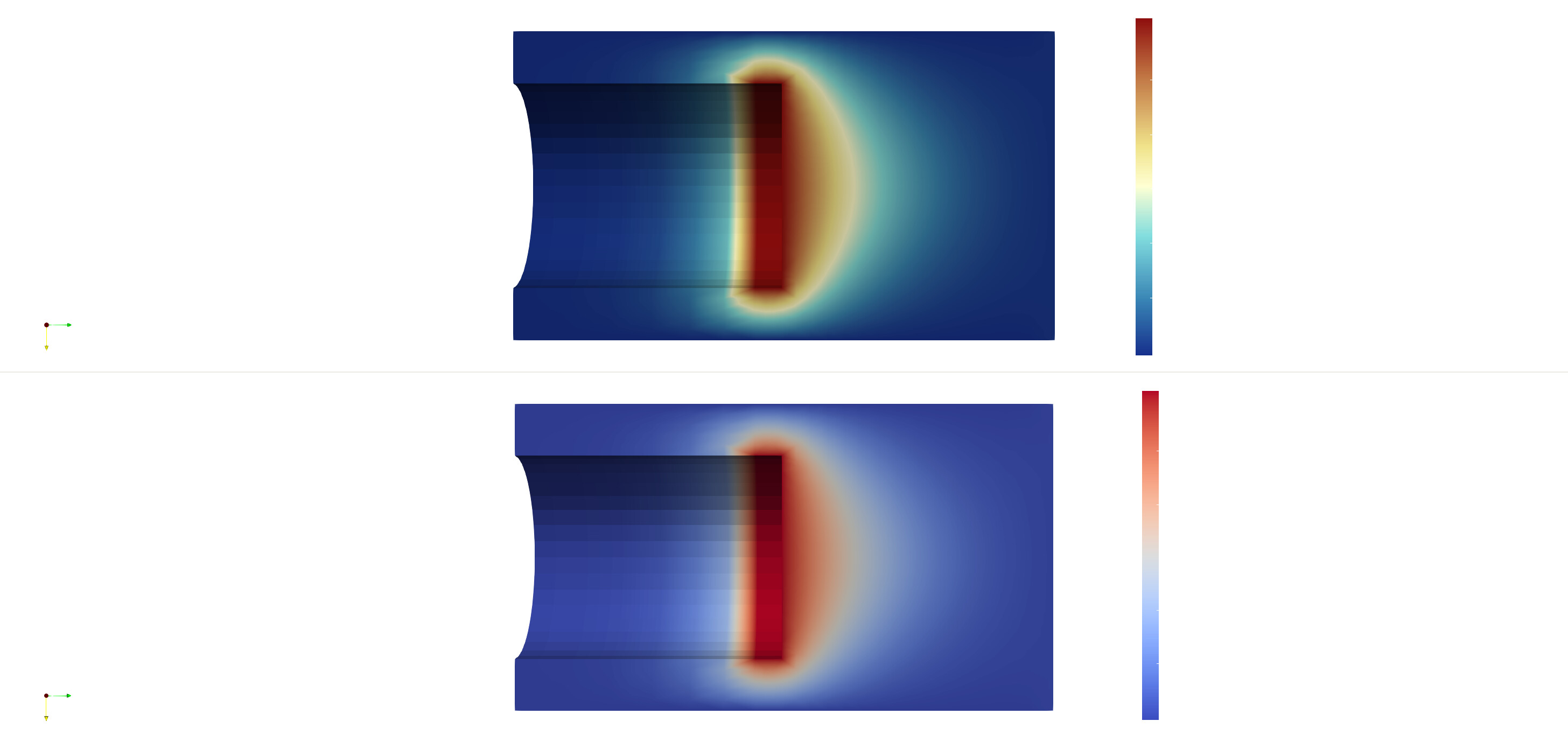
The proposed default background is: 98, 93, 90. This is what I am using in the following images on the top row.
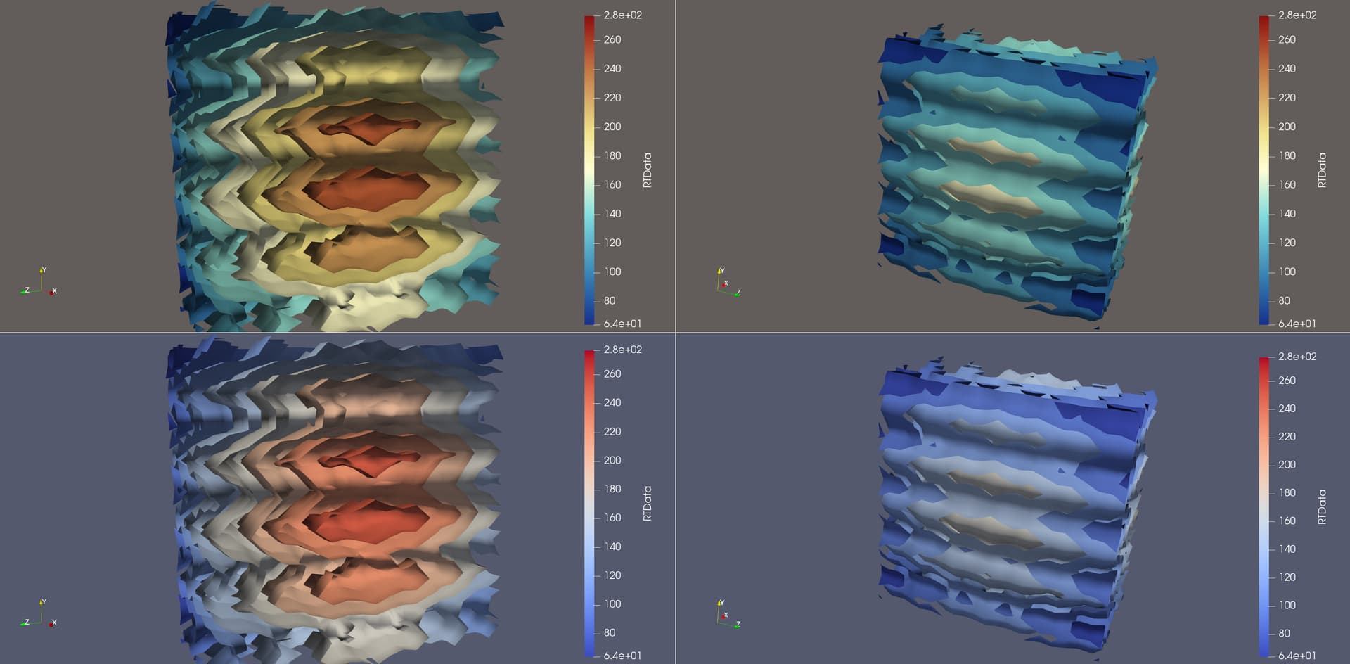
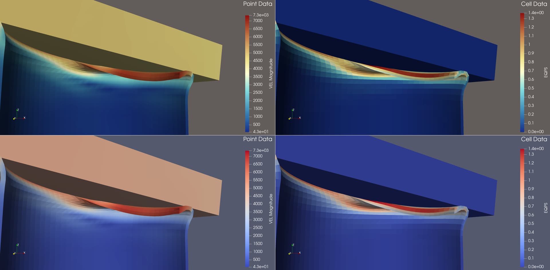
Here are the old and new color maps on disk_out_ref.exo, clipped and then painted by Temp. The right images have contours drawn at 400 degrees and 625 degrees.
Here is an XML file you can import into ParaView to try out the the Fast colormap for yourself: Fast.xml (899 Bytes).
The reason why the colors look similar to those posted to sciviscolor is that they are both designed by Francesca Samsel. Fast is a modification of a blue - orange map that was a top performer for discrimination in a user study.
@wascott has already surveyed users at Sandia about the new color map. A wide majority of the participants preferred the new color map.
I think it’s safe to say that the proposed color map is objectively better than our current default.
Is it just me or does the sample color map look different than what it looks like in the sample ParaView screenshots? It the sample color map image (the one with 18 in it) it seems like there is a fast transition in the middle. In the sample ParaView images though it appears that transition is stretched out.
Any thoughts on using this color map with a white or black background? I’m thinking of its use in papers (white background) and presentations (black background may be a common background besides a white background).
Both the color map and proposed PV background look to be a strong improvement to PV though.
I can’t speak too much about why the sample bar image looks a bit more “pointed”. I do note that it is pretty typical of diverging color maps to sometimes look smooth and sometimes have a bright sharp spot in the middle depending on how compressed the colors are in space. This is less of a problem with the current default cool/warm because there is an exaggerated smooth top. But this is also a problem with the current cool/warm because it tends to wash out features in this range.
I expect the new map to work better against a white background than the current default. The new map has a yellow tinge in the middle that should help differentiate more in the middle range. There might be a bit less contrast against a black background because the ends of the new map are a little bit darker (to get more discrimination range). But they are still kept fairly bright to prevent issues with 3D shading so a dark background should be fine.
Hi @mwestphal. I believe Ken answered most of your questions. With regards to background, I always discourage gradient backgrounds, as I suspect any color expert will. The reason is the human eye is very attuned to contrast as opposed to color. By changing the background, you are changing the contrast. For a great example, see the Classroom Tutorials, Color Maps and Palettes, the chess board.
Also, I have created a composite email of what my users thought - I had something like 30 replies. Ask if interested, and I can send them to you next Monday when I am on my work computer. The vast majority liked the new default map and background better, a fairly large minority asked that we change the background default to white (which I don’t like), one asked that the default background and the screenshot background be different (not happening) and one or two said leave it as is.
@Andy_Bauer The color maps are all the same - map 18 (as per Francesca’s labels). I strongly suspect that your eye is being fooled by the width difference and/or the difference in background (white vs the new background). And as stated by Ken, the center point is not white - it is light yellow. With regards to transitions, this map only has 7 control points (which Ken requested, and was a brilliant comment). The center is light yellow - 1.0, 1.0, 0.83. Note that the center of cool to warm is actually a light gray, thus when impacted by the lighting equations, could fade into a white background.
I tested it with a white background, and I think it looks as good as any other map. (I dislike a white background). Attaching a screenshot from my personal laptop. Note the text is messed up, as I am changing background and not palette. As I have never seen anyone use a black background, I didn’t test it. I expect it would be at least as good as Cool to Warm.
@mwestphal could you please make sure Kitware Europe and whomever else needs to know sees this thread? We don’t want to surprise anyone.
I talked to @cory.quammen today, and I would really like to get this changed before 5.12.0-RC1 comes out, so people will see it and give us feedback. Thus, unless I get pushback by early next week, I intend to make a feature request in git, and push the developers to get this change into 5.12.0-RC1.
I’d rather not have a new colormap and background become the new defaults so quickly / so late in the game. If a change in defaults is going to happen I’d rather be certain it’s a long-term change for stability. It just feels (to me) that there’s not been a lot of testing on a wide range of datasets, that this is a big UX change at the last minute, and if 5.12 changes to this colormap and suddenly 5.13 changes to a new colormap due to deficiencies that would be quite annoying to me.
On the FAST colormap
I personally don’t like the white band in the FAST colormap (see below image using FAST) – at least for as long as there’s not a persistent option to center a colormap around zero. I’m OK if we can set a colormap to center around zero, because zero is at least a reasonable value to highlight in datasets. But so many datasets (e.g. von Mises stress, velocity magnitude) are limited to \mathbb{R}^+ and a default colormap that puts a band at the central value is unfortunate. While the Cool to Warm is also a diverging colormap that’s also not optimal for such cases, at least there’s not such a sharp band. If ParaView adds an option to Center Colormap at Zero a colormap I can get onboard with FAST.
Paper is white and most (all?) peer-review journals and (printed) user manuals use white backgrounds – or rather “transparent background on white paper” – so it’s critical, IMO that whatever colormap is default in ParaView works on a white background.
Final thoughts
In general, I suppose the question is “what is the primary purpose of ParaView?” Is the primary purpose to make pretty pictures? If so, let’s go back to a rainbow. Is the primary purpose to support scientific inquiry of complex datasets? If so, we need a colormap that doesn’t lie to the user.
After discussing with the developers, and especially input from Ken, Matheu and Greg, we decided to split this rollout. The color map Fast and the new warm gray palette will be rolled out in 5.12.0 (release RSN (Real Soon Now)), but we will not make them defaults in 5.12.0. Barring issues and/or negative feedback, this new color combination will become default i 3.13.0.
I just got the weekly digest of this forum and this thread caught my attention. I think it’s good that default are not changed last minute prior to 5.12.
Besides that, I will try the new color map myself next week, but my immediate impression from the images in this thread is that I am not sure if this will be my go-to primary colormap…
IMO that whatever colormap is default in ParaView works on a white background.
I’ll admit that I don’t use the current default nor would I use this default except in very limited circumstances. However, I use white backgrounds almost exclusively. That said, one might argue that this color map will work with a white background because the default ambient/diffuse lighting affects the white such that it will be distinct from the background. If one flips the defaults (ambient → 1 and diffuse → 0, which is what I do in most circumstances to ensure my legend maps directly to my data), then shadows will disappear and the white from the colormap will be indistinguishable from the background.
Not quite on topic, but I have been searching for any information on the parameters used in the XML colormap files. Is there a specification somewhere?
For example in Fast.xml refered to above a point is specified as:
I understand that “x” repfers to the point on the axis and “r,g,b” are obvious but what is “o”, “cms” and “isMoT”? I thought “o” might be opacity but I now doubt that because when looking at Accent:
Note that "x" is the scalar value associated with the color (specified by "r", "g", and "b"). However, by default ParaView rescales the colormap to fit the range of values present in the loaded datasets. You can prevent this automatic rescaling if the absolute values are significant (this might be relevant when physical values should be tied to specific colors – for instance a colormap showing mean sea level might want blue below 0 to indicate water and brown above to indicate land).
I don’t know about isMoT but cms probably stands for “color management system” (indicating the colors may have been corrected for display on a particular medium). See LittleCMS.
Sorry not to be of much help. A VTK reader/writer for colormaps (whether JSON or XML) would be great! Especially if ParaView was made to use it so they were consistent.
Just a couple of notes on the proposed update to the default colormap.
The first goal was to get a map out for comments, which are coming in. Once we have sufficient feedback I will be going in and tweaking the specifics of the colormap. I notice several comments about the transition I the center. I agree, it is not ideal. The issue is that it becomes a trade-off between having a focal point at the center (if one uses a quick transition into more saturation) or smoothing that transition but loosing detail in that region because the lighter hues carry less information. Know we have looked at a couple dozen options and will be honing before it is final based on your comments. Thanks