In light of some the recent discussions regarding colormaps, I’d like to make the following proposals (I’ll go into more detail after the list):
- Support “centering” a colormap around a value (e.g.
0.0)- Support “balanced” color range: [ -\max(|\mathrm{values}|), \max(\mathrm{values}) ]
- A “clipped” color range: [\min(\mathrm{values}), \max(\mathrm{values})]
- Colormaps, in particular diverging colormaps, should “recognize” their central value as a loci for centering
Additional information
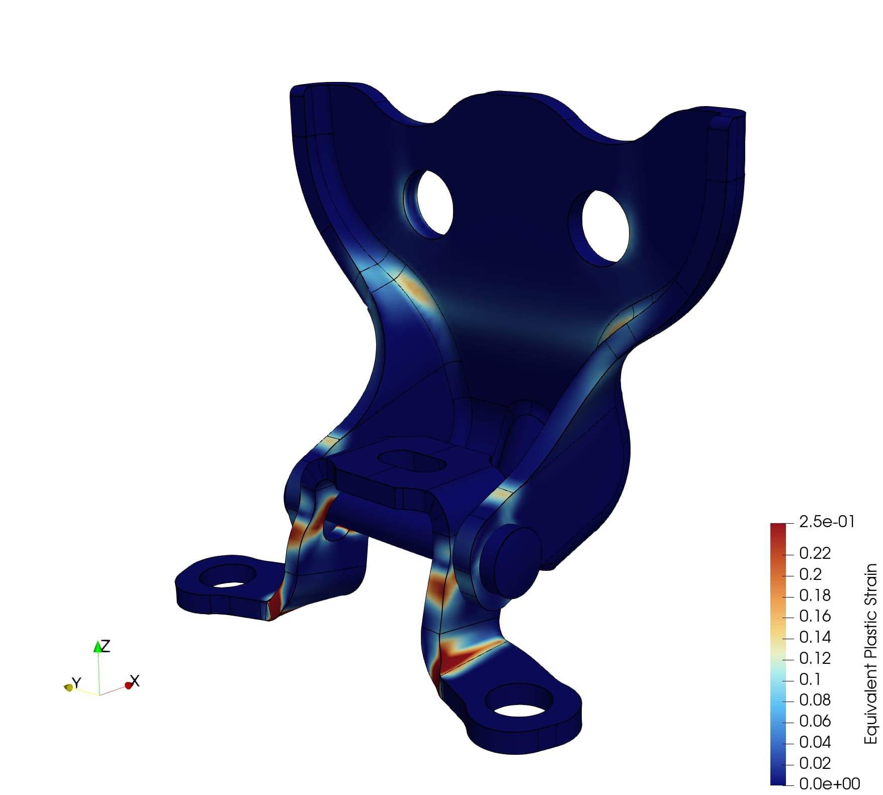
Using the proposed FAST colormap, the default coloring when you open a file / switch variables results in a white “band” at numbers that have no real importance. Consider the following example:
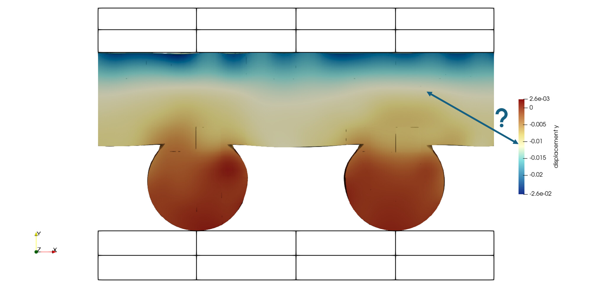
The white band draws attention to some value around -0.01 – not a special number at all, and also makes the positive vertical displacement appear as large as the negative vertical displacement – even though the negative displacement is ~10x larger than the positive displacement. In short, the colormap is lying to me.
Consider instead the following colormaps:
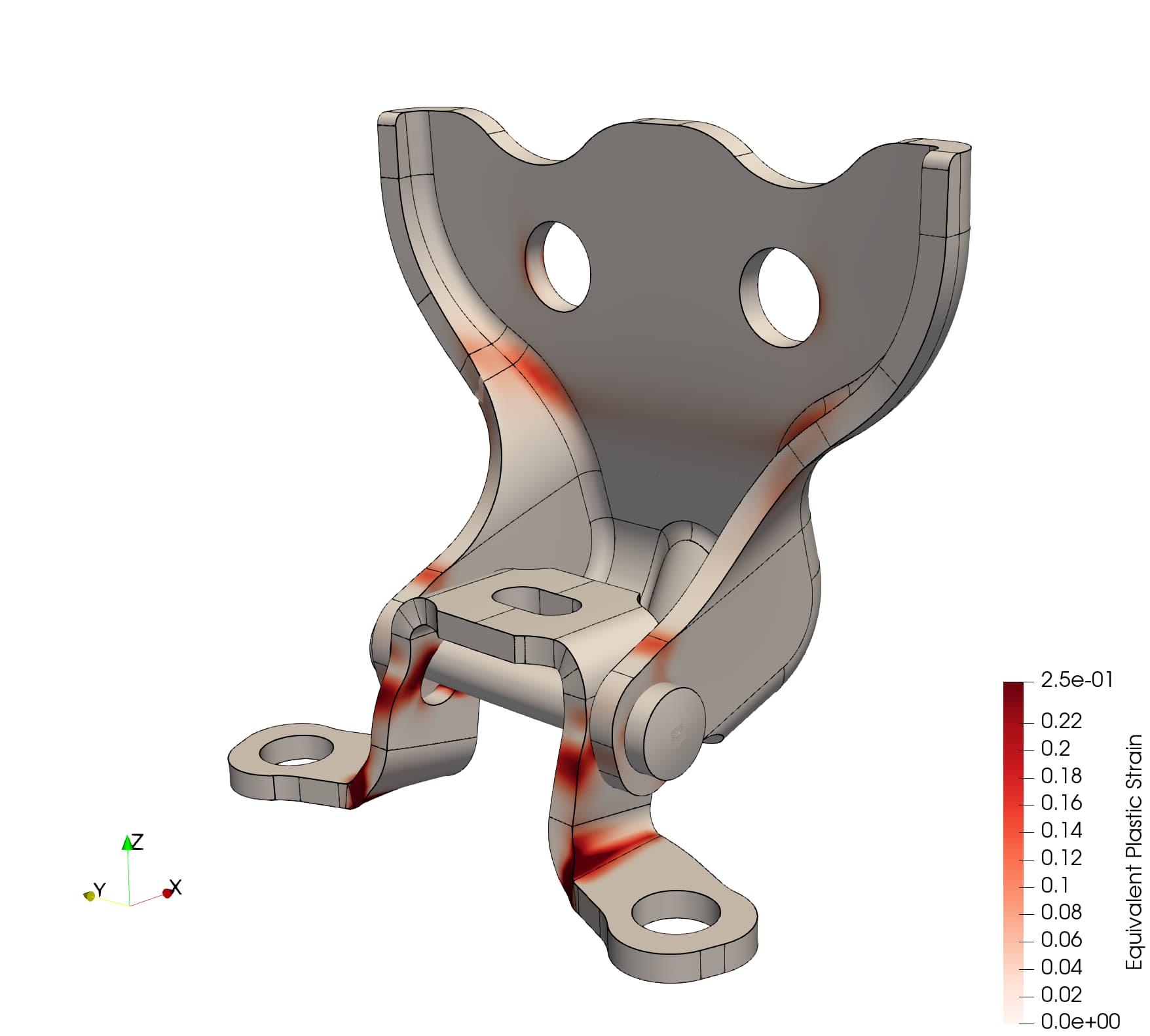
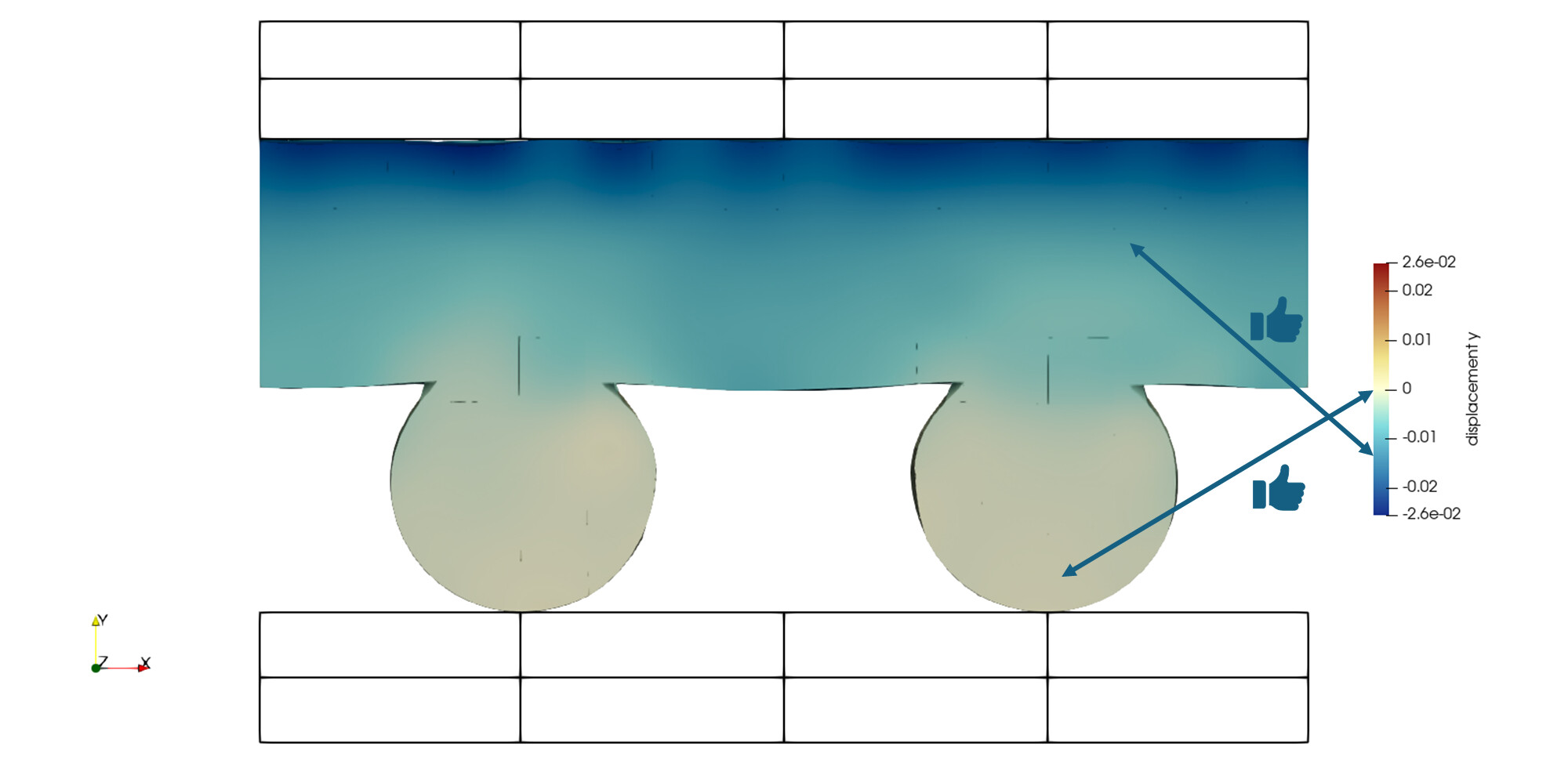
Centered, balanced
Taking the same FAST colormap, but centering it on 0.0 and then “balancing” the range to have equal negative and positive range on the colorbar. Sure, it doesn’t look as “pretty” as the other colormap, but it doesn’t completely lie to me – one could argue that the range of the colorbar might suggest a maximum positive displacement that’s incorrect. In practice I’d probably only use this with the “Data Range Labels” option.
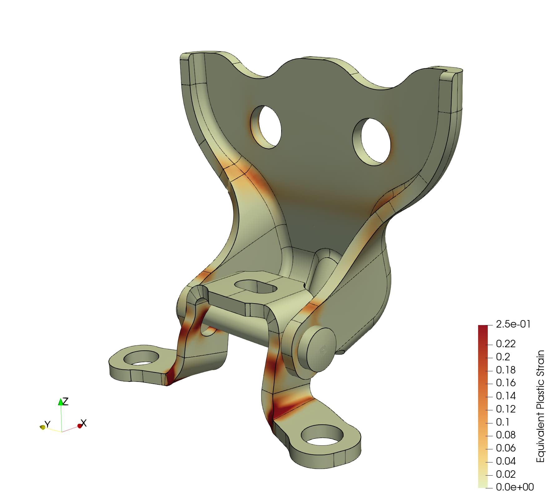
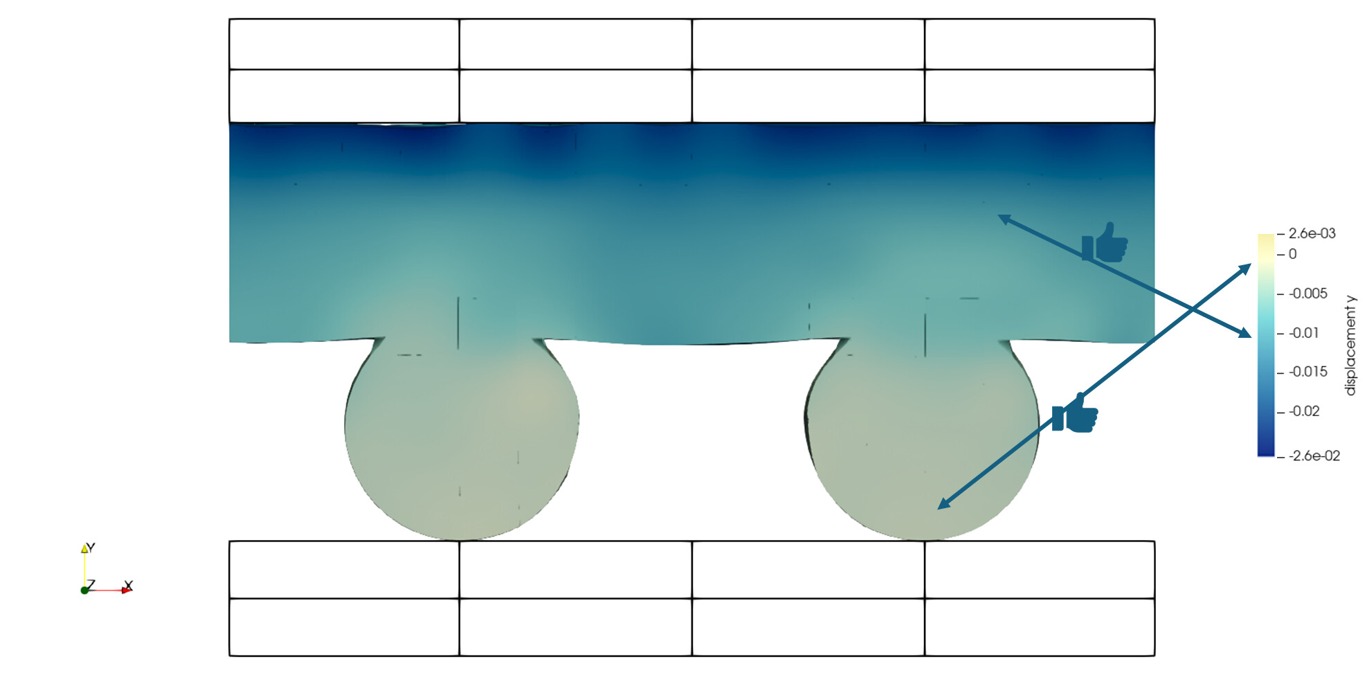
Centered, clipped
I’ve had to “hack” this image together, but the coloring should be equivalent to the balanced colormap above. The only difference should be that now the colorbar is “clipped” to the data range. This is especially relevant for visualizing variables that are restricted to \mathbb{R}^+, such as von Mises stress, velocity/displacement magnitude, etc. No lying at all.
While I can, as a user, manually set these colorbars as soon as I change the variable I’m plotting, or go to the next timestep, I have to redo all this work all over again. What I’d like to be able to do is set some persistent option(s) that “lock” my colormap / data range to one of these approaches.
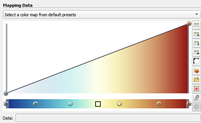
To support this, I would propose that it would make sense to add a locus to the colormap datastructure to be used as the center of the colormap. In the image below, I’ve used a \square to specify this point
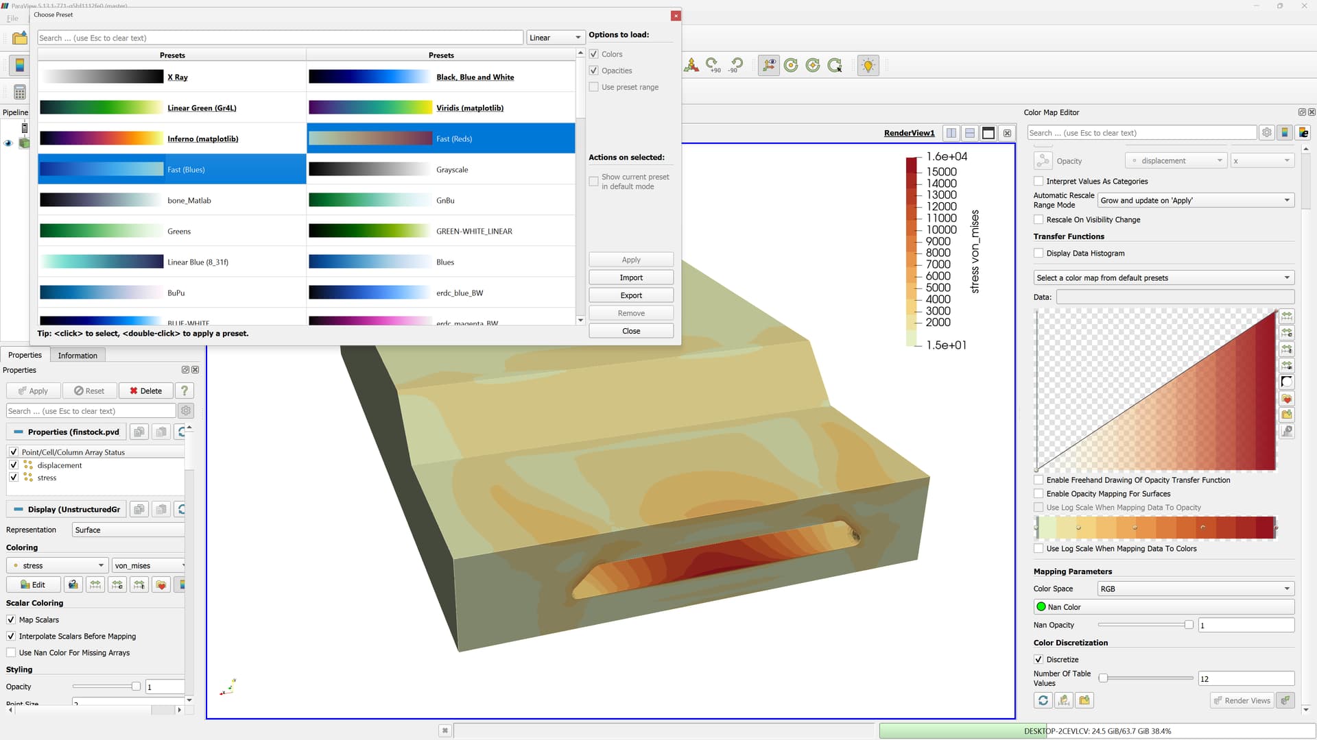
One thought for maintaining the “persistency” of the data-range / colormap is to modify the Custom Range popup to something like:
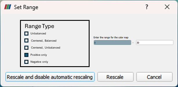
Note that here I’ve included further examples like Positive only which here is forcing the minimum to be 0.0. Obviously a non-zero positive number would work too, so some iteration of this idea would probably be good, but I wanted to start the discussion.
Thoughts?