No, I mean one that goes blue-to-white, and another that goes white-to-red.
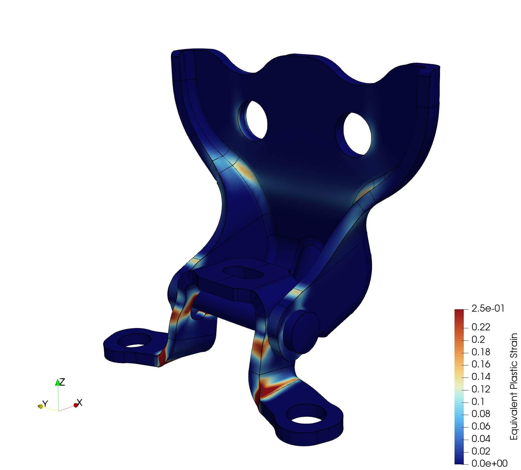
As an example, consider the below simulation of a door lock hinge assembly. Below is a plot of equivalent plastic strain which, by definition, only contains values [0, +inf]:
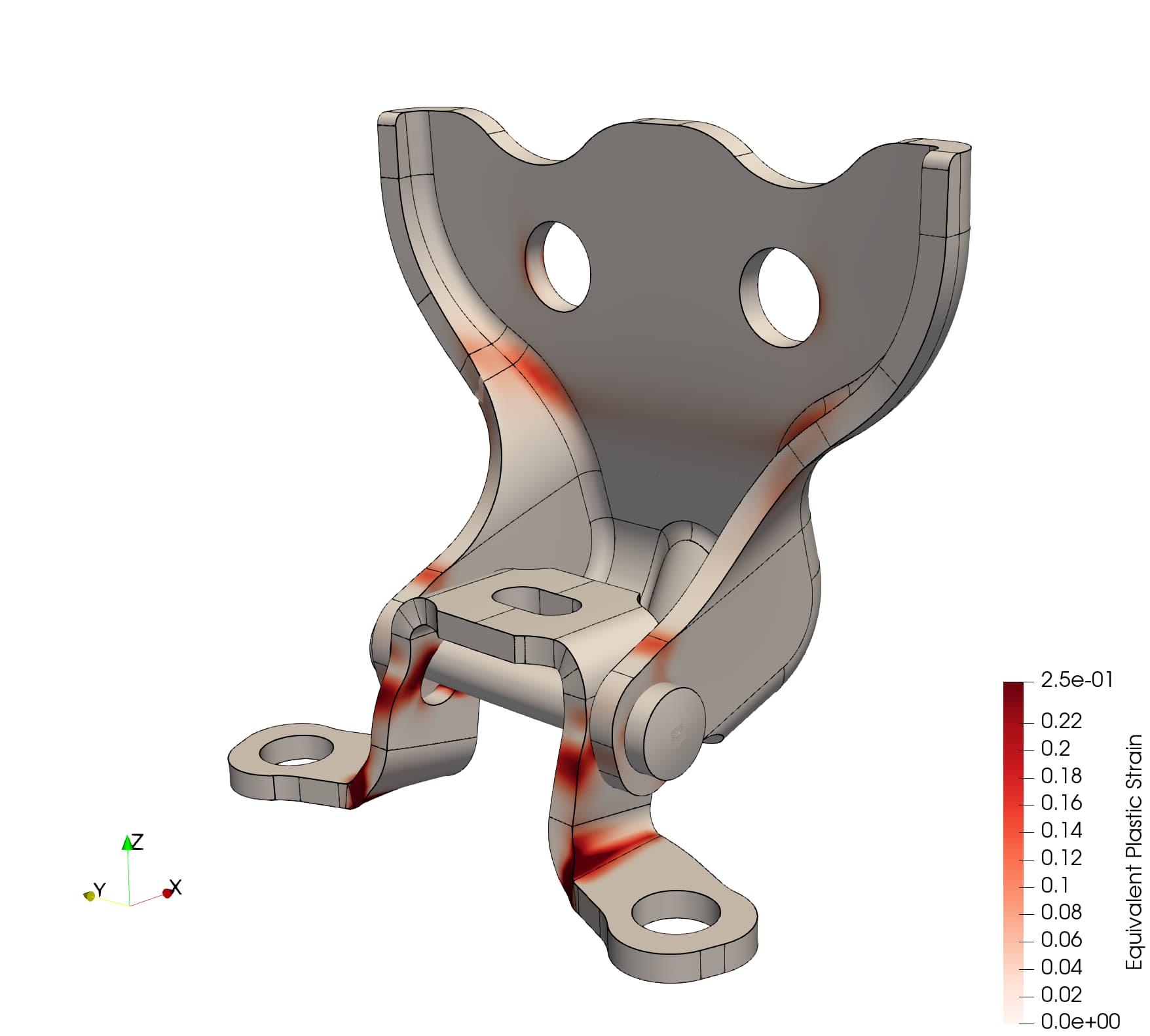
I’d rather show this as a linear colormap from white->red (here using the Reds colormap, inverted):
If we had a FAST Positive or FAST Reds (and equivalent for the blues) then I can guarantee that my contour plots will look consistent between plotting values constrained to either all-negative (e.g., \Delta T in a dissipative thermal simulation with no internal heat source) or all-positive (e.g., \sigma_{\text{Mises}}), and a plot of values that are not constrained/limited to one side of the reals (e.g., \sigma_{xy} )
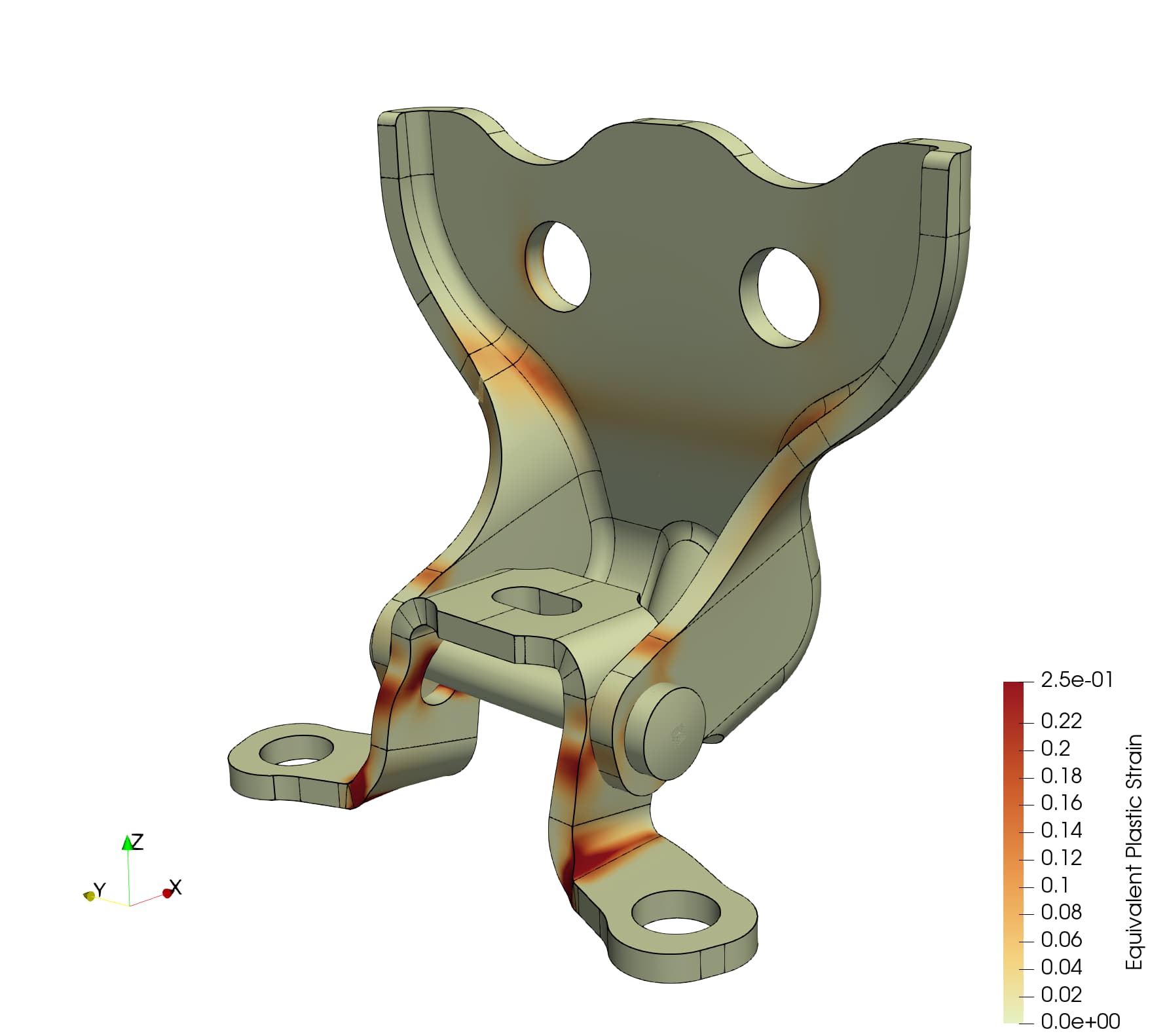
Here, btw, is what this looks like with FAST Reds that I created manually:
I know how to create colormaps manually (here’s a video I recorded to make the above colormap), but it’d be nice to not have to do this on every computer at my organization / every time I get a new computer / every new server / etc.