Allow orientation axis “box” to float off-page
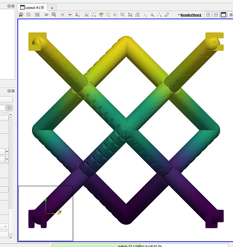
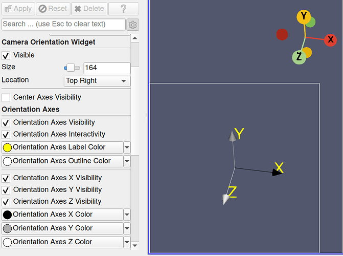
Note in the image below that the model obscures the “X” and “Z” text of the orientation axis. In general, it would be nice if I could move the orientation axis further left and down into the corner so as not to overlap with a model I’m rendering.
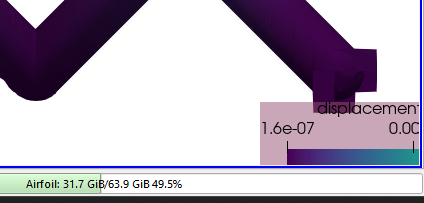
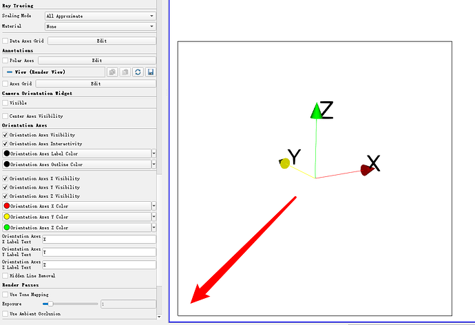
ParaView allows the user to move a colorbar “off-screen”:
and so it seems like it should be possible for the orientation axis as well.
Allow specifying thickness of axis lines
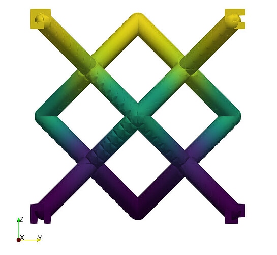
Especially with the use of a yellow axis line, it can be hard to see the arrow when against a white background – which I feel is a fairly common background color. It would be nice if, similarly to specifying line widths for rendered edges we could specify line widths for the orientation axis. Then it may be a bit more visible.
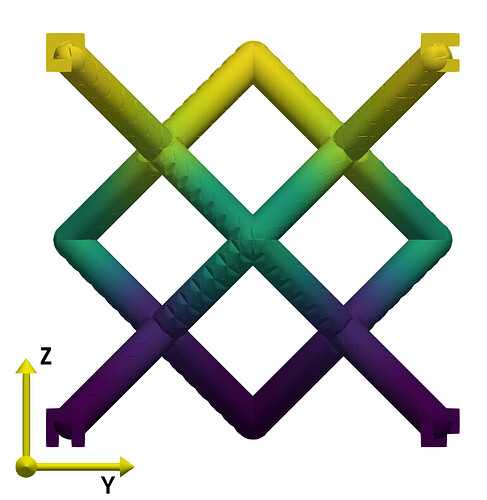
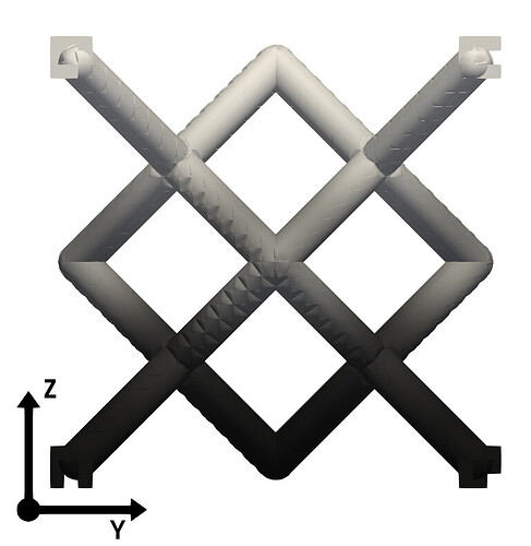
For example, notice how much more legible this axis is (constructed manually with Axes → Glyph + Text + Text sources) with the same yellow color but thicker lines:
Also, notice how this demonstrates the effect of having moved the axis “off-screen” (or at least its interactive box is partially off-screen).
Support user-specified colors
Similar to the above image, I often prefer an all-black axis – especially when making figures that need to be legible when printed in grayscale:
But maybe I want to specify unique colors for each axis. Would be nice to have.
