Hello everyone, I want to introduce you to the new plane widget. The new plane widget has been available on ParaView-master since December 15th, 2021, and it can potentially replace the old one in ParaView 5.11. Be sure to try it out with ParaView-master.
The main differences compared to the old plane widget are the following:
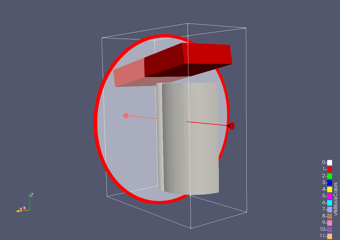
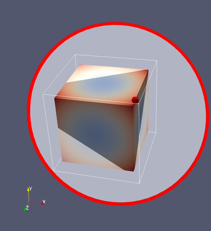
The shape of the plane is a disk instead of a quadrilateral.
The size of the plane’s normal arrow and the plane itself is relative to the viewport size and therefore changes adaptively.
The bounding box of the clipped/sliced data limits the maximum size of both.
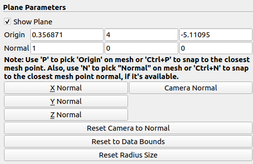
You can change the radius of the plane by dragging it, and you can reset it using the Reset Radius Size button.
The actors of the plane (disk, origin, arrow) are highlighted only when you touch them, and they are slightly larger, which leads to better interactivity.
The picking tolerance for the actors is also relative to the viewport size, which leads to better picking accuracy, especially when you zoom into a dataset.
Apart from picking/snapping the origin to a mesh point, you can now pick/snap the plane normal to a mesh point’s normal (normal snapping requires point normals).
The adaptive size of the new plane is particularly helpful when you clip/slice a mesh, zoom to inspect it and try to (slightly) rotate. With the old plane, this would lead to moving/pushing the plane instead of rotating the mesh. With the new plane, you can now touch the mesh, because the disk plane does not occupy the whole screen, and you can change the radius size.
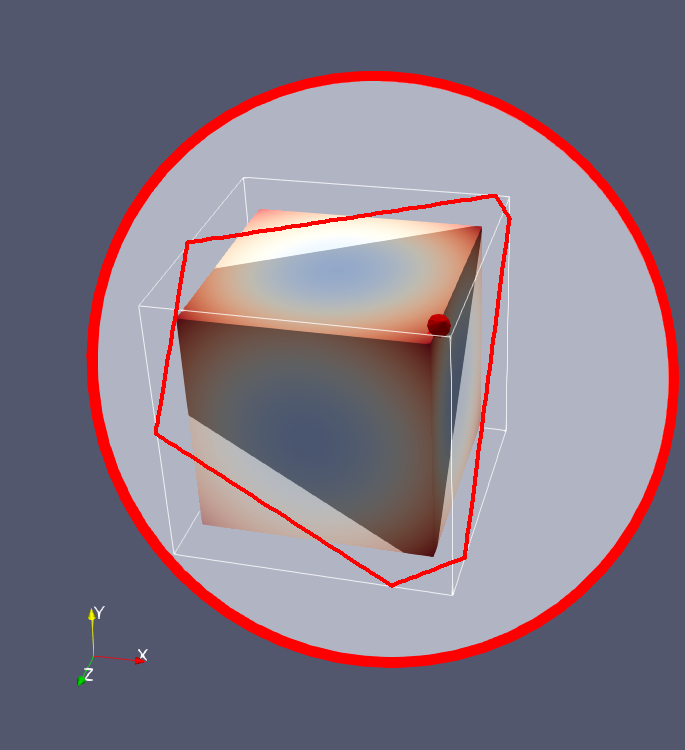
The outline that was used to clip the old rectangular slice has no use for the new circular slice, isn’t it? I propose to remove it as it is confusing - it looks like the outline for the data but slightly bigger.
My $0.02. I haven’t played with it yet, but many of these changes sound very nice. I am, however, a little leery about the switch from a plane intersecting the bounding box and a disk representing the plane. To my eyes, I’m having more trouble placing the disk in space than the plane/box intersection (even when intersecting the geometry). Maybe others are a having an easier time resolving the 3D location/orientation.
Is there a way to have both? Would it work to represent the plane as a sphere but also draw intersection lines in the outline? Something like this?
That is certainly doable and helps with the issue that you mentioned. Of course, the added intersection with the bounding box would not be interactive.
Do you think that by having both the disk and the intersection, we would confuse users as to which is the one that they should interact with? Maybe changing the color of the intersection could help with that.
Yes, if the intersection is not interactive, it would be best to be a different color. I would suggest making it a color that matches the shading. Alternately, instead of explicitly drawing the intersection, you could make the plane two different shades of gray (or probably more accurately, two different opacities of white): one for inside the bounds outline and one for outside the bounds outline. The interface between the two would be noticeable as a line but probably would not indicate interactivity. You could probably achieve that by rendering the plane twice: once for the disk and once for the intersection. The overlap would have more opacitiy.
Your initial comment made me think that you were suggesting to add just the edges of the intersection of the plane with the bounding box, not the plane too. If we have 2 planes that intersect/overlap and have different opacities, I am afraid that we might see weird visual artifacts.
Yes, my first suggestion was just drawing the lines. I’m just spitballing ideas.
Drawing the planes on top of each other might give artifacts, but I don’t think it should. You usually get artifacts from z-buffer fighting. But when drawing the transparent plane, you should probably be turning off writing to the z-buffer, in which case the colors will just blend on top of each other.
Thanks for the clarifications and ideas for improving the new plane furthermore! Let’s see what other people think about that, and we will decide how to proceed!
I mildly agree with Dan. Now, with a circle, and with Ken’s suggestion, and the object, we just have a mass of lines and objects. Maybe get rid of the bounding box? Maybe even make it optional, with a checkbox right below the Show Plane checkbox, default off?
I agree with Ken, I think. Having the outline/border of where the plane meets the exterior surface would be really nice. With regards to drawing the planes, … I am on the fence (assuming I understood…)