Paraview Animation Proposal
TLDR
This post describes the improvement plan proposed by the Kitware Europe Sci-Viz team regarding the animation feature of paraview. It is absolutely open to debate in any of its main points, which are:
- Smoothing the basic user interactions
- Rethinking the time values and the different modes
- Improving the smart/graphical editing of the animation tracks, especially camera movements
These proposals have been partly inspired by other softwares’ animation features, mainly Unity and KeyShot.
Before going further, let us define some terms that will be used all along the post:
- Keyframe: A couple time/property value registered by the user.
- Animation track: A set of keyframes on the same property that are interpolated. The track’s start is the first chronological Keyframe and the track’s end is the last chronological keyframe.
- Timeline: in the interface, it is the part of the animation view that displays the animation tracks and their chronological progression thanks to the time cursor.
- Time cursor: in the interface, it is the vertical black bar on the timeline. It sets the current animation time.
Smoothing the basic user interactions
These changes are non-breaking, either in terms of GUI workflow or python scripting.
Smart Timeline
-
The user can set the current animation time by a simple click on the timeline header
(Done in merge request https://gitlab.kitware.com/paraview/paraview/-/merge_requests/4397) -
Clicking and dragging the time cursor on the timeline immediately triggers the setting of the animation time. No need to release the mouse button anymore. This may trigger more rendering than the previous drag&drop interaction.
(Done in merge request https://gitlab.kitware.com/paraview/paraview/-/merge_requests/4397) -
The timeline can be zoomed in/out with the mouse wheel, depending on the mouse cursor position on the timeline.

(Unity snapshot) -
A time value label is added above the time cursor.

-
The animation time space (Start time to End time) can be resized directly on the timeline thanks to smart handlers.

(KeyShot snapshot)
Smart Tracks
-
Click and drag any existing keyframe on any track to shift it through time in the limit of the previous and next keyframe.

-
Click and drag a whole animation track along the timeline in order to shift all of its keyframes through time.

(KeyShot snapshot)
Smart Menus
-
A new dock widget replaces the old pop-up menus. This dock widget is linked to the current animation track selected in the timeline (therefore it introduces a notion of an active animation track).
-
Any animatable property can be right-clicked to add a keyframe at the moment pointed by the animation time cursor at the current value of the property. In case the corresponding track doesn’t exist yet, a new one is created. This is similar to the Animation shortcuts widgets that can be enabled in settings.
(Unity and Paraview montage)
Rethinking the time values and the different modes
Edit
Discussion about the Time Refactoring is superseded by this thread : ParaView Time Refactoring
These changes completely break existing GUI workflow and python scripts and may even not fully reimplement all features available in the previous implementation.
Reminder
Before going further, we remind you that Paraview currently interacts with three different time values:
- The current pipeline time.
- The animation time, usually the same as pipeline time unless modified in the timekeeper.
- The real time (in seconds) perceived by the user.
In addition, there are two types of animated data: temporal and non temporal data. Finally, there are three animation modes: Sequence, Real Time and Snap To Timestep.
The pipeline time entry can be modified using the variable time in the timekeeper. It lets the user modify it relatively to the animation time. It is only useful in the case of temporal data, since a non temporal data does not rely on the pipeline time, but only on animation time.
These settings are very flexible, however they are confusing and can have unpredictable behaviours for the user, especially in the case of non temporal data.
Changes
The following update plan relies on this goal : to unify all the existing possibilities under a real-time-oriented system, which is most of the time the expectation of the user. If the user still wants to configure the frames generation, or the variation of the pipeline time relative to the animation time, it can still be done as complementary parameters.
Now, here is the main plan:
The main idea is that the animation time and the real perceived time are now one and the same.
Animation time now has a unit, seconds (s).
The Real Time, the Sequence and the Snap to Timesteps modes are removed and replaced by a single mode.
This new mode has a Start Time and an End Time (in seconds) defining the animation time space. A FPS setter is available, letting the user choose the smoothness of the animation and reduce the number of frames if needed. The following picture only gives a general idea of this new interface.
There are some consequences:
- With too high a FPS, the computer will not be able to generate frames fast enough, in this case, we keep the animation time correct but reduce the number of frames and inform the user with a warning.
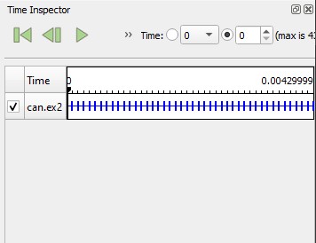
- When loading a temporal data, start time and end time are initialized to the min and max time values of the data. This will change how certain temporal datasets are played by default. This could cause issues with small time values (eg: can.ex2) or dataset with time values not in seconds (months, years). This can be fixed by modifying the timekeeper properties. We could imagine that this problem could be detected and fixed automatically with a variable time in the timekeeper.
- The previous mode “realtime” let the user speedup or slow down the animation, which will not be directly available with this new simple mode. This could be fixed by adding a multiplier setting to the animation time. 0.5 would slowdown, 2.0 would speedup, -1 would invert. This multiplier would apply to what has already been configured in the timekeeper.
- The previous mode “realtime” generated frames as fast as possible. This mode could be kept with a checkbox disabling the FPS setting and generating frames as fast as possible.
Use cases
Here are some different common use cases:
- The user wants to load a temporal data. It is the variation of the water level in a lake over a long time. His unit is in months, and the water level is tracked over more than 50 months. When the data is loaded, the animation is way too slow, since one month has been associated to one second in the animation time. To correct this, he opens the timekeeper widget and adds an entry to the variable time with the time set to 12,5 and the value set to 50. The animation will then run 4 times faster.
- The user is working on non temporal data. He has set many keyframes on properties that will probably slow down the rendering process a lot. The animation length is set to 5 seconds since the Start time is 0 and the End time is 5. The user has set 35 FPS originally. As he runs the play button, the user gets a warning next to the FPS setter and the frame generation scales down.
- The user has lidar data that is animated overtime and wants to move the camera on a camera path within the data. The camera path is correctly synchronized with the lidar data, however, the user wants the whole animation to move faster for communication reasons. To fix this, the user can speed up the animation by using the multiplier setting. He sets it to 1.76 and now the whole animation takes less times to be shown.
Improving the smart/graphical editing of the animation tracks
These changes are new features that may impact slightly GUI workflows.
Graph Editor
Each animation track can be edited through a graph editor. The user can add and modify the keyframes and their interpolations by manipulating the corresponding points and curves on the graph. If this is done well enough, the usual “keyframe table” could be hidden as an advanced setting and let the graph be the main way to edit keyframes.
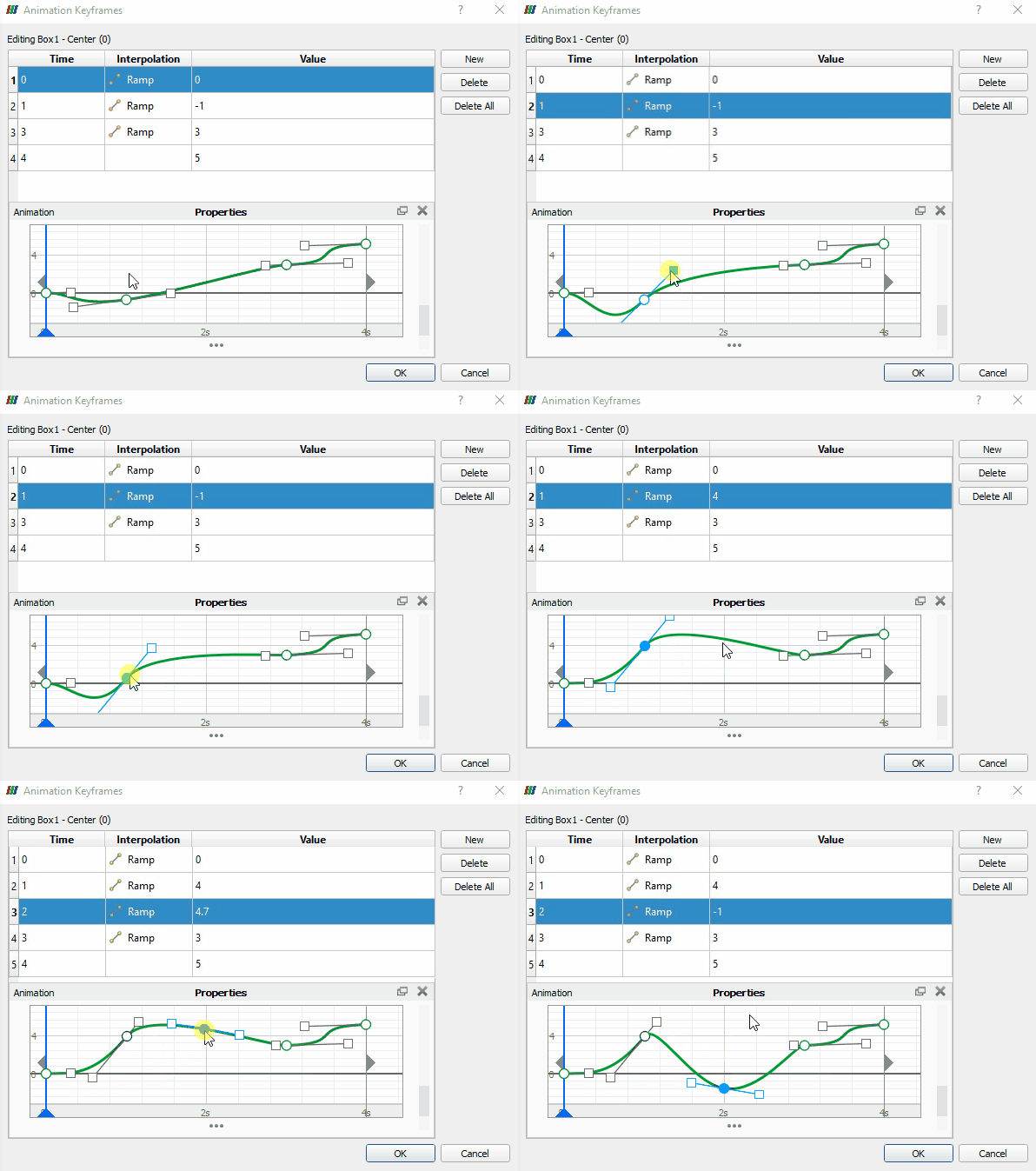
(KeyShot and Paraview montage)
Camera Animation Process
Camera animation tracks are a particular case among the properties allowed to be animated. As the current state of Paraview provides five different animation modes for the camera, they are often redundant and disunited while they have many things in common. Here is our proposition of a new unified process:
-
The user can open a wizard responsible for the configuration of Camera path presets. Many presets are available: orbit, panorama, dolly, follow data… The user can also load any custom path from file or field data from a source.
(KeyShot snapshot) -
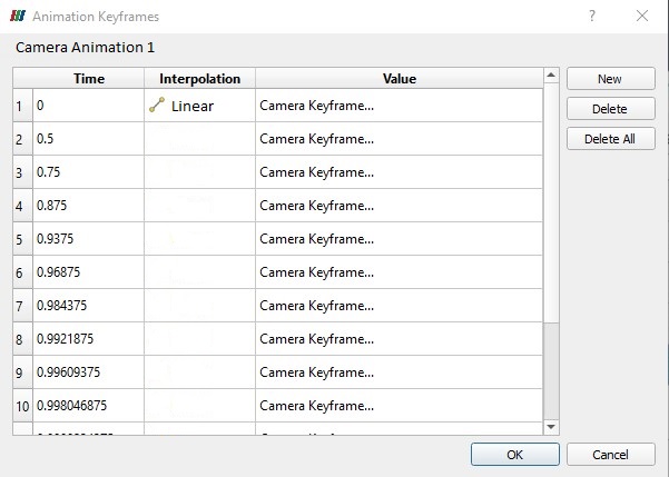
Once the wizard has generated this preset animation track, the user is free to modify its keyframes in the corresponding dock widget. This property widget is universal to any camera animation and as many details as possible will be available in a single Qt widget. The following picture is only a glance at what it could look like. We hope to make it more user-friendly in the future.
-
When not playing the animation, the camera path is visible as previously, however an interactive camera 3D widget is visible at each camera position. Adding a camera keyframe can either be done by manipulating a new camera widget on the path, or by saving the current render camera position.
-
Finally, a new type of view will be available to open from the camera property widget. This type of view will show the same camera path and widgets as said before, but will always render it from a fixed point of view, whatever the current camera position is during the animation.
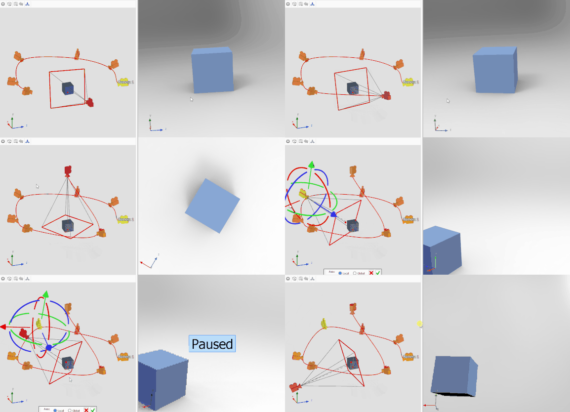
(KeyShot snapshot)
This post has been elaborated in team work with @mwestphal and @nicolas.vuaille.


