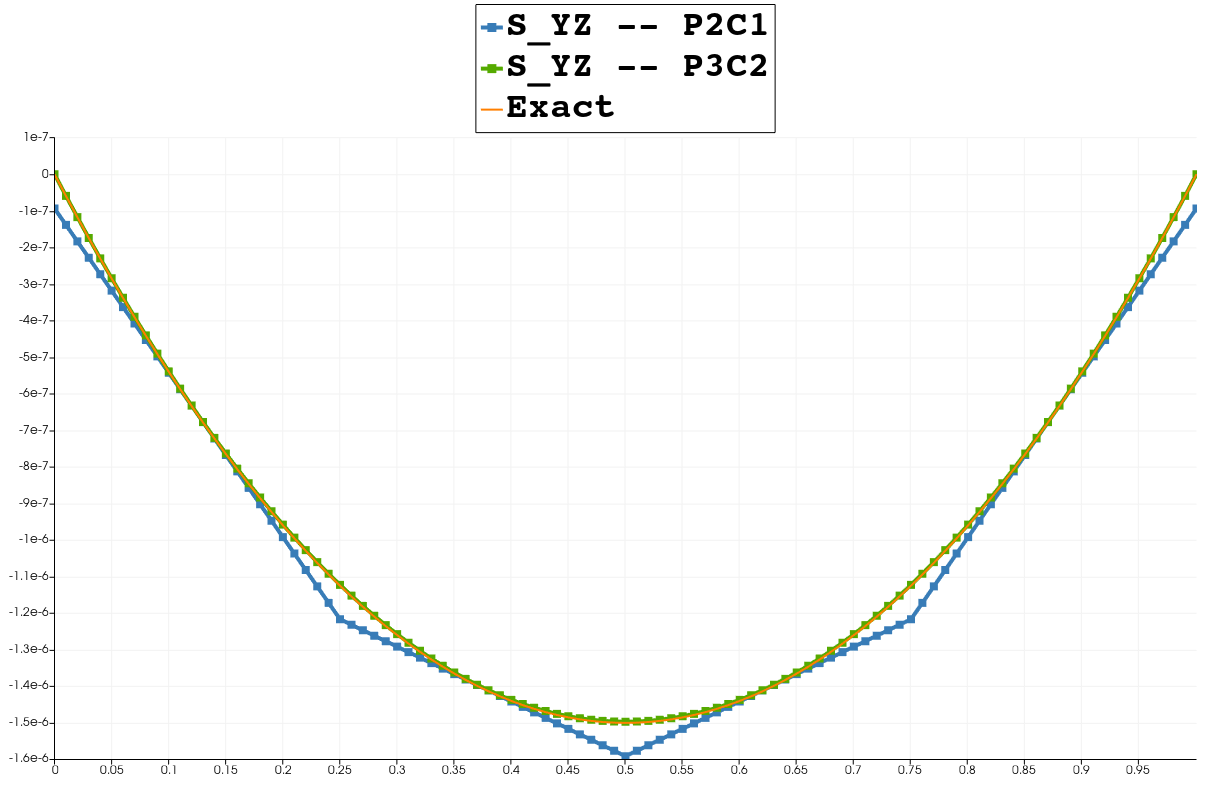
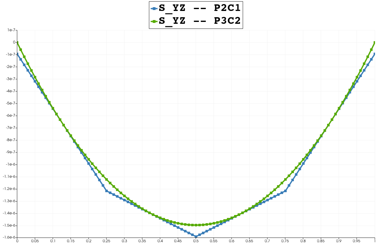
I was wondering today how to plot a known shear-stress profile against computed results. Came up with a solution, thought I’d share.
Let’s say I have the following data that I’ve created via PlotOverLine filters from a simulation solution:
And I want to create the actual function f(x) = \left(\frac{3}{2}\right)\left(\frac{-1e^{-6}}{1}\right)\left( 1 -\frac{x^2}{0.5^2}\right) and plot it on the same chart.
It seems like the easiest way is to:
- Apply a
Calculatorfilter to thePlotOverLinefilter- Use the
arc_lengthvariable as the independent variable, this variable is generated by thePlotOverLinefilter
- Use the
- Apply a
PlotDatafilter to theCalculator- The
Series Parametersdata array to plot has the same name as specified in theCalculatorfilter’sResult Array Namefield.
- The
Note that since arc_length is in the range [0, 1] and I know that I need x = [-0.5, 0.5] I had to shift my function in the Calculator filter:
( 1.5 ) * ( -1e-6 ) * ( 1 - ( ( ( arc_length - 0.5 )^2 ) / ( 0.5^2 ) ) )