One of my favorite UI/UX aspects of ParaView is the filter search menu (Ctrl+Space on Windows). and with the recent discussions about various improvements I started thinking about if this quick search could be even better utilized.
As I understand it, this menu is limited to only pipeline filters (indeed it can also be launched from the menu bar at Filters > Search). If possible, I suggest:
Adding most menu bar actions (Open File, Save State, Connect, Manage Plugins, Python Script Editor, etc.) to this search widget
Adding any important actions from the various toolbars (Edit Color Map, Rescale, Zoom to Data, Set View Direction, etc.) to the quick search menu if they aren’t available from the menu bar options
Emulate/mirror the properties panel search behavior directly inside the quick search. And perhaps also map “Esc” to clear the properties search text as long as focus is anywhere within the properties panel widget/frame, instead of only when within the search bar itself
I’m basically suggesting converting the filter search menu into a generalized command menu akin to the Ctrl+Shift+p menu in Windows Terminal. I know I’ve seen other tools with a similar menu but can’t think of any more at the moment…
While I think the other recent proposals should still be considered, I think opening up the search menu would make a fantastic alternative to finding/triggering actions and alleviate a lot of issues at once.
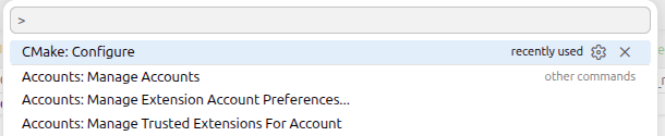
Theodore, I really like this idea. Visual Studio Code has a similar Ctrl+Shit+p chord to bring up a menu of commands filtered by search text.
It would take some thinking of how to keep some of the nice things in the filter search dialog such as showing the description of the filter, why it isn’t available, link to help, etc. but that doesn’t seem insurmountable to me.
I think also that having a pop up to display command could be nice, in term of interface it could be like the quick launch but we should not mix them IMHO (this is what vscode or lot of other IDE already do).
For example, Ctrl+Space shows a Quick launch but only for filter where doing a Ctrl + E will shows a Quick launch but only for command etc…
Also if we move forward in this direction, we should also think to a way for new user to discover the Quick Launch and other shortcut more easily
Maybe there’s logical and/or technical reasons to have a few separate menus, but I think generally the fewer the better or the less effective the overall changes are. If the goal is accessibility/discoverability/ease-of-use I think it would still be annoying to have to keep mental track of which key chords open which menu, which commands/features/filters/options/properties are covered by which menu, etc.
Yes! That’s one of the others I was blanking on. I haven’t used VSCode much but it felt like I could do almost anything from that menu.
Another similar tool is the Command Palette in Microsoft PowerToys. Win+Space to launch a search/filter menu to find files, launch applications, shut down, etc.
As a huge fan of the filter search feature, I love this idea!
I like @theodorebaltis suggestion but this is the first thing I thought about: wouldn’t it be confusing to mix filters and other commands in the same search menu?
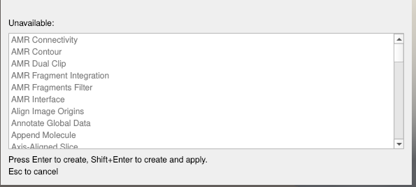
I really like the new filter search dialog with the available/unavailable filters, description, etc…
For me it does exactly what I want and it provides the information I need.
I have a hard time guessing what would be the most intuitive between a search menu for everything or 2 different search menus for commands and filters.
Yeah, I don’t think mixing them would be a good idea, we mix different concepts if we do that. Also quick launch is really nice because we can applied a filter… faster! If we add command in the same mode, to create and applied a Clip, maybe a user will need to write the full name of the filter now which would not be very nice.
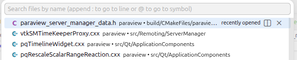
For vscode, here is what I have if I do a ctrl+p (pop up to select a file):
When the pop up is display we can switch between each mode “select a file” and “execute a command” thanks to the character “>” at the beginning of the line, maybe we can have something similar ?
I also agree that this is an interesting proposal. If this is implemented, I personally think it would make more sense to mix menubar and toolbar actions together with adding sources/filters. As a longtime ParaView user/developer, I know the difference between showing a contour and showing a volume rendering. But that is a distinction that may leave less experienced users confused where to go and requires extra thought for those experienced users. Besides, adding filters is part of the menubar, so why not have them together?
I like the analogy with the vscode command bar. I use that a lot. However, I don’t think the distinction between “select a file” and “execute a command” in vscode is quite analogous to the distinction between “add pipeline object” and “do GUI command”.
More generally, vscode is separating “go someplace” from “do something”. The “do something” in ParaView would be the combined add filter + menu items + (many) toolbar buttons. The “go someplace” might be to find a parameter that can be manipulated. For example, if you typed “opacity”, it would quickly take you to the opacity display parameter of one of the existing pipeline objects. I don’t know how that would work, but it would be pretty useful. There was just a discussion at Proposal : Improve Properties Panels about how the search panel on the properties panel is useful but inconvenient enough that people don’t use it.
another improvement for the filter search, is enhanced error messages! this would be awsome.
I made a feature request a while ago: smarter messages 'error/warning' errors when searching a filter
a lot of times, in paraview, we have issues as users, where we are working with new data and a specific filter that we commonly use it is grey out and we can not apply it to the data.
at least in my case, most of the time it is an issue of multi-block data.
Today, paraview checks if the data type is correct, if it is , then it allows to use the filter if not it tells you, you need this kind of data, what i would suggest are two possible solutions:
that paraview checks the input data, and tell you in the message for example, ‘hey this is vtkMultiBlockDataSet, you need to use a vtkDataSet, for this one can use extract block filter’. this will point the user in the right direction on where to go.
that when using a filter, there would be two options (or like right now select the filter->use it directly + warrning message). where it will auto apply extract block, and then apply the corresponding filter. and prompt a message ‘the input data was modified by X filter to enable the use of X2 filter’ and one could add a ok/cancel (and do not show this kind of message anymore checkbox). this would basically do what 1. suggest directly to the user.
I have came across this situation where the filters are grey out quite often, I also should note that generally the solution is quite easy to find, or even i do it automatically as i was not checking the datatype, but this is something that could be polished and nice. (even the second option could be implemented not only from search filter but when selecting a ‘grey out filter’ that now could be instead colored in orange or something like that?)
do it for absolutely the hole family of filters would be a lot of work but at least the most classic filters used.
Hello,
I have a last enhancement/idea for the search bar.
have a checkbox ‘autoapply filter’. my reasoning behind or where i found myself with this:
by default i do not use autoapply, as sometimes i work with large datasets so i have this option turn off.
on the other side, if i want to use the search bar, chaining one after the other, lets say: create sphere-> apply transformation, I would:
hit ctr+space
type sph
hit enter
apply it with the mouse
hit ctr+space
type tran
hit enter
apply it
if i dont do 4. then everything other than sources will be greyed
so two ideas comes to my mind:
when using ctr+space over a selected filter it will automatically be applied (personnally would be the best solution, but if the user was looking to use a ‘source’ that does not require application of the selected filter, could be annoying? also for a user that does not automatically apply, would ask himself why they are being applied) or at least suggest to apply selected one?
add a checkbox to auto apply only in this context of ctr+space?
I dont think any of the two options is optimal, but i dont see a better solution for this rought spot