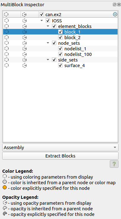
When working with vtkPartitionedDataSetCollections or vtkMultiBlockDataSets , the MultiBlock Inspector proves to be an invaluable tool. This widget empowers you to effortlessly toggle the visibility of distinct blocks within your dataset, offering options to customize their colors and adjust opacity levels. The present appearance of the MultiBlock Inspector is depicted below:
Color Modification: In the first column, simply double-click on the circle to access color editing. This allows you to define the color for the chosen block, encompassing its associated children if applicable.
Opacity Adjustment: In the second column, perform a double-click on the circle to initiate opacity adjustment. This facilitates the setting of opacity levels for the selected block, along with its subordinate children, if present.
Visibility Editing: In the third column, conveniently toggle the checkbox to control the visibility of the selected block and its potential offspring. This option provides a straightforward way to manage visibility settings.
Advantages of this design:
Instant Color Insight: Swiftly discern the block’s color status, including any alterations made.
Opacity Recognition: Rapidly identify whether a block’s opacity has been adjusted.
Efficient Interaction: Each modification requires a simple double-click action, ensuring a speedy access to the UI for color and opacity adjustments.
Drawbacks of this design:
Cumbersome Property Addition: Introducing an extra changeable property mandates the addition of a new column, potentially cluttering the visual layout and posing significant developmental challenges.
Limited Bulk Editing: Inability to apply property changes to multiple selected blocks, assuming they share the same parameters during selection.
The community has long been requesting the ability to color blocks using various arrays, a feature that has been overdue. This demand has sparked discussions about overhauling the Multiblock Inspector to not only fulfill this request but also to address the drawbacks of the current design.
@jaswantp recently completed the required work at the VTK side for enabling the change of several mapper related properties of composite datasets at the block level. It’s now time to expose these properties to ParaView through the Multiblock Inspector.
For this reason, we have designed a mock-up on how the revamped Multiblock Inspector could look like to address the aforementioned drawbacks and feature request.
Parameters Modification: In the first column, click once to enable the editing of the properties of this node (and its children if any), and unclick to reverse the settings
Visibility Editing: In the second column, conveniently toggle the checkbox to control the visibility of the selected block and its potential offspring. This option provides a straightforward way to manage visibility settings.
Advantages of this design:
Easy Property Addition: Introducing new per-block properties is easy very straight forward and easy to implement
Possible Bulk Editing: Performing bulk edits to many selected blocks, assuming they share the same parameters during selection, it’s possible to be implemented. Although, for the first pass of this work, this won’t be implemented, because a performant way to compare properties of several blocks needs to be found, so that interactivity is not hampered.
Identical with Representation parameters: the per-block properties UI is identical to setting properties of the whole dataset through the representation settings.
Drawbacks of this design:
Not Instant color or opacity changes Insight: You can’t know if the opacity or the color has been modified, or the changed color, but you can know if any change has been performed in general.
Any input or insight or suggestions is more than welcome.
Some more things to consider in the long term (not the first iteration):
search and multi-selection: it would be nice to have a search bar at the top of the assembly to let users filter blocks by a string and select many of the blocks at once. Of course, this requires some thought about what to show when not all of the selected blocks share the same value for a property shown in the editor at the bottom.
use a badge to the left of each block to show blocks with identical property settings. The badge could be an identicon and could be used to select all identically-attributed blocks in the assembly.
let users choose representation style (surface, surface-with-edges, glyphs, etc.) on a per-block basis. This is a frequent request for many CMB users. This would also require more support from the representations on the server in addition to a UI.
search and multi-selection is an interesting idea, but as you said it will need some thought as far as how to implement it.
show blocks with identical property settings is something doable for sure.
choosing representation style is something that will need a complete redesign of how representations work in paraview based on how i understand them. Although it’s a useful feature, it’s outside the scope of exposing VTK properties to ParaView.
Overall, +1. Is consistent with Display properties – consistency is always good. However, this does have another drawback (besides the ones mentioned): it is unclear how to only override one of the parameters without affecting the others. e.g. how would I go about overriding color without overriding opacity? This becomes especially important as additional properties start getting added.
Another thing to keep in mind is adding support for selector expressions when specifying properties. That won’t be possible until PDCs become the default, however just planning for it when refactoring these components may be a good idea.
I had the same thoughts regarding the drawback you mentioned, but in my mind, if we don’t want to add extra columns, i can’t think of any other way to selectively edit only 1 property, as we do now.
Now we have only 2 properties (colors and opacity) and we want to add a bunch more, which, in my mind, it means that we need to allow the user to edit all these properties at once, and not do something special (double click) like we do now. Of course, all properties, once you decide to edit them, will have as default what the whole representation has.
True, but overriding properties has major implications: so overriding all properties when intent was only to set one of them is really not a good idea. Simple use-case, I want to change opacity for a specific leaf node and leave all other properties to be inherited. The advantage is that if you change parent’s color in the future, I know my leaf will get that color automatically. In this new approach, we have a problem…the leaf’s color won’t track the parent nodes color and I will have to manually update it. This can get very problematic especially as you add more properties.
I am not suggesting separate columns is a better approach. I am suggesting we need to explore options for how to let user override only the ones they want to override.
Is this because the property widgets always force-set proxy properties on display. Isn’t there an option for these properties to opt out of the initialization? If not, can we add one?
Spiros, definitely talk to Kitware’s UI/UX people, if you haven’t already!
Two things that SMTK does to handle this type of issue:
display in the widget if the value is the default, or inherited from the parent. For line-edit widgets we use a yellow background, that changes to the default white if the user edits it.
Use a context menu that allows the user to “reset to default”
I do think a context menu might be useful here, but I don’t think the yellow background indicator will help.
One thing I’ve seen done (in Visual Studio?) is having an explicit lock icon, maybe in front of each row/property, which starts locked with the property disabled, meaning that it is inherited. The user clicks the lock to unlock it, and now the property editor is enabled, and no longer inherited. Click the lock again to return to inherited.
After discussing with Kitware’s UI/UX team, we figured out that the best way to accomplish what @utkarsh.ayachit is saying, i.e. edit only one property and do not push all properties, is the following:
The first column will be just an indicator if something has been edited or not (and maybe ctrl+click to reset all properties), and all buttons/checks/line edits would be disabled by default, therefore they are not overridden. To edit any of these, you would have to enable them by clicking once, and then act as usual. Τhis way we maintain the same number of clicks to perform an edit. To reset one property and disable it again, you would have to ctrl+click.
My only hesitation with that plan is that Ctrl+click is not very discoverable. At least the tooltip for each UI element should mention Ctrl+click is available to reset to the inherited property. I don’t think adding another UI element to reset to default is necessary.
Instead of ctrl-click, why not have a visual element (like a checkbox) next to each property widget indicating whether that overridden property is activated?
Right now, ctrl-click is how you reset the settings, so users are familiar with it.
Aside from that, adding a checkbox would introduce visual clutter IMO. Think of the case where you have a Boolean property (therefore a checkbox) and a checkbox to it, which one do you click?
Another idea was only when hovering over a property/button to show a lock which if you click it would be unlocked, and if you click again, it would be locked, but personally, i have no clue how to implement a tooltip with buttons in Qt, neither how much time it will take me. So, i don’t want to spend too much time trying to make it beautiful.
I’ve been using ParaView for over 20 years, and I didn’t know this was a thing. I just tried ctrl-clicking in a bunch of places in the GUI, and I still don’t know what this means.
This is a good point, but solvable. If the activate widgets were aligned in a column and if the associated widgets were grayed out when inactivated, it would be immediately clear which widget did what, even for boolean checkboxes.
Also, I said like a checkbox. It doesn’t have to be a literal checkbox widget. To make things less confusing, it can, for example, be a lock icon that open and closes if it is activated or deactivated. That is like what you just suggested, except you don’t have to wait for a hover event to pop it up.
I am talking specifically about the MultiBlock Inspector, if you want to reset e.g. a color, you ctril+click to do it.
Sadly, the widgets/properties/buttons i am trying to provide to the user (same as the ones in the representation) are not aligned in a column.
Checkbox is indeed the worst possible choice which creates the maximum confusion. A lock icon would be better, but it would add a lot of visual clutter to the GUI (for every button and property).
They’re not? I guess I got confused. I thought when the GUI was generated from the XML specification, it was arranged in a straight vertical list. The GUI elements look to be arranged in a vertical column in your mockup (with the exception of some rows like the color edit buttons, but those could be grouped together with the same lock toggle).