Hi everyone,
the PV user interface could make better use of the available screen estate. In contrast to Blender, I always have the feeling there is not enough space in the PV interface. For example, a range widget uses up a lot of unnecessary space:
Blender makes better use of the available screen space by using compact widgets:
So I was wandering what people think about converting the existing widgets to such a format. If there is interest I would put together a prototype, but I wanted to get some feedback before I spend time on this.
I assume you are referring to the properties tab. Further, I assume you are talking about horizontal width.
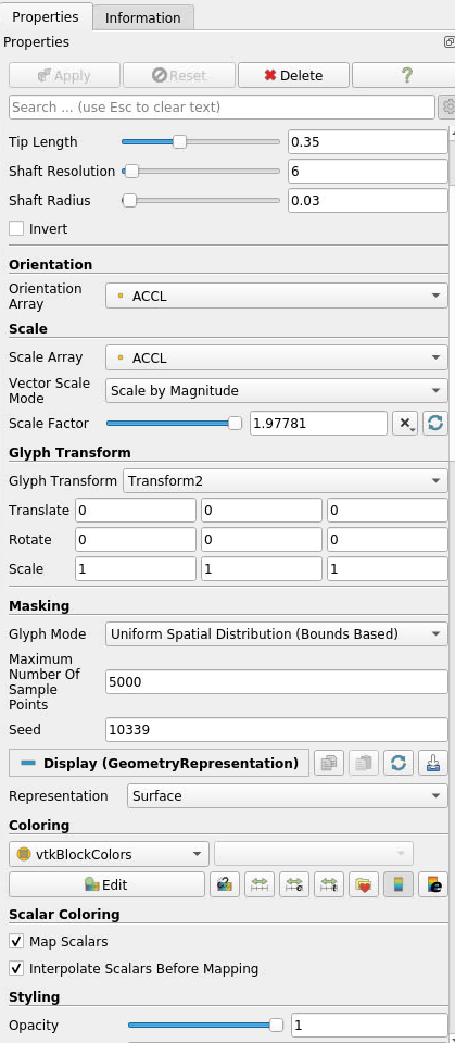
I don’t think slider bars are the issue. Our problem is we have many objects that are very wide, and possibly should be made narrower. Here is a screenshot of Glyph.
I also think there is utility in having a slider bar. That doesn’t mean it needs to be as wide as it currently is. For instance, input boxes are frequently insanely wide. I don’t know how to fix this however, as a user may actually want a scale factor of 1.23456789
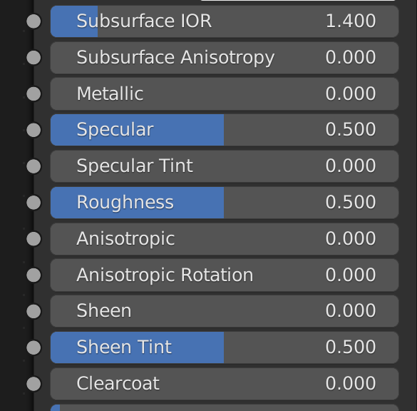
Thank you for your reply @wascott. I completely agree. The properties panel you show is already pretty wide, and if you would decrease its width the sliders would become super small until the handle is not really usable anymore. Blender widgets basically work in the following way:
Show the value of a property on the right
Show the label of the property on the left (cut off the label if it would be above the value text)
If a user performs a single mouse click on a widget then the widget switches to a normal text input. After the user entered a value the widget switches back to the slider representation.
If the user clicks on a widget and then starts to drag the mouse to the left or right the widget behaves as a slider widget. Even when a property is not a range input, the user can still change the value by dragging. The only difference is that the background is always gray since there is no min max value to encode a bar.
Here is an updated screenshot that shows text-cutoff and the text input:
If text is cut off one can still see the complete name as a tooltip. Of course, if a property has an extremely long name like Maximum Number of Sample Points we should try to find shorter names and maybe move some text to a group label. For instance, the Orientation Array property is directly below the Orientation group, so one could argue to drop the prefix of the property name.
While I agree with the sentiment, we are working with two constraints here.
Should be doable with Qt widget easily
Should be generalizable enough to be automatically generated from xml
The blender example is very nice but implementing all the required widgets using Qt is a big endavour, and this is hard to do iteratively.
That being said, if you want to give a go into implementing a drop-in pqDoubleVectorPropertyWidget that you can replace the current one with, that would give the community something to look at and see if we can just overhaul the UI this way !
HI Jonas,
I like your idea of incorporating the text and title within the slider. I too have noticed that I have to expand the Properties window to accommodate all the text and controls. I would like to see you implement the drop-in that Mathieu is talking about, so we can see what it would look like within ParaView.
That being said, the general look and feel of the controls should not be changed too drastically at this point. To further clarify this, the color scheme and general lay-out of the controls should remain constant at this time, in my opinion. This is because ParaView just went through a major interface change when the IOSS reader was implemented.
Respects range limits (pqDoubleLineEdit ignores those)
This is intentional, range limits are soft and should stay that way. Ideally, a XML param should let user decide if its soft or hard, but everywhere in paraview should be soft except when a clamp macro is used in the VTK setter behind.
Also, keep in mind that the precision of the double edit are very important in ParaView and should be similar as it was before.
Hi everyone,
here is the result of the latest prototyping:
As requested by @mwestphal the ranges are now soft.
Same as in blender, as soon as one starts to drag a value the cursor becomes hidden and reappears after at the location where the drag was initiated.
It is even possible to drag values when no range was specified (see center property in video). Very handy to adjust a value without having to use a keyboard.
The new NumberVectorProperty now also replaces IntegerVectorProperty (see subdivison property).
I also replaced the default checkbox (bool property) with a toggle button. This also frees up a lot of space. The goal is to place multiple toggle buttons in the same row to save even more space.
The question now is to where to go from here. Such a huge change in the UI will require a lot of testing on different operating systems and window managers. I’m also not sure about @mwestphal comment about the precision of the numbers. To support integers I use the same widget as for doubles but with 0 decimal places. This way I do not have to duplicate a lot of code, but is it ok to that the widget internally manages a double which will then be cast to an integer?
Hi Jonas,
I love it with the one exception that the precision of the numbers can be integers in some cases, but I know that while working with ParaView, some numbers need to be between 0 and 1. In theses cases the precision needs to be much greater. The display should reflect this when the values are updated. it would be nice to have them update continuously so the user can see what the value it is as he is dragging the bar. But I am just thinking out loud here, it may be better just to have the image update as the bar is dragged and then the number displayed. As an alternative, the user should be able to enter the number directly as well. I also agree about the testing, as it would have to be tested extensively.
Thank you for your response @phismith. I forgot to mention this but of course you can enter the number directly as usual in any precision. While dragging the value will be increases/decreased by the singleStep member variable, which has either been defined through a domain, or is 0.1 by default for doubles and 1 for integers.
Hi Jonas ,
I like the new design a lot (!) at the exception of how you represent a boolean. I don’t see how replacing a check box by a button free up space : the horizontal inner padding of your button is often as wide as the place of a checkbox (which is usually tiny), and a button takes more place vertically. Also to take Blender as an example they are also using checkboxes instead of buttons and I think the state of the boolean is more readable this way.
Otherwise I’m all for seeing this in ParaView !
Hi @timothee.chabat, you are right for a single boolean, but imagine you want to put three boolean properties in one row. In this case this will look weird with three checkboxes + text in contrast to three toggle buttons (of course just my opinion).
I understand your point but I never saw a vector of boolean so far (I’m not even sure it is supported by the widget generation code) , and even if it’s a thing it’ll always be a very small fraction of booleans property. Also if we really want to optimze space for a vector of boolean we can always add a specific widget and code path for booleans when number_of_elements != 1
Sorry I was unlear. I think in the future we could add something to the PropertyGroup xml elements in which one can specify that properties could be arranged in one row. For instance to put these buttons next to each other:
Right, these buttons are actually a good example of your point … mmh you’re right but I’m still a bit reluctant to replace check boxes with buttons. Also after re-reading what I’ve typed I don’t think it’s a good idea to have both buttons and check boxes in the same application to represent booleans anyway. Well let’s see what the others say since I don’t have an alternative solution to propose yet

