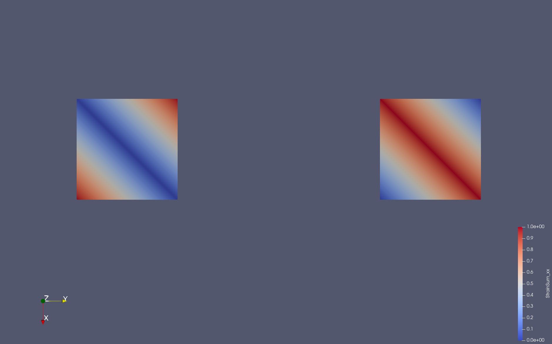
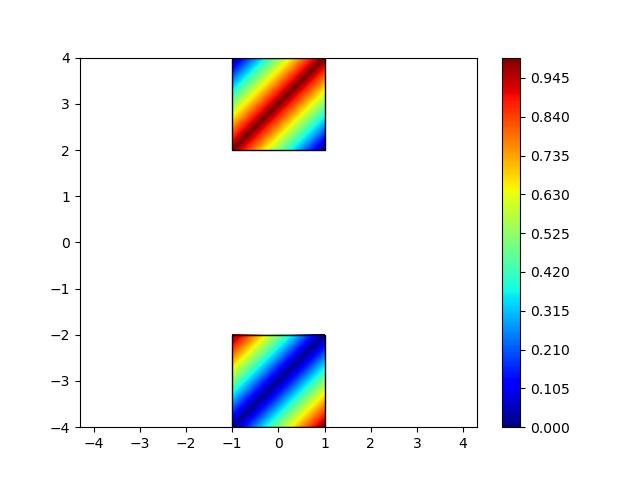
I’m a green hand of Paraview. I have a test dataset (UNSTRUCTURED_GRID) that is symmetic about the x axis, however the contour is unsymmetric rendered by Paraview. I am puzzled and can’t find out the reason. The followings are the contour and dataset:
Thanks for your suggestion.
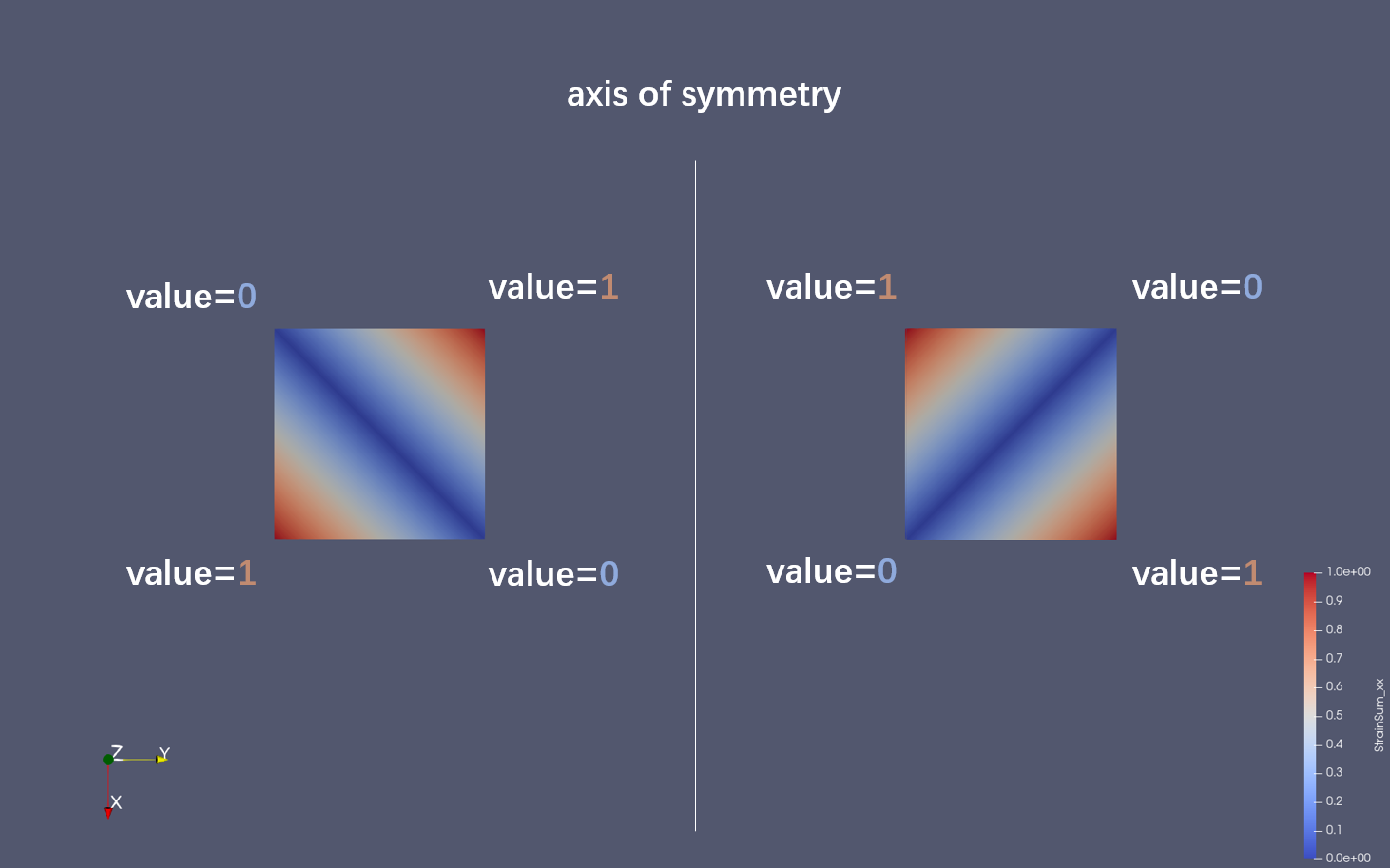
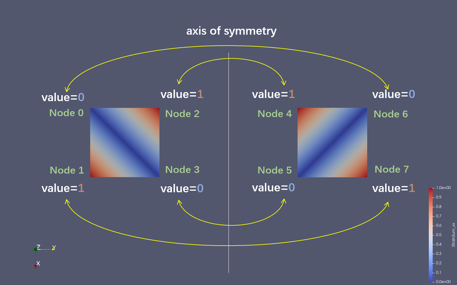
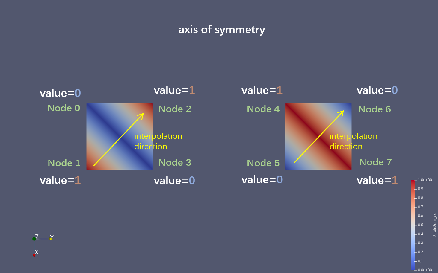
I’m trying to understand the way that Paraview renders the contour. It seem that Paraview render the field value by 1-D interpolation along diagonal so that you recommend to invert the order of the points.
I just wanted to add a little clarity of what is happening. ParaView is loading your data correctly, but rendering it a bit wrong. The asymmetry you are seeing is an artifact from the rendering library that ParaView is using. Just about every rendering system will take quadrilaterals and internally divide them into triangles before rendering. This is because interpolating colors/texture coordinates is a lot faster for a triangle. This is true for pretty much every OpenGL implementation I have encountered as well as the OSPRay rendering backend. This is why you are seeing that either red or blue diagonal line through the squares. You are seeing the triangles the rendering system is interpolating on.
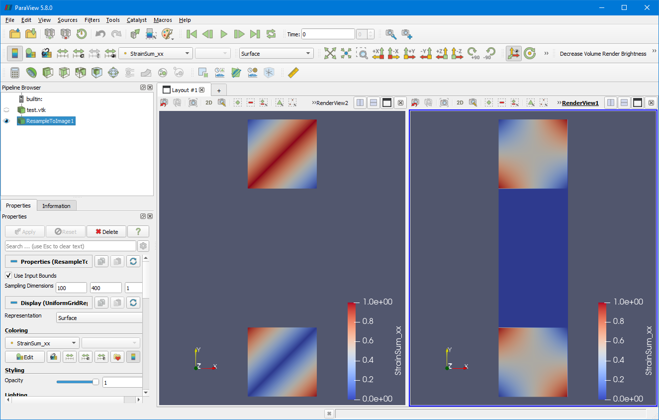
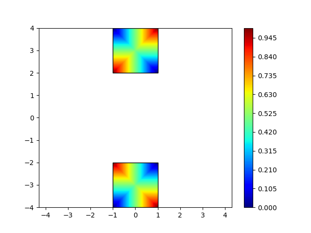
Even though the rendering system is simplifying your data, ParaView itself will do a proper bilinear interpolation. So for example, in the following screenshot I have run the Resample To Image filter on your data. You can see that when a ParaView filter probes your data, you get the correct interpolation. (The blue in between is just the resample filter trying to probe the empty space between your quadrilaterals.)
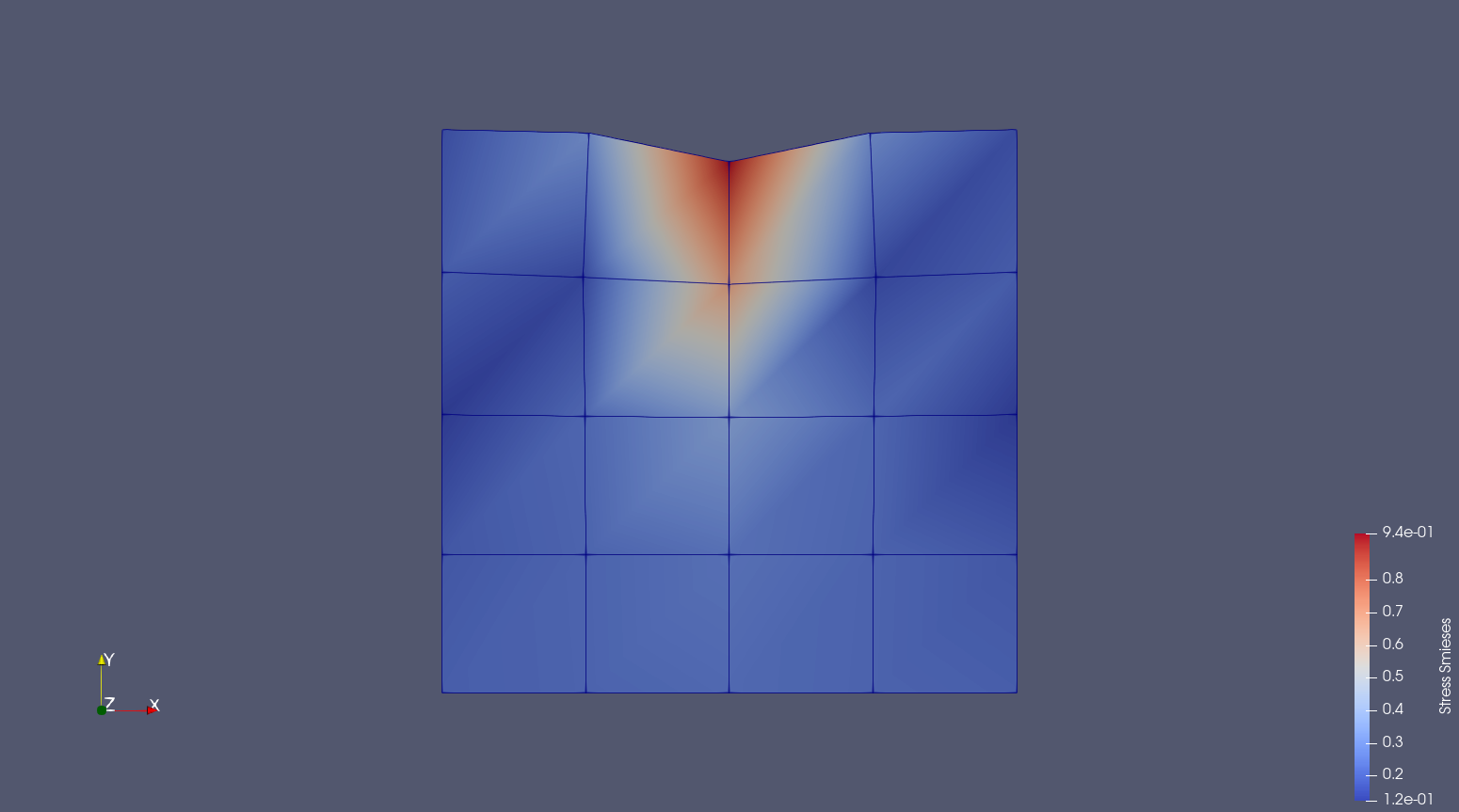
This thread also explains why I get the asymmetric visualization of my symmetric data. The problem is a mesh of quadrilaterals under point load which creates symmetric deformation about vertical axis in the middle. Similarly reduced Von Mieses stresses are symmetric. However due to this internal subdivision of quads into triangles the bi-linear interpolation produces wrong impression of asymmetry. See the attached screenshots of deformation (displacements) and Von Mieses stress and the data vtu file.bous_T1.0000000000e 00_P1.vtu (6.8 KB)
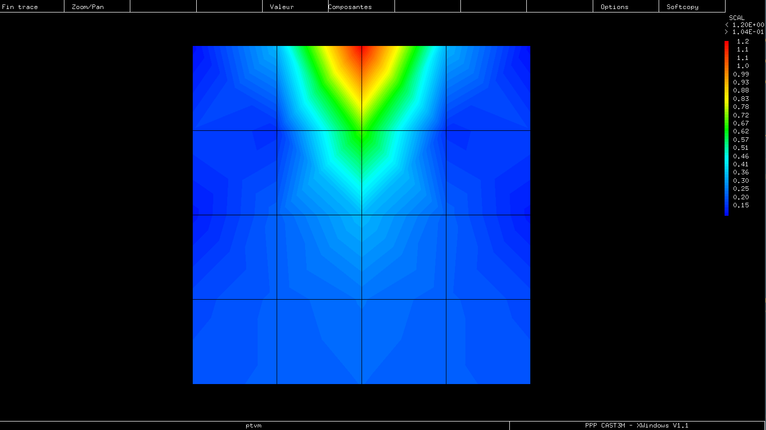
Edit: I know there are some mechanical and civil engineering software which render this kind of problems correctly. I will find and show a screenshot from a program how it should be rendered.
Edit 2: Below is the Von Mieses stress map from Cast3m software
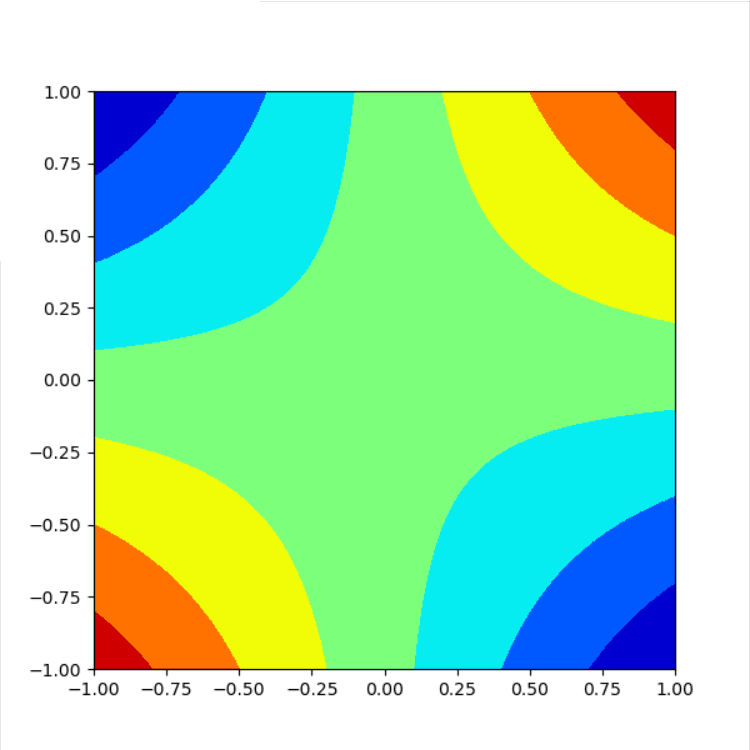
Looking at what other dedicated finite element visualization software is doing with symmetric quad data I found that they seems to split a quadrilateral into four triangles (instead of only two). It involves creation of additional node at the quad centroid (sum of x coordinates / 4, sum of y coordinates / 4, value at the centroid sum of values at nodes divided by four). I include here two python matplotlib scripts which illustrate this procedure. quad_2el_paraview_quad22tri.py (1.5 KB) quad_2el_paraview_quad24tri.py (2.7 KB)
And below are the plots they are producing:
Perhaps in Paraview this kind of internal splitting for quadrilateral can be applied?