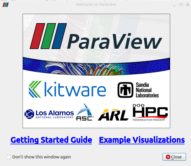
The Welcome Page of ParaView doesn’t offer any functionality other than seeing visualization examples and getting started guide. So, this page doens’t seem very relevant to ParaView users.
We could use this welcome page to improve user experience by displaying most common users action are willing to do when opening ParaView : opening a recent state file, opening a recent data file or connecting to a server.
For the window not to be a constraint to the user, it should be closable very easily, so as soon as the user press a key or click outside of the window, it should automatically be closed.
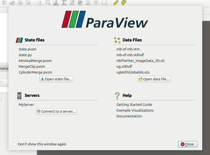
Also, if we add this window to ParaView, I think we should find a way to unset the previous “Show Welcome Dialog” of the user settings, otherwise some user might miss this new window which can now be useful to everyone. Here is a POC with the design I imagined for the window :
By clicking a state file or a data file it directly open it, and if the data is not in our recent we still have a button to open other files. The same goes for the server where we display the server name. By hovering a file we have the full file path.
I’m waiting for your feed back, I think it can be a great feature that improves user experience
As an old-timey ParaView developer, I’d like to give some context on the ParaView welcome page. The page is not designed for most ParaView users. The page is specifically designed for new users. In particular, it is the first thing that a user that has never used ParaView sees.
One of the problems that we have with the ParaView user experience is that it is overwhelming. There are three long rows of toolbar buttons and a really confusing array of menus. It is often compared to an airplane cockpit. There is no way a person would be expected to make anything work without some instruction. We’ve talked endlessly about simplifying the interface, but we also don’t want to hamper the utility for experienced users.
The welcome window was introduced to help solve this problem. It is meant to be the opposite of the ParaView interface: a very simple, minimal interface to provide a brand new user what they need to get started. By design, the welcome page is void of all but two functions: a getting started guide and example visualization. The first button provides a new user very simple instructions that in 5 minutes will give them the knowledge they need to get started with ParaView. The second button provides a list of some of the things you can do with ParaView and a demonstration of how they are done.
So, for most users, the welcome page is useless by design. I also get annoyed at clicking Don’t show this window again every time I download a new version of ParaView. But I would be hesitant to add any feature that would distract from these two functions.
That’s a good idea. I think everyone will appreciate getting around the welcome screen fast.
I agree with you the ParaView user experience is overwhelming, that’s why it has to be simplified and we should improve the user experience
but we also don’t want to hamper the utility for experienced users
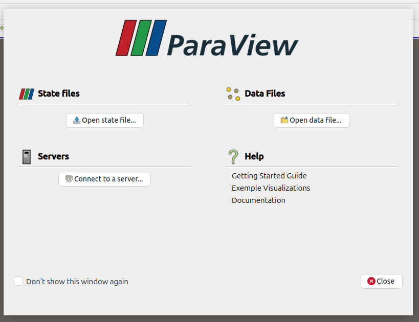
I disagree with this. Of course we don’t want our old user to feel lost by interface changes, but by never simplifying the interface, it only add complexity overt time. By doing smart improvement of the interface that simplify it, experienced user would need some time to get used to but at the end it will be beneficial. Especially for this welcome page, it would increase the user experience for those experienced user, and for new users, the screen would look like this, with a less information so I don’t think it would distract users from the two functions you mentionned :
There may be several opportunities to make the ParaView interface simplified. But let’s be clear: The proposal on this specific discourse page does not simplify the ParaView interface. This page is specifically about making the welcome page less simple (and thereby more useful). Other pages, such as Proposal : Improve toolbar, are discussing simplifying the main ParaView GUI. That is all good, but our discussions will be more useful if we stay on topic.
This misses my point. My point is that the GUI interface is complex now, and the welcome page helps first-timers navigate that complexity. If you think you can improve the interface enough where you don’t need this handholding, that would be great. But do those improvements first. Then we can come back and talk about what to do with the welcome screen.
I agree with this. I’m for making improvements even if experienced users have to get used to them. But my problem has nothing to do with the experienced user. My problem is with the negative impact for the first-time user.
This is better than the original proposal, but I still feel it provides little value to experienced users while making it less clear to first-time users what they should do first.
An experienced user doesn’t need a new open file button on the welcome page. They just need it to get the hell out of the way. I suggest we focus on ways to get past the welcome page easier. The click anywhere outside the dialog to close it is a great idea. Maybe there could be a counter that automatically activates the “don’t show this again” after ParaView launches 5 times. Or maybe change the checkbox to a button that closes and never shows again with one click. Those are easy, non controversial changes that would improve the interface for experienced users.
That’s what the “Example Visualization” link in the welcome page already does. It’s helpful but not sufficient. It shows what you can do but not how to do it.
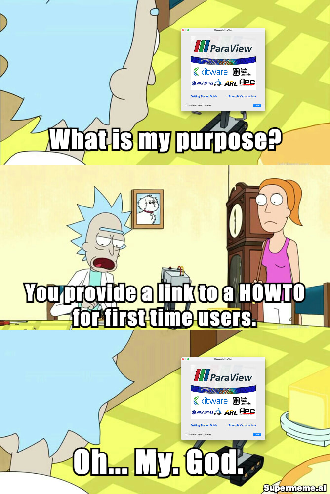
one needs to love when a developper adds a meme in his answer.
I think what it is missing that i would add is a ‘Tips & tricks’ or things like that.
with a ‘how to…’ of a bunch of random things that everybody finds himself trying to figure out.
fully not related things that some can be found in the documentation but more simply described with a ‘for more information check…’.
some examples,
how to save the data of a specific time step into a csv file
i am getting some annoying random lines when doing a slice, are this part of my mesh? is paraview reading wrongly (i can not count the number of times that anyone has found themselves in this situation, every new openfoam user has this question)
how i recover a field in a numpy array in python
how can i modify a field in python and plug it back to my filter
i have my script that it is running slowly, how can i run it while use the max resources of my pc
this kind of things. a cheat sheet but insead of sheet a cheat section for the documentation.
i know it is out of the scope of the ‘welcome page’ but at same time it is something perfectly fit for there!
Interesting. You could point to the Tips and Tricks - ParaView page on this discourse site. But the page might be a bit haphazard to link from the welcome page. Maybe a link from the Help menu…
A cheat sheet would make a good addition to the welcome page. A single summary reference page could make a nice desk reference. The trick would be to decide on the set of simple, common actions and how to organize them.
Hi @lucas.gottar
Finally!! Thanks for thinking about this. In my opinion, this is a very “welcome” change.
After becoming a heavy user of ParaView, one of the first things I usually do is to config out the welcome splash. I am not a big fan of “welcome splashes” with little to click on, but I can easily appreciate a useful “welcome page”.
New users will stop clicking those two links fairly quickly anyway. As an experienced user, though, I would actually consider enabling the “welcome splash page” again if it lets me quickly jump back into a specific data/state file. That could speed up an investigation. My Paraview workflow is often less “trial and error” and more “trial and crash”. So, like me, I am sure that many would appreciate being able to get back to their data/state with a single click after a brutal paraview crash.
I dont think new users are likely to get lost with the proposed change. The Help section is still there, clearly separated, and I think there is a good chance most users will understand the following language
I also got curious about why, after all these years, a kitware engineer wanted to touch something that never changes and never breaks :). That led me to your kitware profile page, and after seeing your background in visual perception research,.. I guess you just couldn’t resist making this change.
One suggestion: instead of only the paraview logo at the top, perhaps use a condensed version of the original paraview splash artwork where there is some nice visualization in the background, with the paraview and collaborator logos in the foreground, all in a rectangular layout.
Thanks again and I hope this gets a chance to make it in.
Interesting. You could point to the Tips and Tricks - ParaView page on this discourse site. But the page might be a bit haphazard to link from the welcome page. Maybe a link from the Help menu…
it is not the same i would say… for me i would make a documentation page called tip & tricks, like the docs, so something like this: 3. Loading Data — ParaView Documentation 6.1.0 documentation
with different images etc, where there would be different titles and images for the different cases.
there is a bunch (i want to clarify beforehand, i think paraview is a excelent piece of software do not get me wrong!) small rought spots that a lot of users came to find when interacting on the begining. and that it takes time or asking the same question by a bunch of users again and again. eg. the ‘random lines during a slice,clip’ this i have already answered to OpenFoam users in the discord at least 10 times, and it is a small community, i imagine other uses find themselves in same situation.
but there is so much in paraview that even basic things sometimes one misses. eg., after several years i learned the go back in the renderviewer.
another thing could be a small ‘clippy like’ suggestion that will be different each time, this one could be each post of the tip & tricks of discourse? this would be awsome. and keep it alive for experienced users.

 . So, like me, I am sure that many would appreciate being able to get back to their data/state with a single click after a brutal paraview crash.